Share This Post

复制链接
分享至X
分享至 LinkedIn
分享至 Facebook

Alert

Share This Post

复制链接
分享至X
分享至 LinkedIn
分享至 Facebook

Share This Post

复制链接
分享至X
分享至 LinkedIn
分享至 Facebook

Alert

Share This Post

复制链接
分享至X
分享至 LinkedIn
分享至 Facebook

Share This Post

复制链接
分享至X
分享至 LinkedIn
分享至 Facebook

Alert

Share This Post

复制链接
分享至X
分享至 LinkedIn
分享至 Facebook

What is Alert

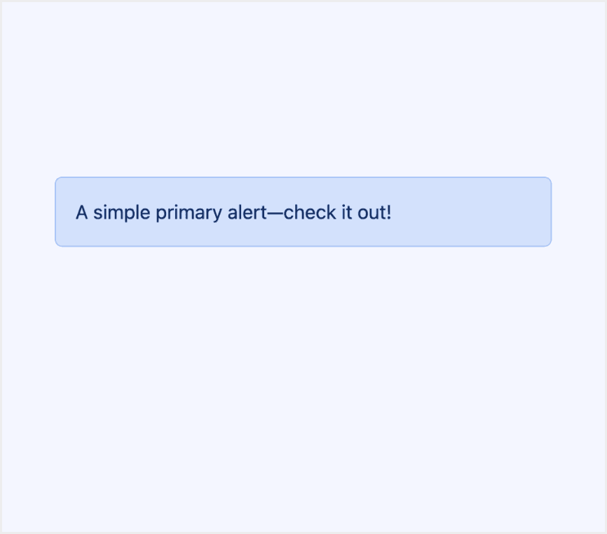
An Alert in a design system is a visual component used to deliver important messages to users. These messages can include errors, warnings, success notifications, or informational updates.

Alerts are made to catch the user's eye with clear visuals. These include colors, icons, and text styles. This helps share important information quickly and clearly.
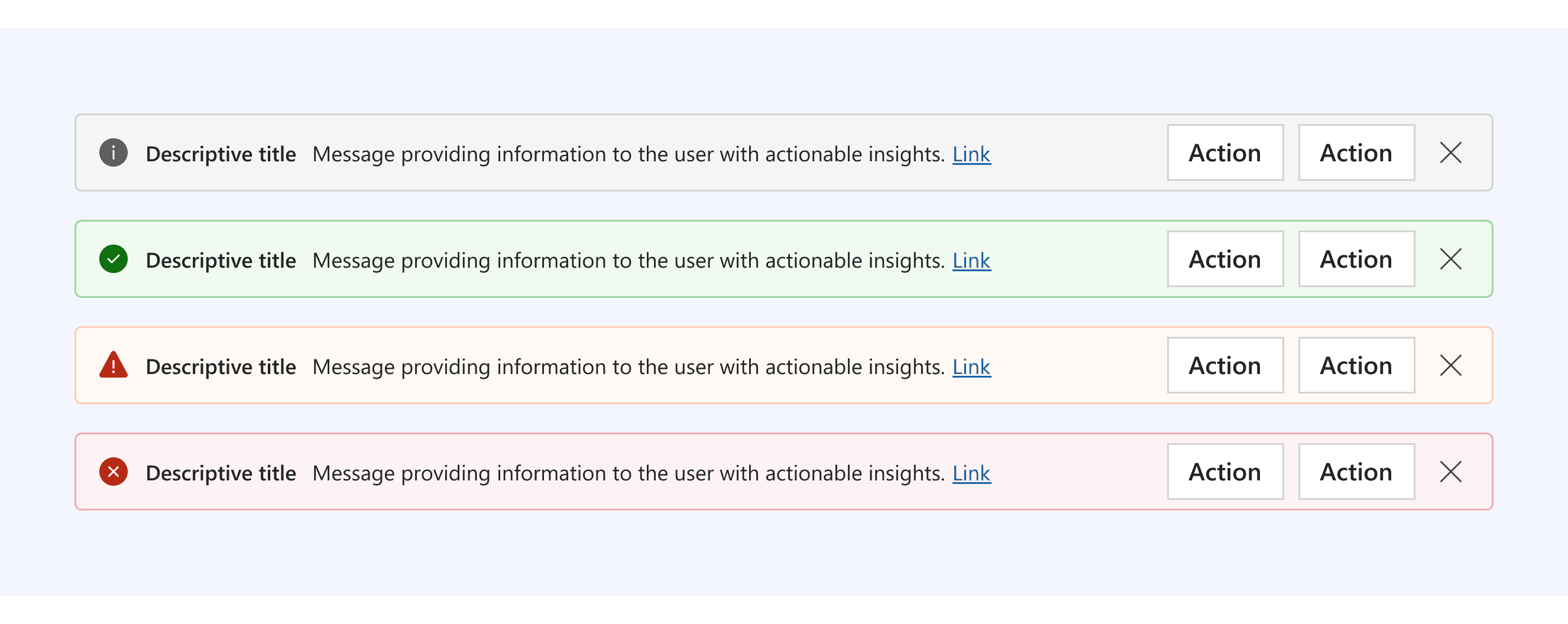
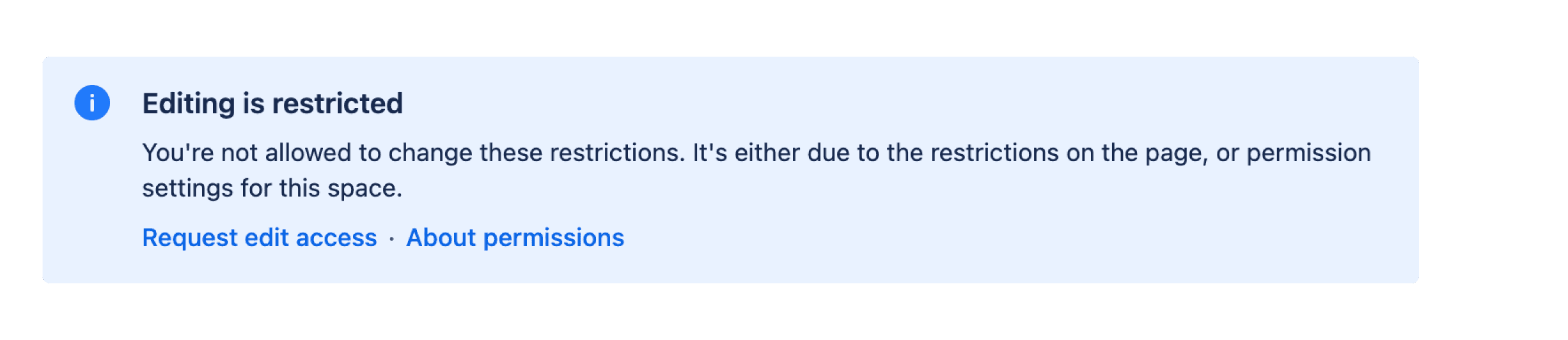
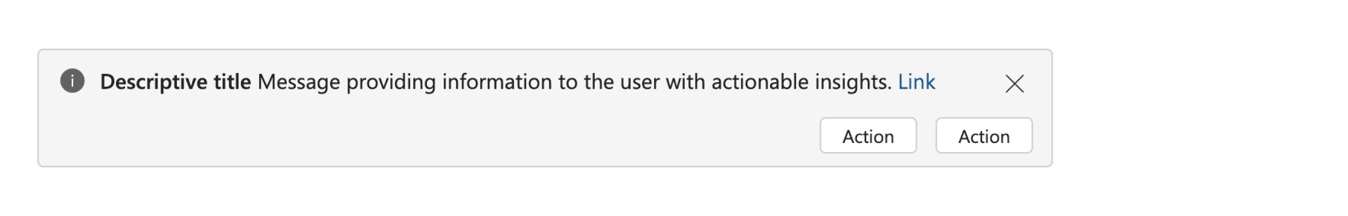
Anatomy Alert

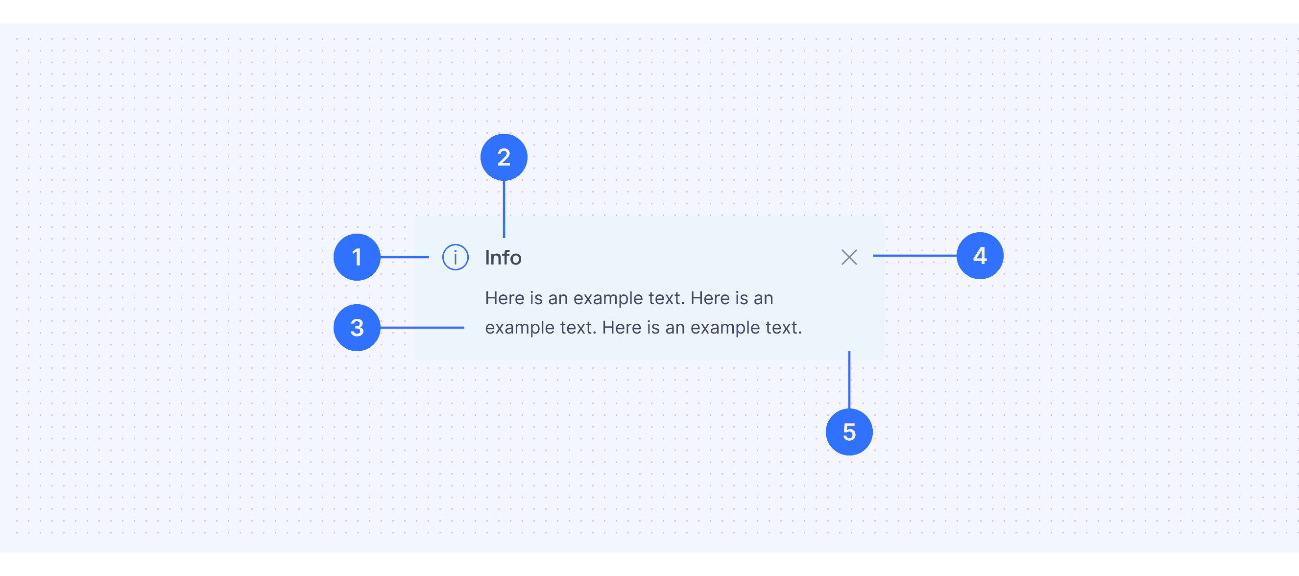
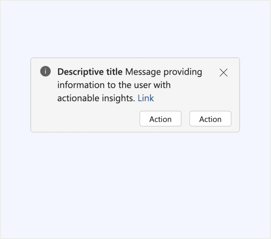
  1. Icon: Use functional icons for specific scenarios and preset icons like "info" for semantic purposes.

  2. Title: Clearly indicate the message's purpose to provide context.

  3. Description: Briefly explain the issue and any required actions, expanding as needed but staying concise.

  4. Actions: Provide links or buttons for users to act on the message.

  5. Container: Background colors are preset to match the message type (e.g., yellow for warnings).

Core features

  • Clear Messaging: Alerts should deliver a clear, brief message that informs users about the situation or action required.

  • Visual Hierarchy: Alerts are usually placed where they are easily noticeable, such as at the top of a page or near the relevant content.

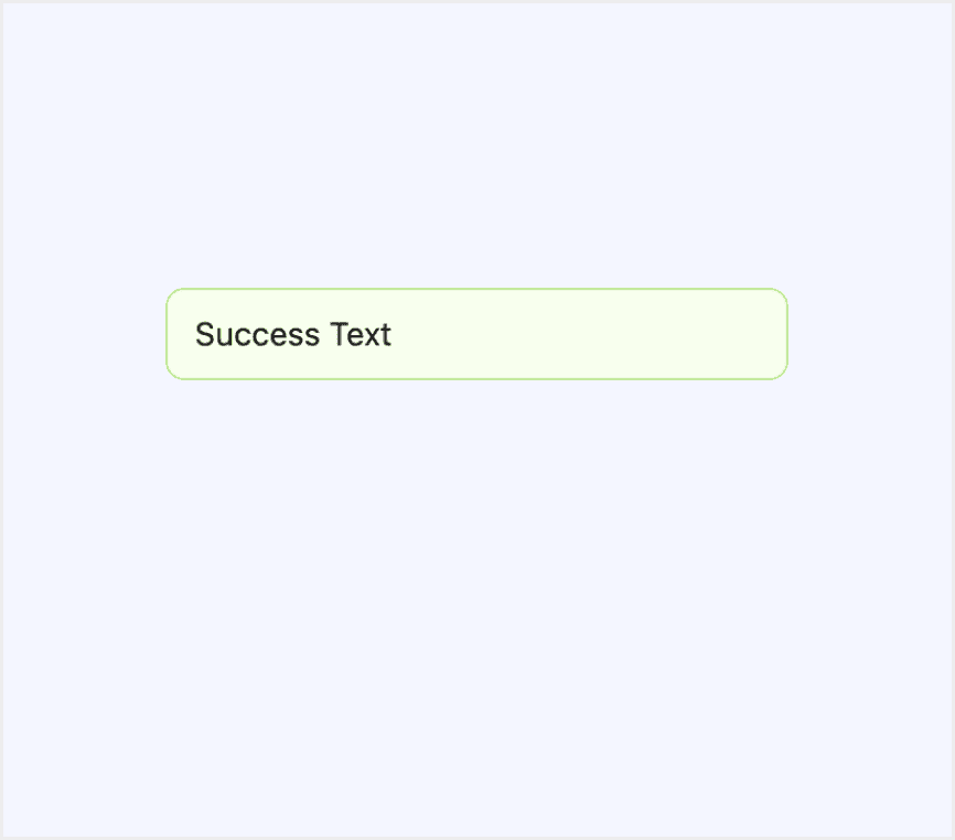
  • Variants for Different States: Common types include Success, Error, Warning, and Informational.

  • Dismissibility: Allow users to dismiss the alert if it’s no longer relevant.

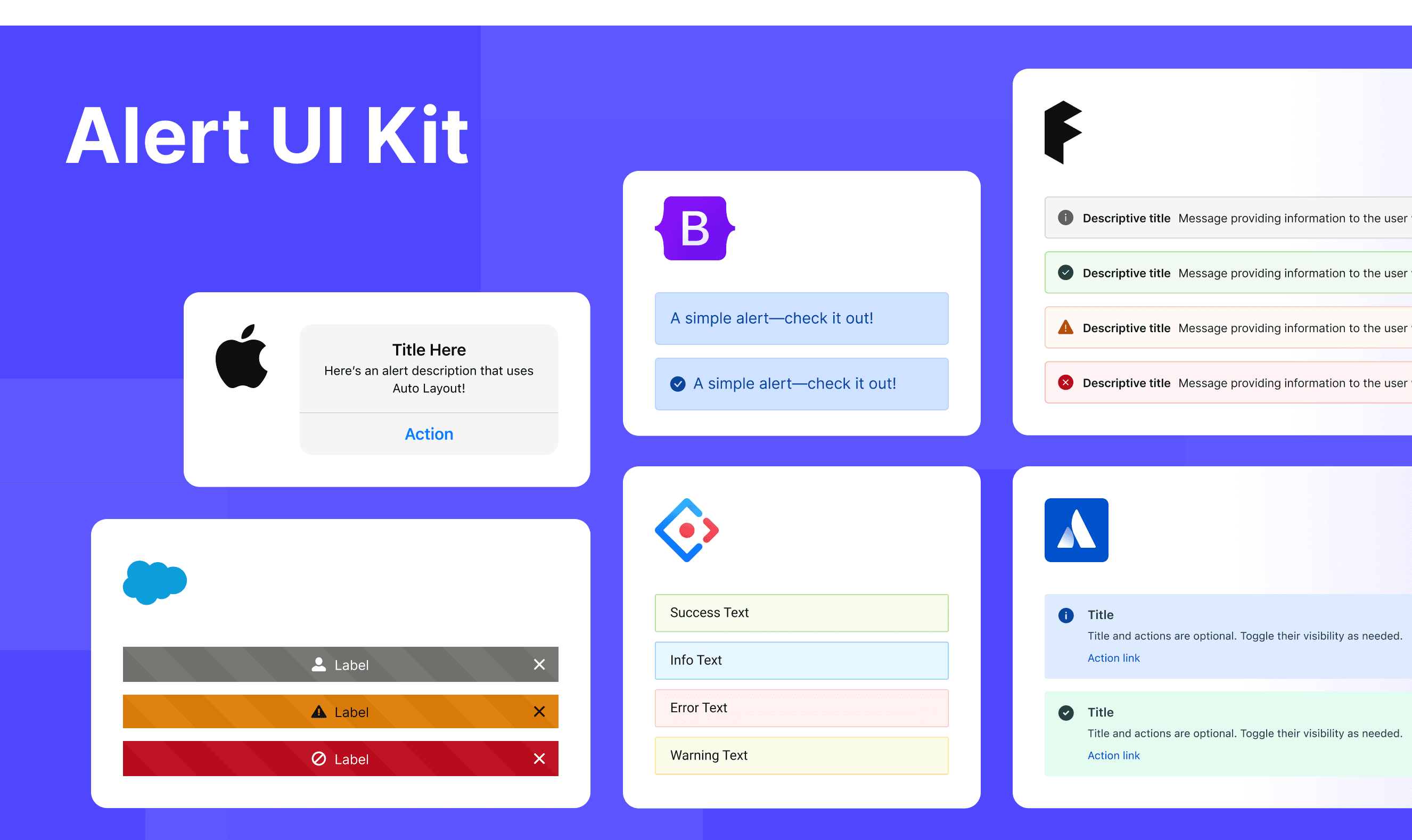
Comparison of Usage in Popular Design Systems

Now, let's look at how some well-known design systems define and implement alerts:

Learn how alerts work in different design systems like Atlassian Design, Fluent 2 Design, and Ant Design. Check their features and rules, such as types and main content structure, to find the best fit for your project.

Default Styles

Enumerates the default appearances of alerts across various design systems, highlighting their visual characteristics and usability.

Atlassian design alert

Atlassian design alert

Atlassian design alert

Atlassian design alert

Fluent 2 design alert

Fluent 2 design alert

Fluent 2 design alert

Fluent 2 design alert

Ant design alert

Ant design alert

Ant design alert

Ant design alert

HIG design alert

HIG design alert

HIG design alert

HIG design alert

Lightning design alert

Lightning design alert

Lightning design alert

Lightning design alert

Bootstrap design alert

Bootstrap design alert

Bootstrap design alert

Bootstrap design alert

Features comparison in Design Systems

Comparing badges in Atlassian, Fluent 2, Ant, HIG, Lightning and Bootstrap shows differences in types and content structure.

Design System

Defines

Types

Content Structure

A section message is used to alert users to a particular section of the screen.

  • Information

  • Warning 

  • Success

  • Error

  • Discovery

  • Actions

  • Icon

  • Title

  • Description

  • Actions

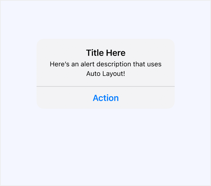
A message bar communicates important information about the state of the entire product or the surface where it appears, such as a page, drawer, dialog, or card.

  • Info

  • Success

  • Warning

  • Error

  • Icon

  • Title

  • Description

  • Actions

  • Links

Display warning messages that require attention.

  • Success

  • Info

  • Warning

  • Error

  • Icon

  • Title

  • Description

  • Actions

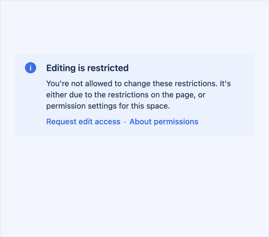
An alert gives people critical information they need right away.

  • Only distinguishes the number of actions.

  • Title

  • Description

  • Actions

Communicate a state that affects the entire system, not just a feature or page.

  • Offline

  • Error

  • Warning

  • Info

  • Icon

  • Title

  • Description

  • Link

Provide contextual feedback messages for typical user actions with the handful of available and flexible alert messages.
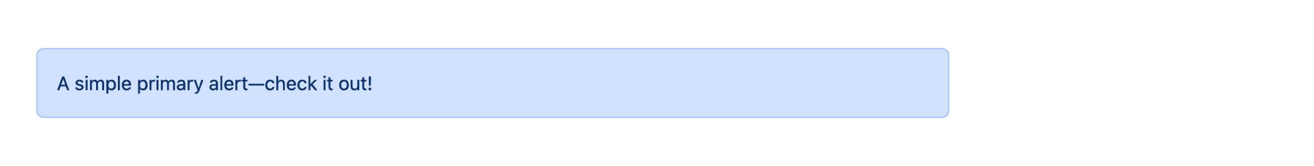
  • Primary

  • Secondary

  • Success

  • Danger

  • Warning

  • Info

  • Light

  • Dark

  • Icon

  • Title

  • Description

  • Link

Special Types

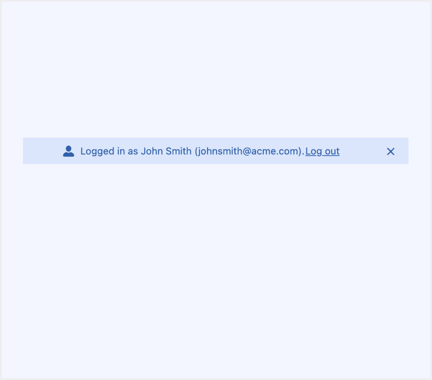
Fluent 2 Design System supports alert with links.

Link provides additional information related to the message.

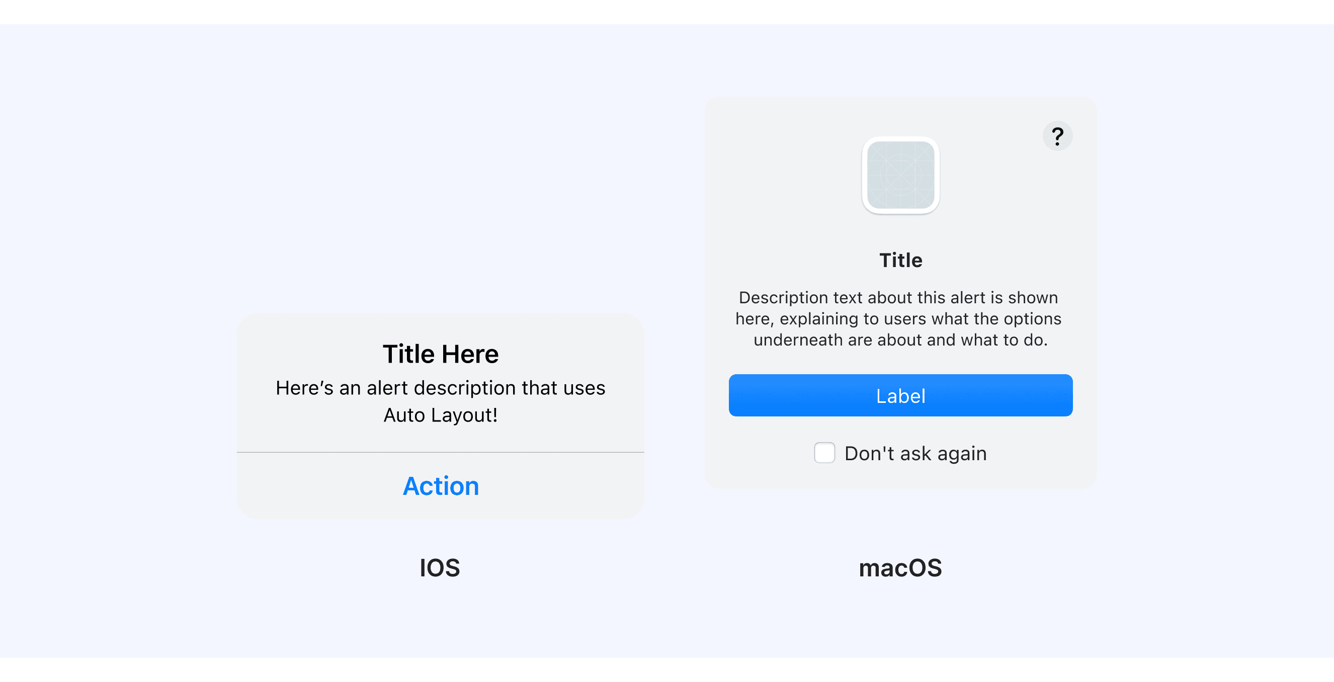
HIG Provide alerts across multiple platforms and devices.

An alert is a modal view that can look different in different platforms and devices.

Bootstrap provides alert with additional content.

Alerts can also contain additional HTML elements like headings, paragraphs and dividers.

Alert Template for Motiff

This UIkit file combines alert designs from Atlassian, Fluent 2, Ant, HIG, Lightning and Bootstrap Design System. It showcases their styles, usage, and customization in one place for easy exploration and selection.

Open and edit in Motiff →

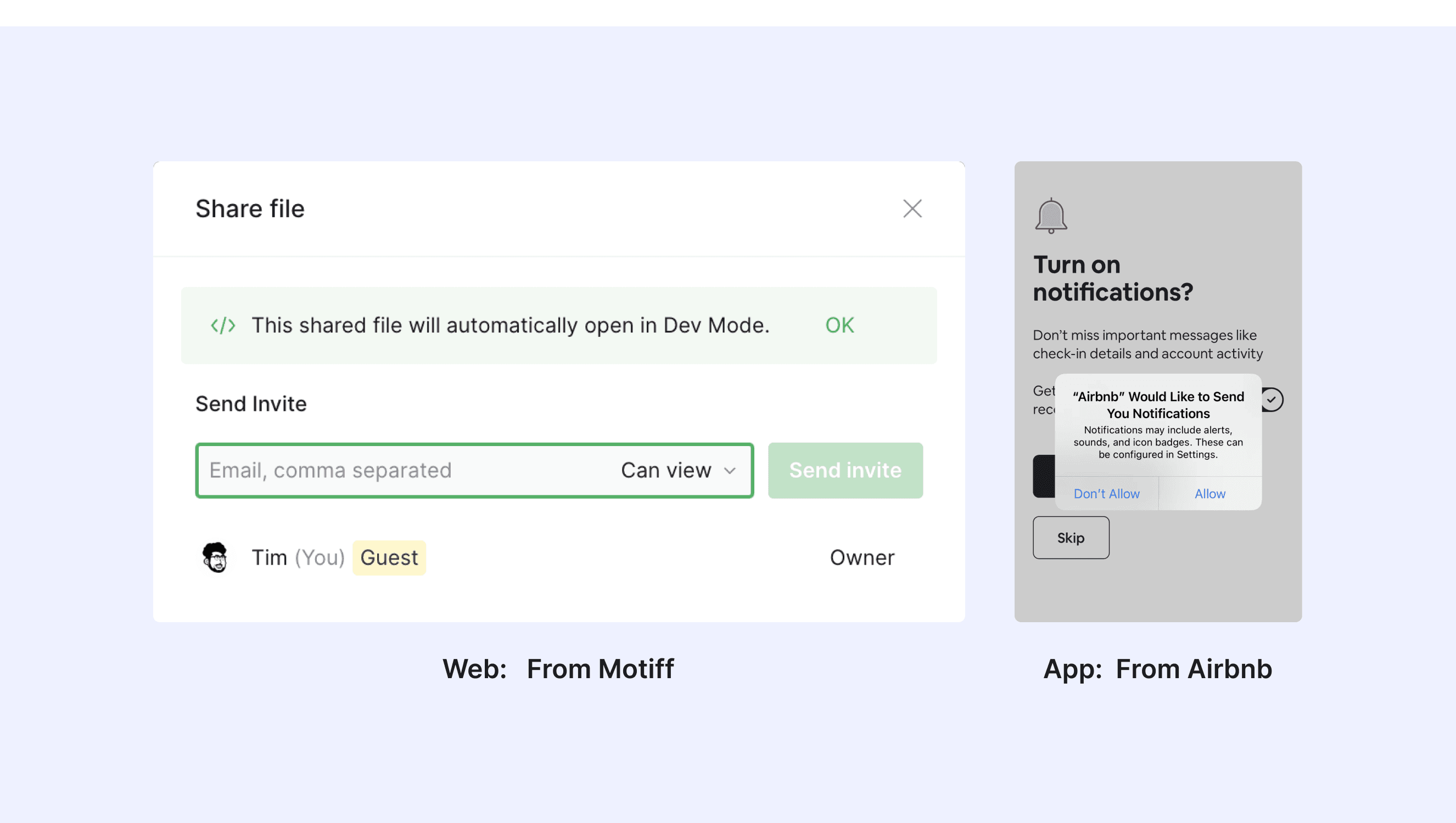
Alert vs. Toast vs. Notification: Difference and When to Use

In user interface (UI) design, the terms "toast", “alert” and "notification" are often used interchangeably, but they have distinct meanings, which are adapted from a Stack Overflow discussion.
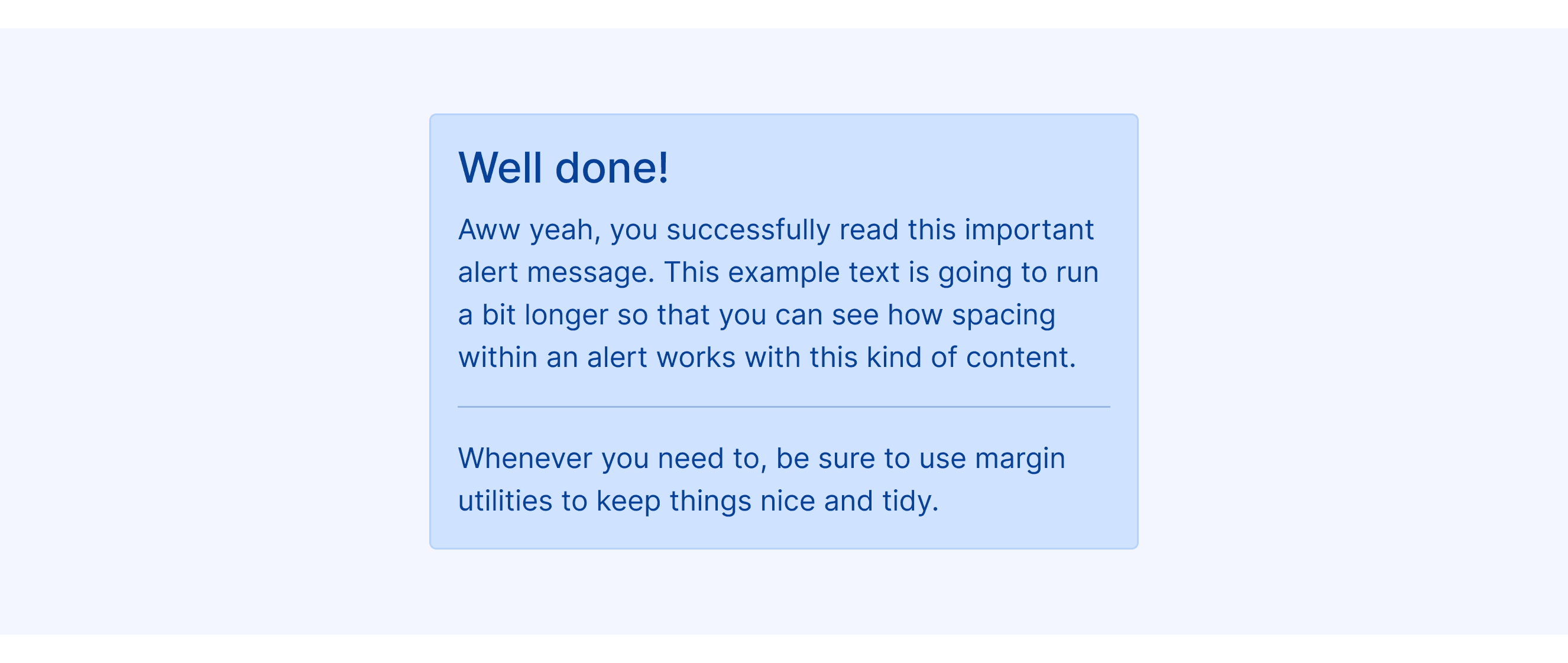
Alert:

  • Characteristics: Stops you until you click "OK" or "Close." For important or urgent info.

  • Use Case: When immediate action is needed, like confirming a deletion.

Notification:

  • Characteristics: Appears at the top, doesn’t interrupt, and can be ignored.

  • Use Case: To show results or updates, like a form submission or error.

Toast:

  • Characteristics: A small popup that disappears in a few seconds, no interruption.

  • Use Case: For quick updates, like a new email or song change.

Accessibility in Different Design Systems

Common Practices

  • Visual hierarchy and contrast: All design systems focus on the visual hierarchy of Alert components. They use colors, icons, and typography to show different types of information, like success, warning, and error.

  • Icons and visual cues: Most design systems use icons in Alerts to enhance the comprehensibility of the information. Icons are typically aligned with the text content and provide clear visual feedback.

  • Responsive design: Alert components maintain consistent behavior across different screen sizes, with content automatically adjusting to fit smaller screens.

Differences Practices

  • Atlassian Design System: The Section Message component emphasizes information hierarchy, using subtle background colors and clear icons to distinguish different message types.

  • Fluent 2: Allows you to show several MessageBars at the top of a page or content area. This is great for situations with many messages at once.

  • Ant Design: Includes Loop Banner variant, enabling looping banner effects using react-text-loop-next or react-fast-marquee.

  • Apple HIG: This system offers styles for many devices. It focuses on modal dialog forms for quick user responses.

  • Lightning Design System: Recommends placing it at the top of their context area for maximum visibility.

Code Examples

Explore default alert implementations in Atlassian, Fluent 2, Ant, HIG, Lightning and Bootstrap design. These examples showcase standard usage, default settings, and core features across design systems.

Atlassian Design

import React from 'react';

import SectionMessage, { SectionMessageAction } from '@atlaskit/section-message';

export default () => (
	<SectionMessage
		title="Editing is restricted"
		actions={[
			<SectionMessageAction href="#">Request edit access</SectionMessageAction>,
			<SectionMessageAction href="#">About permissions</SectionMessageAction>,
		]}
	>
		<p>
			You're not allowed to change these restrictions. It's either due to the restrictions on the
			page, or permission settings for this space.
		</p>
	</SectionMessage>
);

Show More

Fluent 2 Design

import { FluentProvider, webLightTheme } from '@fluentui/react-components';
import { Default as Example } from './example';

const App = () => {
    return (
      <FluentProvider theme={webLightTheme}>
        <Example />
      </FluentProvider>
    );
};

export default App;

Show More

import { FluentProvider, webLightTheme } from '@fluentui/react-components';
import { Default as Example } from './example';

const App = () => {
    return (
      <FluentProvider theme={webLightTheme}>
        <Example />
      </FluentProvider>
    );
};

export default App;

Show More

import { FluentProvider, webLightTheme } from '@fluentui/react-components';
import { Default as Example } from './example';

const App = () => {
    return (
      <FluentProvider theme={webLightTheme}>
        <Example />
      </FluentProvider>
    );
};

export default App;

Show More

import { FluentProvider, webLightTheme } from '@fluentui/react-components';
import { Default as Example } from './example';

const App = () => {
    return (
      <FluentProvider theme={webLightTheme}>
        <Example />
      </FluentProvider>
    );
};

export default App;

Show More

Ant Design

import React from 'react';
import { Alert } from 'antd';

const App: React.FC = () => <Alert message="Success Text" type="success" />;

export default App;
import React from 'react';
import { Alert } from 'antd';

const App: React.FC = () => <Alert message="Success Text" type="success" />;

export default App;
import React from 'react';
import { Alert } from 'antd';

const App: React.FC = () => <Alert message="Success Text" type="success" />;

export default App;
import React from 'react';
import { Alert } from 'antd';

const App: React.FC = () => <Alert message="Success Text" type="success" />;

export default App;

Bootstrap Design

<div class="alert alert-primary" role="alert">
  A simple primary alert—check it out!
</div>
<div class="alert alert-secondary" role="alert">
  A simple secondary alert—check it out!
</div>
<div class="alert alert-success" role="alert">
  A simple success alert—check it out!
</div>
<div class="alert alert-danger" role="alert">
  A simple danger alert—check it out!
</div>
<div class="alert alert-warning" role="alert">
  A simple warning alert—check it out!
</div>
<div class="alert alert-info" role="alert">
  A simple info alert—check it out!
</div>
<div class="alert alert-light" role="alert">
  A simple light alert—check it out!
</div>
<div class="alert alert-dark" role="alert">
  A simple dark alert—check it out!
</div>

Show More

Try AI Design Systems

Create, maintain, and check your design systems with AI in one click.

Try AI Design Systems

Create, maintain, and check your design systems with AI in one click.

Try AI Design Systems

Create, maintain, and check your design systems with AI in one click.

Try AI Design Systems

Create, maintain, and check your design systems with AI in one click.

Try AI Design Systems

Create, maintain, and check your design systems with AI in one click.