What is Avatar
In a design system, an avatar represents a user or entity visually. It’s usually a small, round image, icon, or placeholder that identifies a person, group, or organization. Avatars are widely used in apps and websites to display profile pictures, comments, chat messages, or user lists. They make the experience more personal and help users easily recognize people or groups.
Anatomy Avatar
Body: Typically represents the image of a user or entity.
Container: The holder for the content, supporting both circular and rounded square shapes.
Core features
Display Users or Content: Used to represent a person or an organization visually. It can be a profile photo, the initials of a name, or a simple graphic symbol. For example, in a chat application, you can see a friend's profile icon to identify who sent the message.
Various Shape Options: It can have different shapes, such as circular, square, or rounded square, depending on the design style and requirements. For instance, a social media app might prefer circular profile icons, while a corporate platform might go for square ones.
Different Size Options: It comes in various sizes, such as small, medium, and large. Small icons are ideal for user lists, while larger ones are better suited for profile or detail pages. This flexibility allows them to fit seamlessly into different layouts and components.
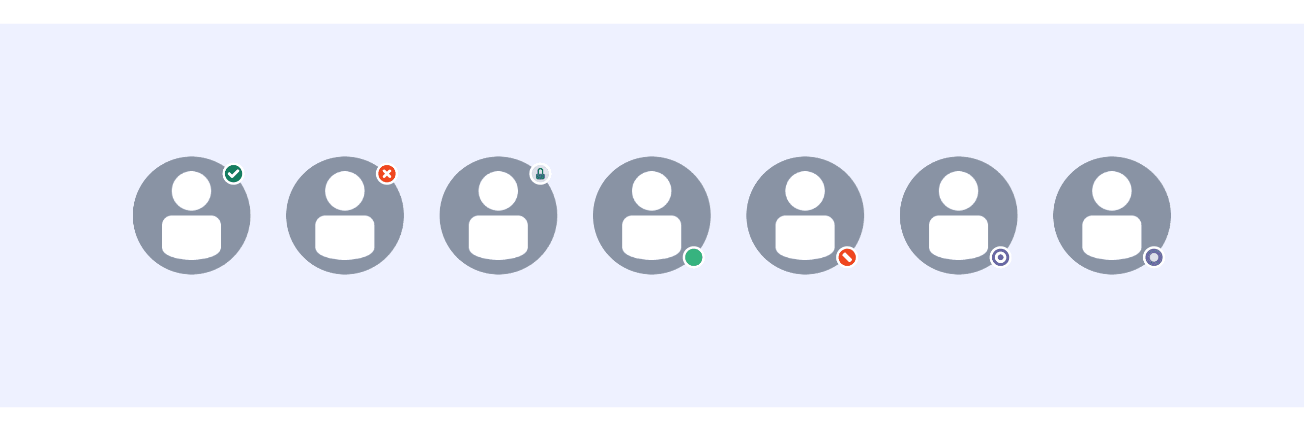
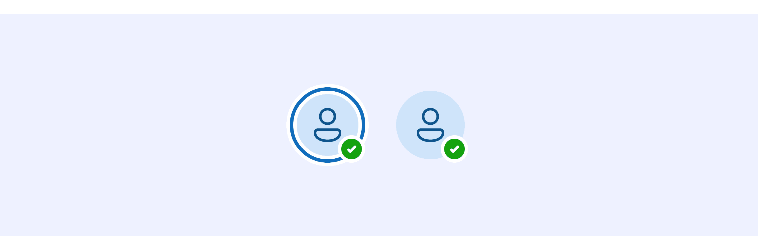
Status Indicators: It can include small status markers to show whether someone is online, offline, or busy. This helps users quickly understand a person's current availability and decide whether to contact them.
Comparison of Usage in Popular Design Systems
Now, let's look at how some well-known design systems define and implement avatars:
Learn how different design systems, such as Atlassian Design, Fluent Design, and Ant Design, use avatars. Explore their features and guidelines, like size options and content types, to find the best match for your project.
Default Styles
Enumerates the default appearances of avatars across various design systems, highlighting their visual characteristics and usability.


Features comparison in Design Systems
Comparing modals in Atlassian, Fluent 2, Ant, Polaris, Base Web, and Lightning shows differences in size and content support.
Design System
Defines
Size
Content Support
An avatar is a visual representation of a user or entity.
XS (16px)
S (24px)
M (32px)
L (48px)
Image
Text initials
Icon
An avatar shows an image or text to represent a person or group as well as give additional information like their status and activity.
20px
24px
32px
48px
64px
Image
Icon
Text + badge
Used to represent users or things, supporting the display of images, icons, or characters.
24px
32px
40px
64px
80px
Image
Text/icon
Dynamic badge (e.g., online status)
Avatars are used to show a thumbnail representation of an individual or business in the interface.
20px
28px
40px
60px
Image
Brand icon
Placeholder (e.g., “?”)
The Avatar component adds additional visual information about a user.
Customizable (via size prop)
Image
Text
Custom SVG
Represents a person or entity as an image, icon, or initials in a circular frame.
X-Small (24px)
Small (32px)
Medium (48px)
Large (64px)
Image
Initials
Status indicator (e.g., “Busy”)
Atlassian Design System supports “Avatar with badges”.
A profile image with a status label shows both the user's picture and an indicator of their current activity or availability.
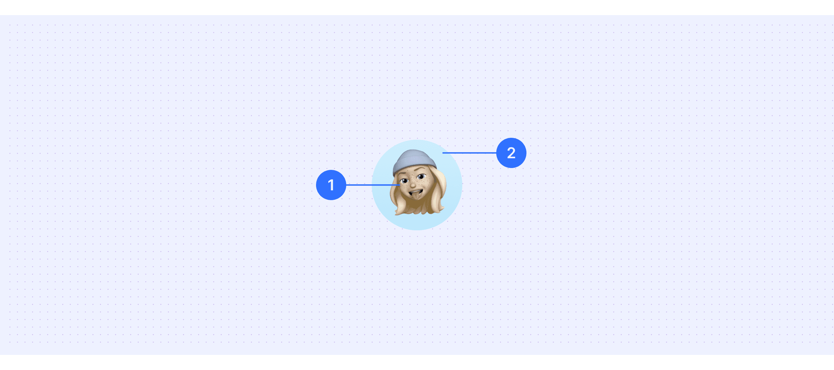
Fluent 2 Design supports “Avatar include activity rings”.
You can add activity rings around profile pictures to show when someone is actively doing something, like talking in a Teams call or typing in a shared Office document.
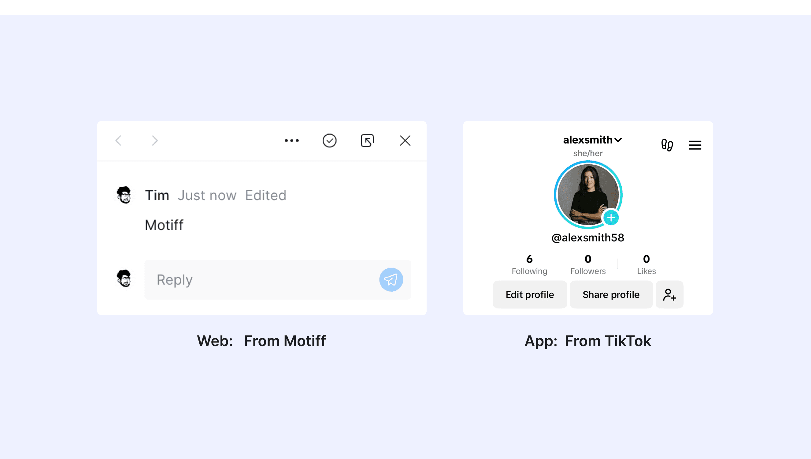
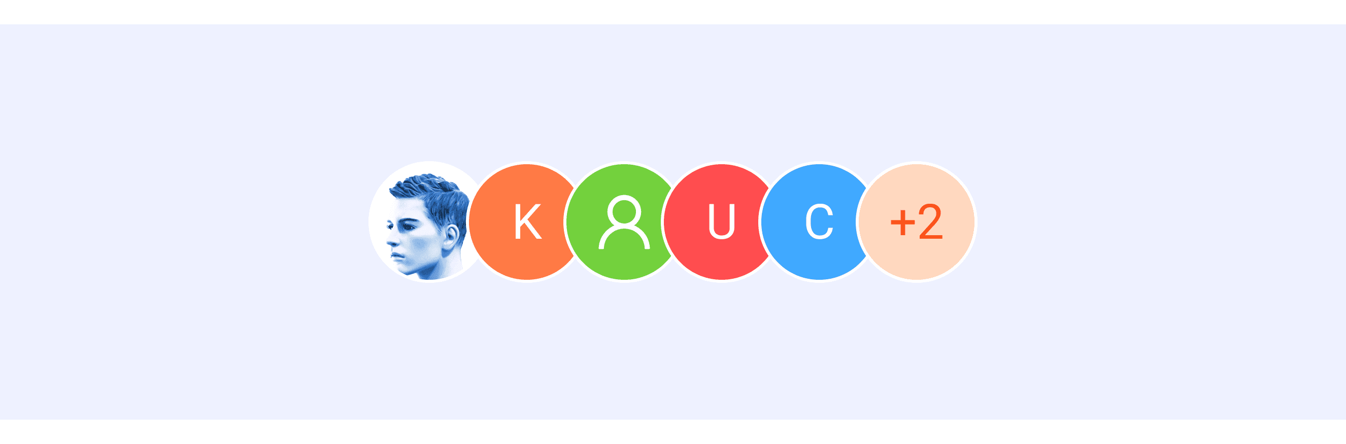
Ant Design System supports Avatar group display.
An avatar supporting group display is a feature that visually represents multiple users or entities as a group. It is often used in team tools, social apps, or any platform that focuses on group activities.
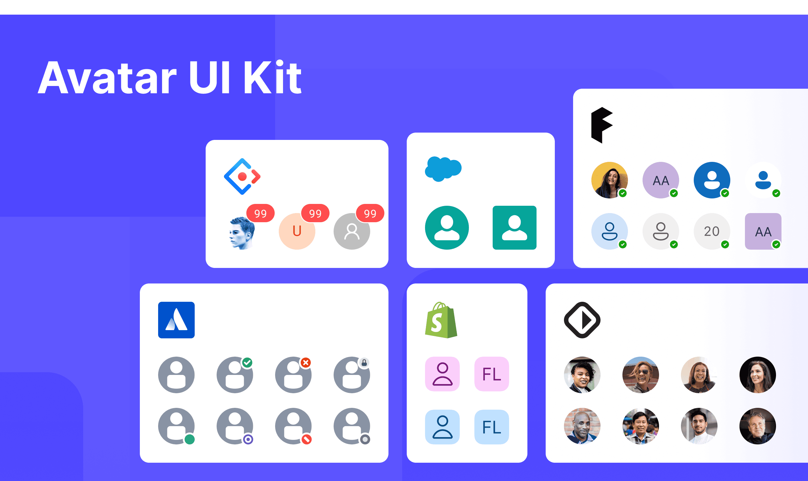
Avatar Template for Motiff
This UIkit file combines avatar designs from Atlassian, Fluent 2, Ant, Polaris, Base Web, and Lightning Design. It showcases their styles, usage, and customization in one place for easy exploration and selection.
Avatar Group: A Versatile UI Component
Avatar Group is a versatile UI component that shows multiple user profiles in one place. It’s perfect for team collaboration, social interactions, and representing user identities. With its compact design and customizable features, Avatar Group improves both user experience and visual appeal. This concept is inspired by a discussion in the Soul design system discussion.
Use Cases
Displaying team members in collaboration tools.
Showing friend lists or user interactions in social platforms or comment sections.
Highlighting task participants in project management tools.
Configuration and Customization
Supports setting a maximum number of visible profile images, with excess represented as a numeric indicator.
Allows customization of image styles, border colors, and backgrounds.
Interactions and Behaviors
Enables specific actions by clicking on user icons, such as viewing detailed information.
Provides hover effects to enhance user interaction and engagement.
Accessibility in Different Design Systems
Common Practices
Alt Text for Screen Readers: Every avatar includes a description (called "alt text" or an ARIA label) so that people using screen readers can know what the avatar represents. For example, if the avatar is a picture of "John," the screen reader will say, "John's profile picture."
Focus Managemen: When you use the keyboard to move through a list of avatars, the system highlights the avatar you're currently selecting. This makes it easier to know which avatar you're focusing on and gives clear feedback.
Scalable Sizes: Avatars come in different sizes, like small, medium, and large, so they can fit into different parts of the interface. For example, a small avatar might be used in a chat list, while a large avatar could appear on a profile page.
Fallback Mechanism: If an avatar image isn’t available, the system will show something else instead, like the person’s initials (e.g., "AB") or a default icon. This ensures there’s always something to represent the avatar.
Differences Practices
Atlassian Design: Dynamic status indicators are updated in real-time using "aria-live," ensuring that screen readers provide timely updates. For example, when an avatar’s status changes from "offline" to "online," the screen reader immediately notifies the user.
Fluent 2: Badge content uses a special tag called "aria-describedby," which helps screen readers easily read the badge details. For instance, a badge next to an avatar might display "new messages," and the screen reader will accurately read this information.
Ant Design: Dynamic loading placeholders use "aria-busy=true" to indicate that something is currently loading. For example, when an avatar’s image is still loading, the screen reader knows it’s busy and won’t mistakenly read incomplete content.
Shopify Polaris: Placeholder avatars use "aria-hidden=true" to prevent screen readers from reading irrelevant content, ensuring users aren’t distracted by unnecessary information.
Base Web: Fully supports custom ARIA attributes, making it adaptable for more complex accessibility needs. For example, you can add specific descriptions to an avatar to help screen readers better explain its purpose.
Lightning: Status indicators use a special tag called "role=status," which helps screen readers focus on and read status updates first. For instance, when an avatar’s status changes from "busy" to "available," the screen reader prioritizes this information and notifies the user.
Code Examples
Explore default modal implementations in Atlassian, Fluent 2, Ant, Polaris, Base Web, and Lightning Design. These examples showcase standard usage, default settings, and core features across design systems.
Atlassian Design

Fluent 2 Design

Ant Design

Polaris Design