Share This Post

复制链接
分享至X
分享至 LinkedIn
分享至 Facebook

Badge

Share This Post

复制链接
分享至X
分享至 LinkedIn
分享至 Facebook

Share This Post

复制链接
分享至X
分享至 LinkedIn
分享至 Facebook

Badge

Share This Post

复制链接
分享至X
分享至 LinkedIn
分享至 Facebook

Share This Post

复制链接
分享至X
分享至 LinkedIn
分享至 Facebook

Badge

Share This Post

复制链接
分享至X
分享至 LinkedIn
分享至 Facebook

What is Badge

In a design system, a badge is a small, visual indicator used to convey concise information, status, or contextual metadata about an item or element. Badges are typically used to grab attention and provide additional context without overwhelming the user interface.
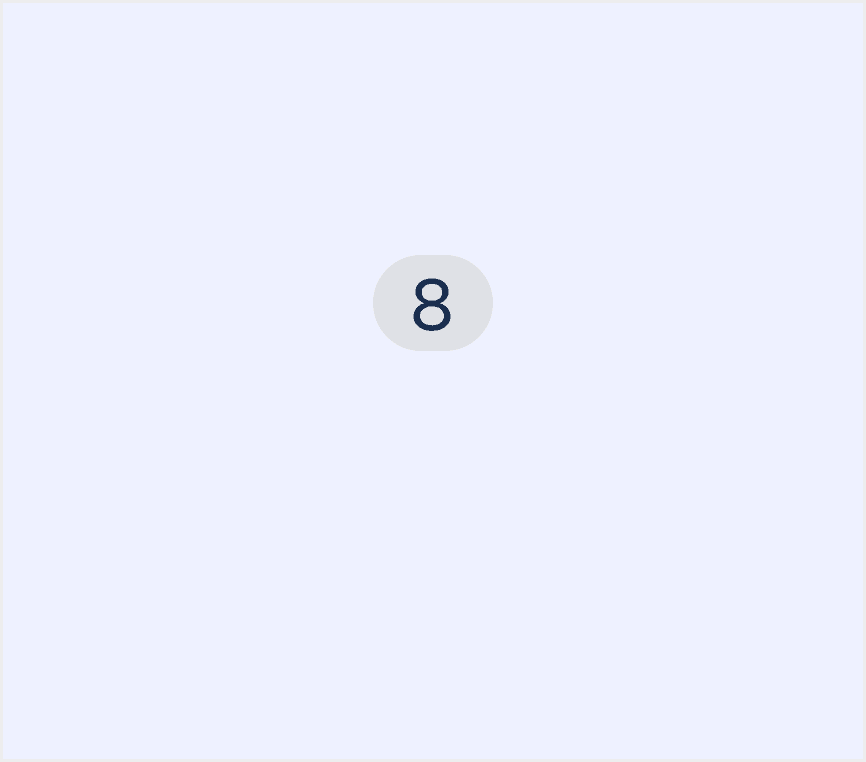
Anatomy Badge

  1. Container: The outer frame or background of the badge, designed to encapsulate numbers or text, ensuring the information is clear and easy to recognize.

  2. Number/Text: The core information displayed within the badge, which can be a number, symbol, or short text. It conveys specific status or quantity information, such as notification counts or error states.

Core features

  • Compact Design: Badges are small and unobtrusive, designed to fit seamlessly into the UI without overwhelming other elements.

  • Attention-grabbing: Badges often use vibrant colors (e.g., red for alerts) and prominent placement to draw user attention.

  • Dynamic Content: The content inside a badge (e.g., numbers, icons, or text) can update in real time based on system changes.

  • Positioning: Typically positioned near or on top of relevant UI elements to provide context (e.g., on icons, avatars, or buttons).

Comparison of Usage in Popular Design Systems

Now, let's look at how some well-known design systems define and implement badges:

Discover how badges are implemented across different design systems like Material Design, Fluent 2 Design, Ant Design, etc. Look at their features and rules, like size, and core types to choose the best fit for your project.
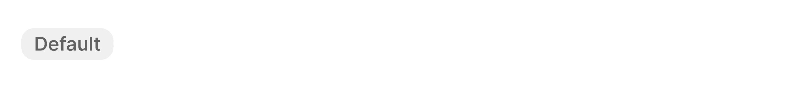
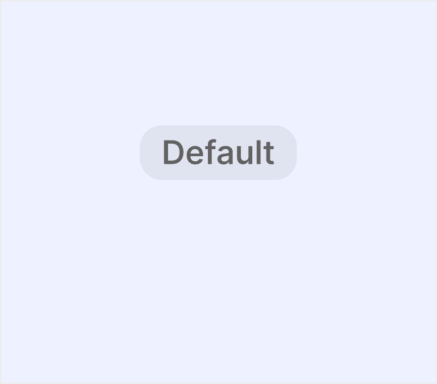
Default Styles

Enumerates the default appearances of badges across various design systems, highlighting their visual characteristics and usability.

Material design badge

Material design badge

Material design badge

Material design badge

Atlassian design badge

Atlassian design badge

Atlassian design badge

Atlassian design badge

Fluent 2 design badge

Fluent 2 design badge

Fluent 2 design badge

Fluent 2 design badge

Ant design badge

Ant design badge

Ant design badge

Ant design badge

Polaris design badge

Polaris design badge

Polaris design badge

Polaris design badge

Bootstrap design badge

Bootstrap design badge

Bootstrap design badge

Bootstrap design badge

Features comparison in Design Systems

Comparing badges in Material, Atlassian, Fluent 2, Ant, Polaris and Bootstrap shows differences in size and core types. 

Design System

Defines

Core Types

Size

Badges show notifications, counts, or status information on navigation items and icons.

  • Numeric

  • Notification marker

  • Small badge size: 6dp

  • Large badge one digit size: 16dp

  • Large badge max character count size: 16dp x 34dp

A badge is a visual indicator for numeric values such as tallies and scores.

  • Numeric

  • Default: 27px x 16px

  • Large: 35 x 16px

A badge is a visual indicator that communicates a status or description of an associated component. They use short text, color, and icons for quick recognition and are placed near the relavant content.

  • Normal badge

  • Presence badge

  • Normal badge:

    • Extra large: hight 32px

    • Large: 24px

    • Medium: 20px

    • Small: 16px

  • Presence badge:

    • Extra-large huge: 28 x 28px

    • Large: 20 x 20px

    • Medium: 16 x 16px

    • Small: 12 x 12px

    • Extra-small: 10 x 10px

    • Tiny: 6 x 6px

Small numerical value or status descriptor for UI elements.

  • Badge/Dot

  • Badge/Status

  • Badge/Count

  • Badge.Ribbon

  • Small Badge/Count: 16 x16px

  • Medium Badge/Count: 20 x 20px

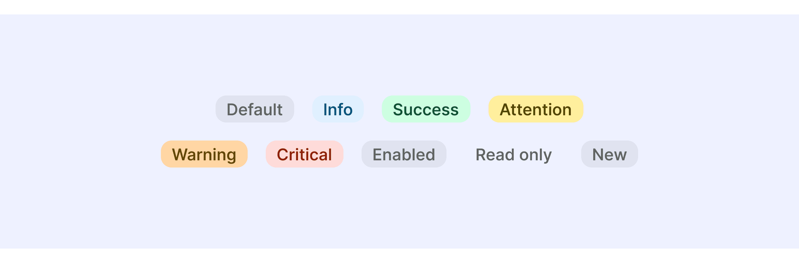
Badges are used to inform merchants of the tone of an object or of an action that’s been taken.

  • Tone: 

    • Default

    • Info

    • Success

    • Attention

    • Warning

    • Critical

  • Status Indicator:

    • Enabled

    • Read only

    • New

  • Progress Status:

    • Incomplete

    • Partially complete

    • Complete

  • Large badge: 24 x 24px

  • Medium badge: 20 x 20px

Documentation and examples for badges, our small count and labeling component.

  • Normal badge

  • Pill badge

  • Dot badge

  • Including six sizes from H1 to H6
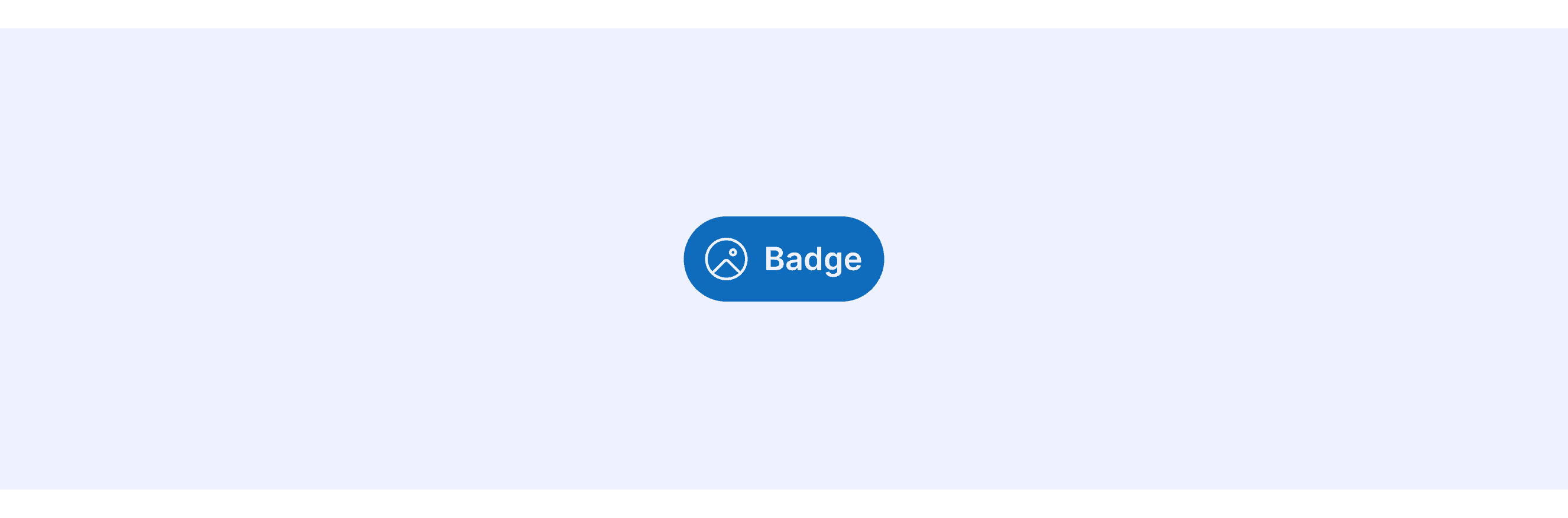
Special Types

Fluent 2 Design System supports badges with icons.

Fluent 2 allows embedding icons within badges and provides hover and click interaction effects.

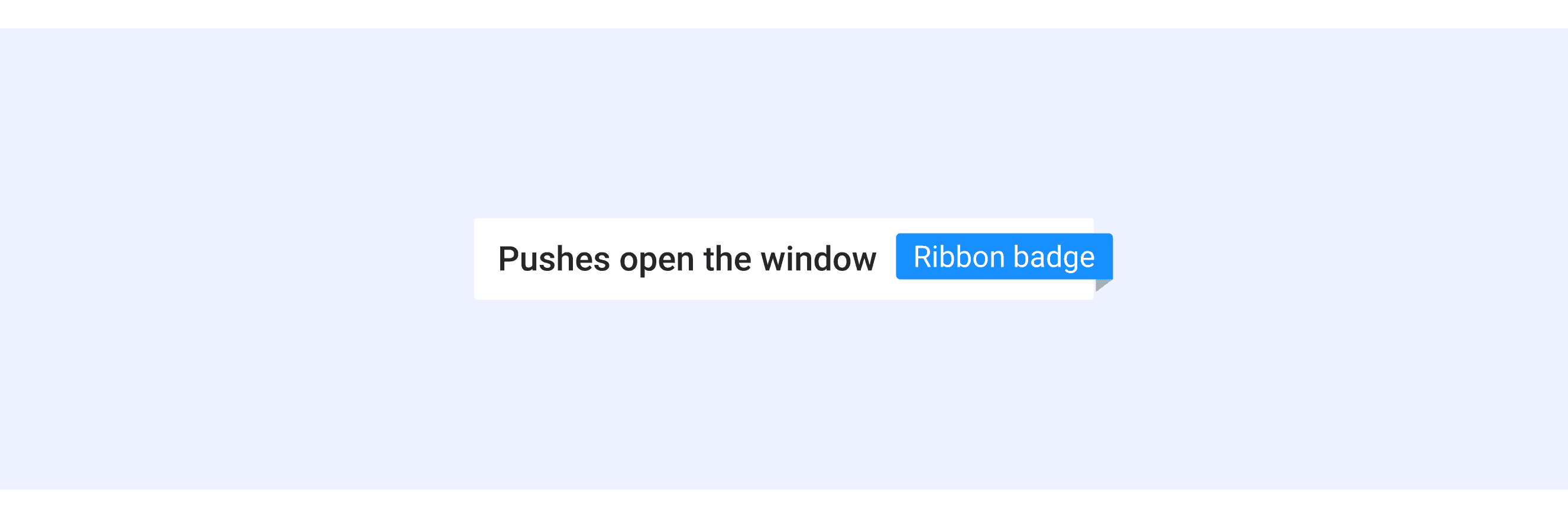
Ant Design supports specially styled Ribbon Badges.

Ant Design offers Ribbon Badges for labeling content or highlighting specific information.

Shopify Polaris provides semantic badges

Use the badge’s tone to help reinforce semantic meaning and messaging, such as success or critical errors.

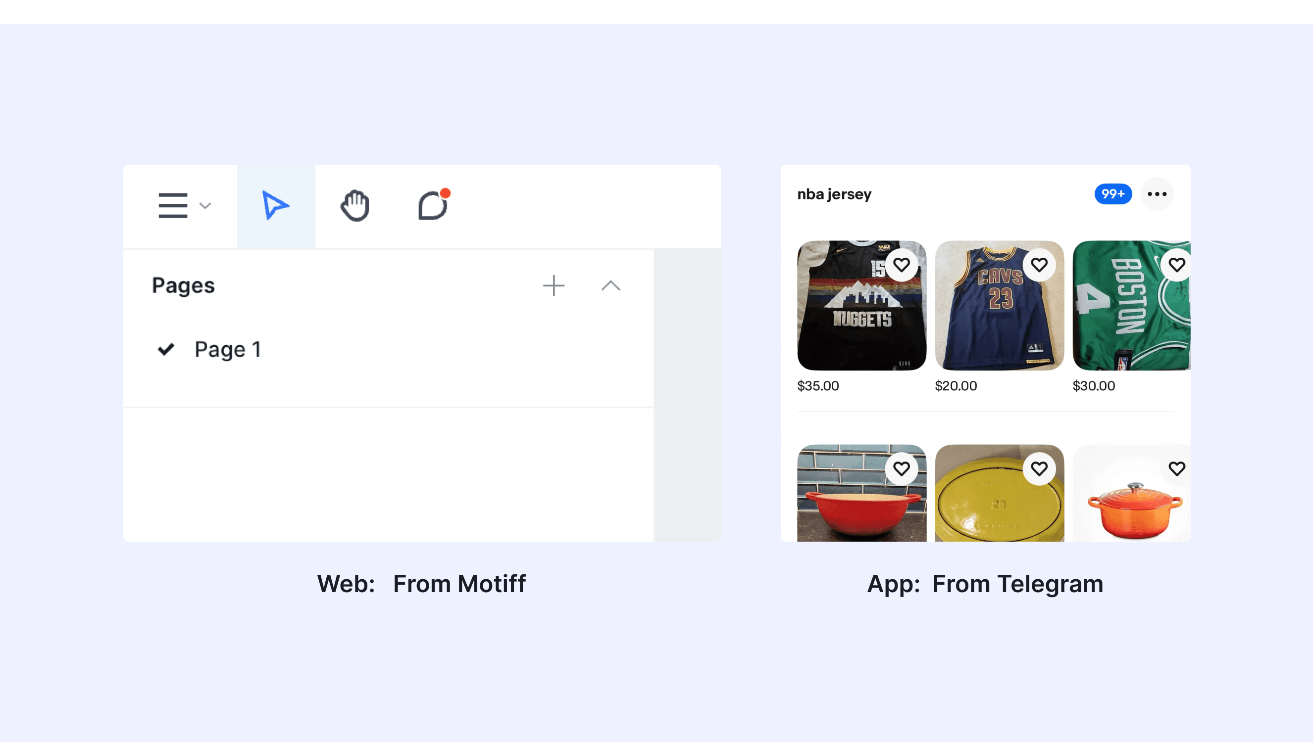
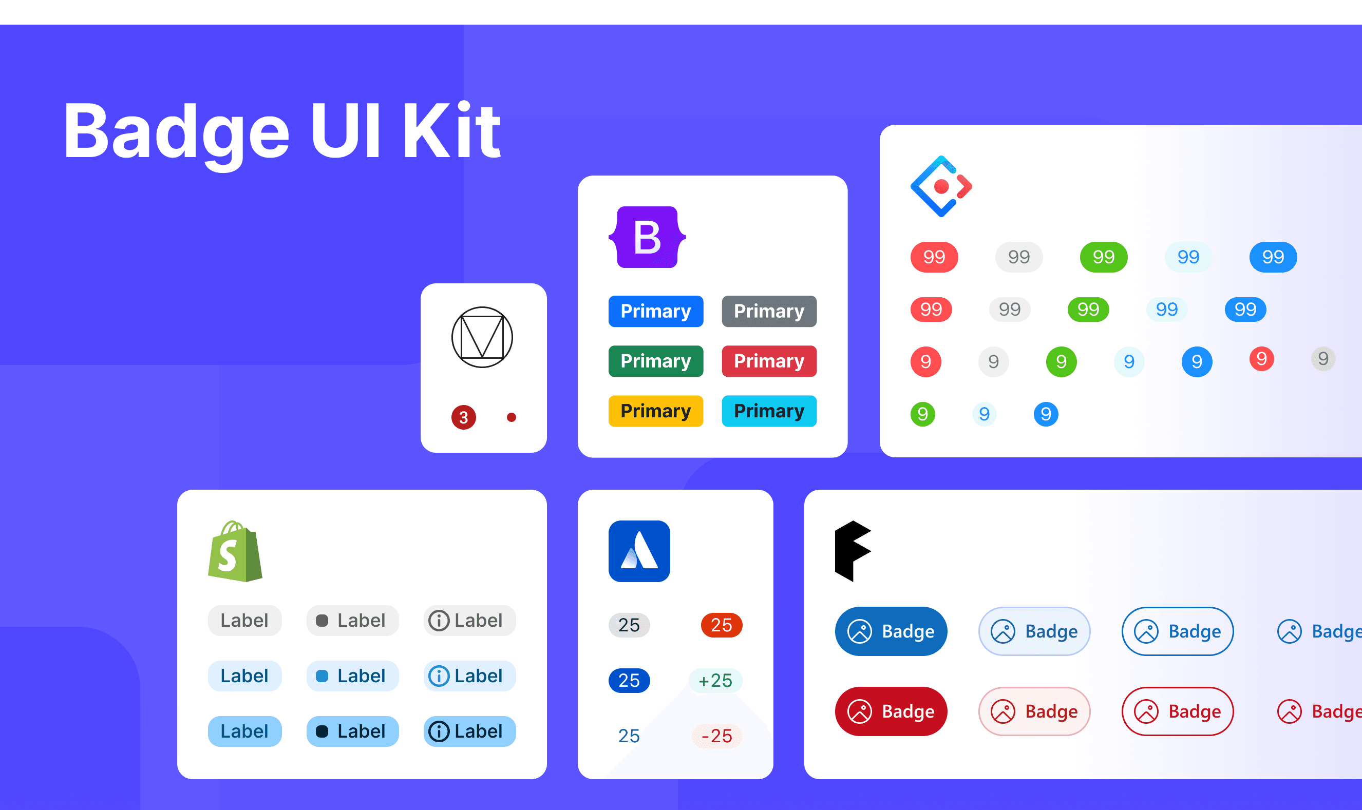
Badge Template for Motiff

This UIkit file combines badge designs from Material, Atlassian, Fluent 2, Ant, Polaris and Bootstrap Design System. It showcases their styles, usage, and customization in one place for easy exploration and selection.

Open and edit in Motiff →

Badge vs. Tag: Difference and When to Use

In user interface (UI) design, the terms "badge" and "tag" are often used interchangeably, but they have distinct meanings, which are adapted from a Smart interface design patterns discussion.

Badges Are Static Labels:

Badges are always static components. They relay status and updates (e.g. draft, new, pending, -7%↘), they highlight changes and are subtle indicators for main content. As such, they aren’t used for navigation.

Tags Can Be Static or Interactive:

Tags, on the other hand, can be static or interactive. Static tags show topics with keywords and labels (e.g. AI, Accessibility). Interactive tags are often used for links, filters, selection and actions.

They come in many different flavors:

  • Display-only tags ← visually represent categories (keywords, labels, details).

  • Data tags ← numerical data, reading time, file size (e.g. PDF 262 KB).

  • Filter tags ← show active filters, with an option to remove and clear.

  • Selection tags ← filter content and input information (also called chips or pills).

Accessibility in Different Design Systems

Common Practices

  • Focus Management: Ensure that badges are visible and accessible to screen readers, providing appropriate ARIA labels.

  • Color Contrast: Maintain sufficient color contrast between the badge and its background to ensure readability.

  • Content Adaptation: Badges should adapt to different content lengths without losing their visual integrity.

Differences Practices

  • Material Design (M3): Supports two types of badges, Numeric and Notification Marker.

  • Fluent UI (Microsoft): Offers badges in various sizes and styles, with many variations, including badges with icons.

  • Atlassian Design: Only supports the Numeric type of badge.

  • Ant Design: Includes multiple types of badges, such as Badge/Dot, Badge/Status, Badge/Count, and Badge.Ribbon.

  • Polaris (Shopify): Features badges with multiple status indicators, such as Success, Error, and Warning.

  • Bootstrap: Provides badges in multiple sizes corresponding to H1-H6 heading styles.

Code Examples

Explore default modal implementations in Atlassian, Fluent 2, Ant, Polaris and Bootstrap Design System. These examples showcase standard usage, default settings, and core features across design systems.

Atlassian Design System

import React from 'react';

import Badge from '@atlaskit/badge';

const BadgeDefaultExample = () => {
	return <Badge>{8}</Badge>;
};

export default BadgeDefaultExample;
import React from 'react';

import Badge from '@atlaskit/badge';

const BadgeDefaultExample = () => {
	return <Badge>{8}</Badge>;
};

export default BadgeDefaultExample;
import React from 'react';

import Badge from '@atlaskit/badge';

const BadgeDefaultExample = () => {
	return <Badge>{8}</Badge>;
};

export default BadgeDefaultExample;
import React from 'react';

import Badge from '@atlaskit/badge';

const BadgeDefaultExample = () => {
	return <Badge>{8}</Badge>;
};

export default BadgeDefaultExample;

Fluent 2 Design System

import { Badge, BadgeProps } from "@fluentui/react-components";
import * as React from "react";

export const Default = (props: BadgeProps) => <Badge {...props} />;

import { Badge, BadgeProps } from "@fluentui/react-components";
import * as React from "react";

export const Default = (props: BadgeProps) => <Badge {...props} />;

import { Badge, BadgeProps } from "@fluentui/react-components";
import * as React from "react";

export const Default = (props: BadgeProps) => <Badge {...props} />;

import { Badge, BadgeProps } from "@fluentui/react-components";
import * as React from "react";

export const Default = (props: BadgeProps) => <Badge {...props} />;

Ant Design System

import React from 'react';
import { ClockCircleOutlined } from '@ant-design/icons';
import { Avatar, Badge, Space } from 'antd';

const App: React.FC = () => (
  <Space size="middle">
    <Badge count={5}>
      <Avatar shape="square" size="large" />
    </Badge>
    <Badge count={0} showZero>
      <Avatar shape="square" size="large" />
    </Badge>
    <Badge count={<ClockCircleOutlined style={{ color: '#f5222d' }} />}>
      <Avatar shape="square" size="large" />
    </Badge>
  </Space>
);

export default App;

Show More

Polaris Design System

import {Badge, Card} from '@shopify/polaris';
import React from 'react';

function BadgeExample() {
  return (
    <Card>
      <Badge>Fulfilled</Badge>
    </Card>
  );
}
import {Badge, Card} from '@shopify/polaris';
import React from 'react';

function BadgeExample() {
  return (
    <Card>
      <Badge>Fulfilled</Badge>
    </Card>
  );
}
import {Badge, Card} from '@shopify/polaris';
import React from 'react';

function BadgeExample() {
  return (
    <Card>
      <Badge>Fulfilled</Badge>
    </Card>
  );
}
import {Badge, Card} from '@shopify/polaris';
import React from 'react';

function BadgeExample() {
  return (
    <Card>
      <Badge>Fulfilled</Badge>
    </Card>
  );
}

Bootstrap Design System

Bootstrap Design System

Bootstrap Design System

Bootstrap Design System

<h1>Example heading <span class="badge text-bg-secondary">New</span></h1>
<h2>Example heading <span class="badge text-bg-secondary">New</span></h2>
<h3>Example heading <span class="badge text-bg-secondary">New</span></h3>
<h4>Example heading <span class="badge text-bg-secondary">New</span></h4>
<h5>Example heading <span class="badge text-bg-secondary">New</span></h5>
<h6>Example heading <span class="badge text-bg-secondary">New</span></h6

Show More

Try AI Design Systems

Create, maintain, and check your design systems with AI in one click.

Try AI Design Systems

Create, maintain, and check your design systems with AI in one click.

Try AI Design Systems

Create, maintain, and check your design systems with AI in one click.

Try AI Design Systems

Create, maintain, and check your design systems with AI in one click.

Try AI Design Systems

Create, maintain, and check your design systems with AI in one click.