Breadcrumb

Share This Post

复制链接
分享至X
分享至 LinkedIn
分享至 Facebook

Breadcrumb

Share This Post

复制链接
分享至X
分享至 LinkedIn
分享至 Facebook

Breadcrumb

Share This Post

复制链接
分享至X
分享至 LinkedIn
分享至 Facebook

Breadcrumb

Share This Post

复制链接
分享至X
分享至 LinkedIn
分享至 Facebook

Breadcrumb

Share This Post

复制链接
分享至X
分享至 LinkedIn
分享至 Facebook

Breadcrumb

Share This Post

复制链接
分享至X
分享至 LinkedIn
分享至 Facebook

What is Breadcrumb

In a design system, breadcrumbs are a secondary navigation tool that shows the user's current location within a website. They help users navigate back to higher-level pages and understand the site's structure.

Anatomy Breadcrumb

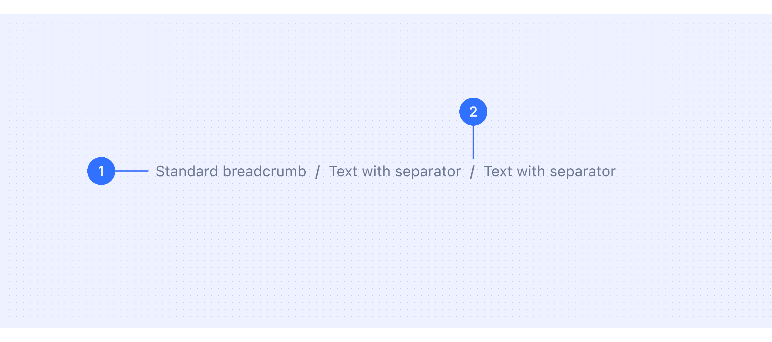
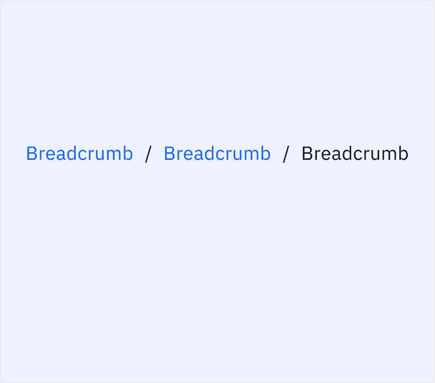
  1. Item Name: A section or page within the product, usually a link.

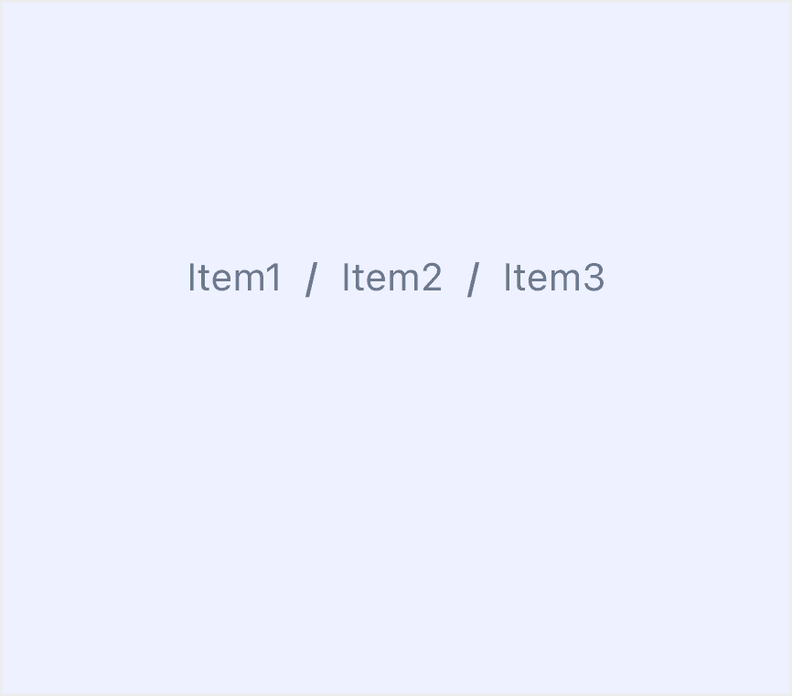
  2. Separator: Positioned between items in the list, typically a forward slash /.

Core features

  • Hierarchical Navigation: The component provide a clear path to help users understand their location within the product hierarchy and navigate back to previous levels easily.

  • Context Awareness: They show the user's current page in relation to the overall structure of the product.

  • Compact Design: Breadcrumbs are lightweight and unobtrusive, offering navigation without taking up much screen space.

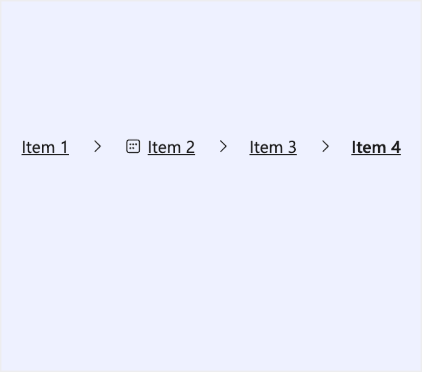
  • Clickable Links: Every item in the list (except the current page) is a clickable link. This lets you quickly access higher-level sections.

  • Visual Separation: Separators (e.g., / or > symbols) visually distinguish each breadcrumb item for clarity.

  • Responsive Behavior: Adapt to different screen sizes, often collapsing or truncating on smaller screens while maintaining usability.

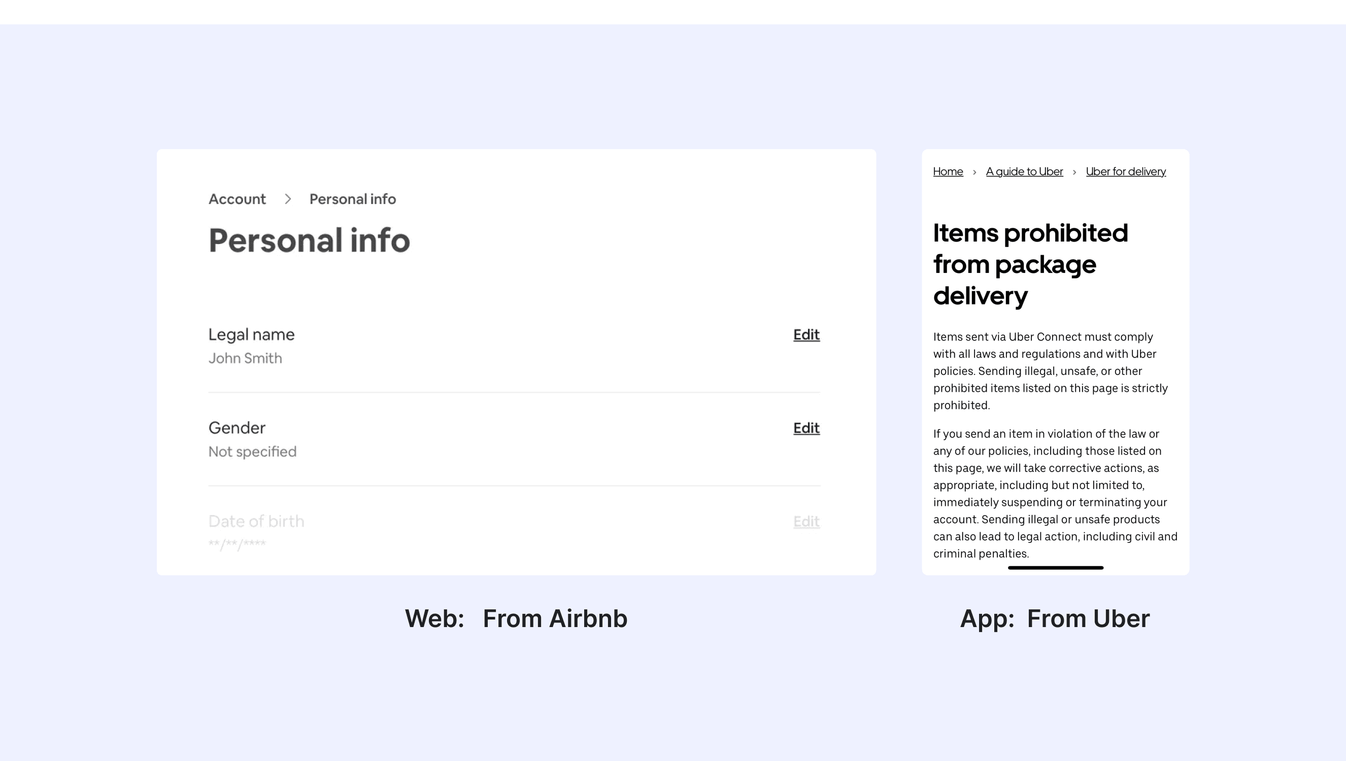
Comparison of Usage in Popular Design Systems

Now, let's look at how some well-known design systems define and implement breadcrumbs:

Discover how breadcrumbs are implemented across different design systems like Atlassian Design, Carbon Design, Ant Design, etc. Look at their features and rules, like separator type, and Interaction to choose the best fit for your project.

Default Styles

Enumerates the default appearances of breadcrumbs across various design systems, highlighting their visual characteristics and usability.

Atlassian design breadcrumb

Atlassian design breadcrumb

Atlassian design breadcrumb

Atlassian design breadcrumb

Fluent 2 design breadcrumb

Fluent 2 design breadcrumb

Fluent 2 design breadcrumb

Fluent 2 design breadcrumb

Ant design breadcrumb

Ant design breadcrumb

Ant design breadcrumb

Ant design breadcrumb

Carbon design breadcrumb

Carbon design breadcrumb

Carbon design breadcrumb

Carbon design breadcrumb

Lightning design breadcrumb

Lightning design breadcrumb

Lightning design breadcrumb

Lightning design breadcrumb

Bootstrap design breadcrumb

Bootstrap design breadcrumb

Bootstrap design breadcrumb

Bootstrap design breadcrumb

Features comparison in Design Systems

Comparing modals in Atlassian, Fluent 2, Ant, Carbon, Lightning, and Bootstrap shows differences in size and closing methods. Some support custom modal sizes, while others do not.

Design System

Defines

Separator Type

Interaction & Feedback

Breadcrumbs are a navigation system used to show a user's location in a site or app.

  • Default slash /

  • Customizable icons

  • Show underline on hover

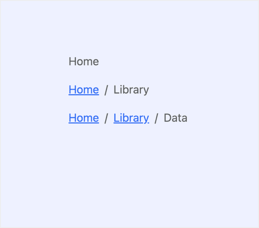
A breadcrumb helps people understand and move through the hierarchy of a complex site or app. It lists at least two location names, usually links, separated by dividers.
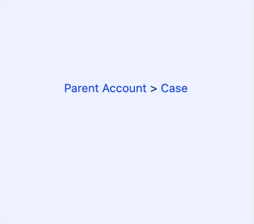
  • Default arrow >

  • Change background color on hover

Display the current location within a hierarchy. And allow going back to states higher up in the hierarchy.

  • Default slash /

  • Optional arrow >

  • Highlight the link on hover

  • Change background color on hover

The breadcrumb is a secondary navigation pattern that helps a user understand the hierarchy among levels and navigate back through them.

  • Default slash /

  • Highlight the link on hover

  • Show underline on hover

Breadcrumbs display a trail of links to help users understand where they are in a content hierarchy and easily navigate back to previous pages.

  • Default right arrow ›

  • Highlight the link on hover

Indicate the current page’s location within a navigational hierarchy that automatically adds separators via CSS.

  • Default slash /

  • Customizable symbols

  • Highlight the link on hover

Special Types

Atlassian Design System supports breadcrumbs with ellipses.

When a breadcrumb contains more than eight items, the breadcrumb auto-collapses and uses ellipses to indicate more information. The first and last items are shown by default. Users expand the breadcrumb by selecting the ellipsis.

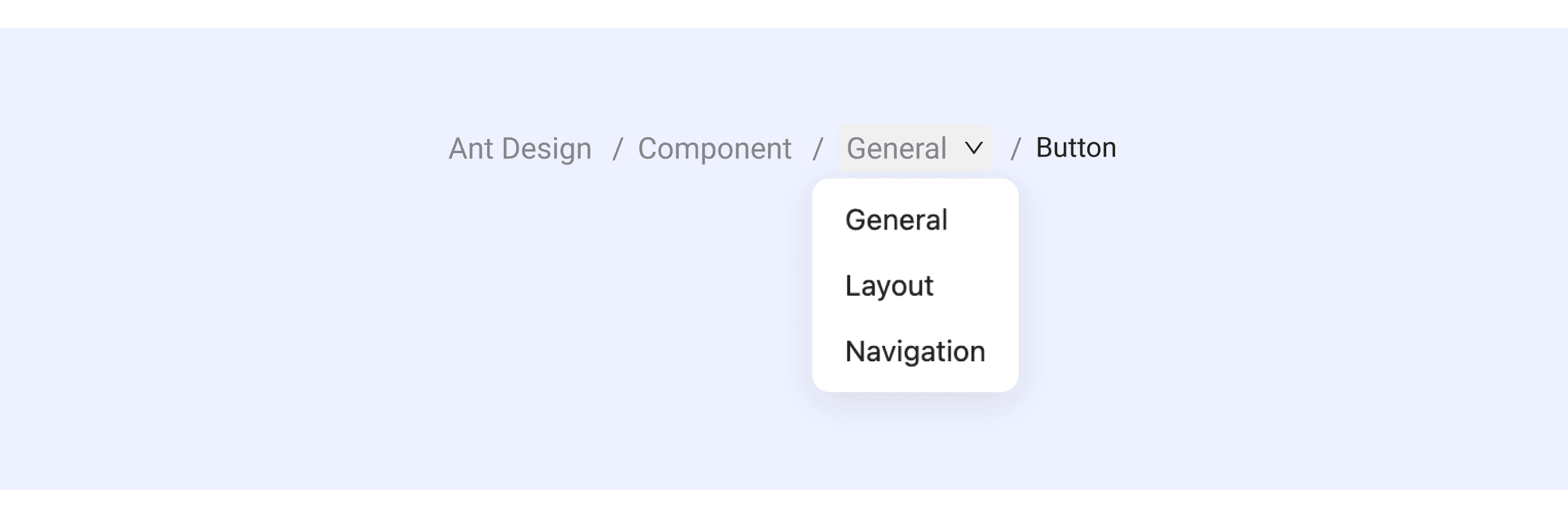
Ant Design supports breadcrumbs with drop down menu and Icon.

Breadcrumbs with a dropdown menu improve traditional breadcrumbs. They let users reach not just the parent pages but also other related pages at the same level.

The icon should go before the breadcrumb text. This helps give context and improve usability. For example, use a house icon before "Home."

Breadcrumbs Template for Motiff

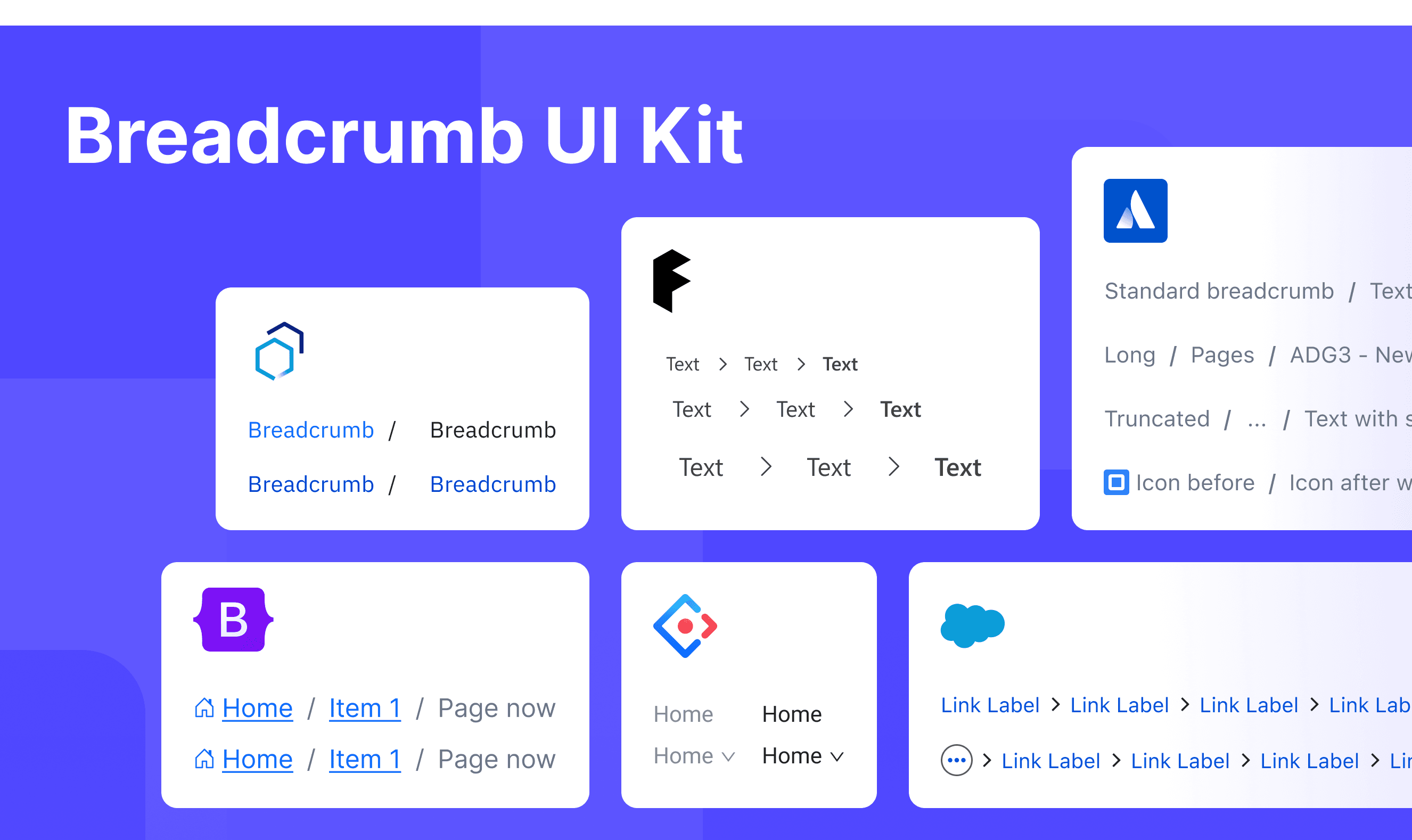
This UIkit file combines breadcrumbs designs from Atlassian, Fluent 2, Ant, Carbon, Lightning, and Bootstrap Design. It showcases their styles, usage, and customization in one place for easy exploration and selection.

Open and edit in Motiff →

Multiple Breadcrumbs on One Page: Design Tips and Best Practices

The use of breadcrumbs in UI design is well-established for helping users navigate hierarchical structures. However, placing multiple breadcrumb trails on a single page introduces unique challenges and opportunities, which are adapted from a  UX Stack Exchange discussion.

When a page belongs to multiple hierarchies or categories (e.g., a product is part of both "Electronics > Laptops" and "Promotions > Weekly Deals"), breadcrumbs can help users understand the page's multiple associations. However, if the design is unclear, multiple navigation paths might confuse users.

  • Making Navigation More Interactive with Dropdown Menus:

    • To make navigation paths more interactive and allow users to move between branches, dropdown menus can be added to certain levels.

    • The dropdown menus can include links to other pages at the same hierarchical level. For example, at a specific level in the navigation trail, users can quickly jump to other related pages in the same category through the dropdown menu.

  • Keeping Things Clear and Easy to See:

    • It's important to make sure the navigation paths are easy to understand. Designers can use things like extra space, lines, or groups to separate different paths. This way, users won’t get confused about where they are or where they can go next.

  • Showing Only What’s Useful Right Now:

    • Navigation should focus on what’s important for the user at that moment. Instead of showing every possible path or page, it’s better to only display the ones that are directly related to the current page. This keeps things simple and avoids overwhelming the user with too much information.

Accessibility in Different Design Systems

Common Practices

  • Visual Hierarchy & Separators

    • Most systems use clear visual separators (e.g., /, ›, or custom icons) to distinguish between breadcrumb items.

    • The current page is visually emphasized (e.g., bold text, disabled link) to avoid confusion.

  • Responsive Adaptation

    • Breadcrumbs collapse or truncate on smaller screens (e.g., hiding intermediate items with "..." or a dropdown), ensuring readability on mobile devices.

  • Interactive Feedback

    • Clickable breadcrumb links provide hover/focus states (e.g., underline, color shifts) to signal interactivity.

  • Icon Integration

    • Some systems replace text labels with icons (e.g., home icon) to save space while maintaining intuitive recognition.

Differences Practices

  • Atlassian Design System: Supports responsive truncation, with hidden items displayed via a dropdown menu.

  • Fluent 2: Uses system-specific icons (such as arrows) as separators to align with Fluent's overall visual language.

  • Ant Design: Allows customizable separators (icons or text) to match the brand's aesthetics.

  • Carbon Design: When space becomes limited, use an overflow menu to truncate breadcrumb navigation.

  • Lightning Design System: When there are too many page levels, use breadcrumbs to hide higher-level pages.

  • Bootstrap: Offers various style variants (e.g., with background colors or dividers).

Code Examples

Explore default modal implementations in Atlassian, Fluent 2, Ant, Carbon, Lightning, and Bootstrap Design. These examples showcase standard usage, default settings, and core features across design systems.

Atlassian Design

import React from 'react';

import Breadcrumbs, { BreadcrumbsItem } from '@atlaskit/breadcrumbs';

const BreadcrumbsDefaultExample = () => {
	return (
		<Breadcrumbs>
			<BreadcrumbsItem href="/item" text="Item 1" />
			<BreadcrumbsItem href="/item" text="Item 2" />
			<BreadcrumbsItem href="/item" text="Item 3" />
			<BreadcrumbsItem href="/item" text="Item 4" />
			<BreadcrumbsItem href="/item" text="Item 5" />
			<BreadcrumbsItem href="/item" text="Item 6" />
			<BreadcrumbsItem href="/item" text="Item 7" />
			<BreadcrumbsItem href="/item" text="Item 8" />
		</Breadcrumbs>
	);
};

export default BreadcrumbsDefaultExample;

Show More

Fluent 2 Design

import { FluentProvider, webLightTheme } from '@fluentui/react-components';
import { Default as Example } from './example';

const App = () => {
    return (
      <FluentProvider theme={webLightTheme}>
        <Example />
      </FluentProvider>
    );
};

export default App;

Show More

import { FluentProvider, webLightTheme } from '@fluentui/react-components';
import { Default as Example } from './example';

const App = () => {
    return (
      <FluentProvider theme={webLightTheme}>
        <Example />
      </FluentProvider>
    );
};

export default App;

Show More

import { FluentProvider, webLightTheme } from '@fluentui/react-components';
import { Default as Example } from './example';

const App = () => {
    return (
      <FluentProvider theme={webLightTheme}>
        <Example />
      </FluentProvider>
    );
};

export default App;

Show More

import { FluentProvider, webLightTheme } from '@fluentui/react-components';
import { Default as Example } from './example';

const App = () => {
    return (
      <FluentProvider theme={webLightTheme}>
        <Example />
      </FluentProvider>
    );
};

export default App;

Show More

Ant Design

import React from 'react';
import { Breadcrumb } from 'antd';

const App: React.FC = () => (
  <Breadcrumb
    items={[
      {
        title: 'Home',
      },
      {
        title: <a href="">Application Center</a>,
      },
      {
        title: <a href="">Application List</a>,
      },
      {
        title: 'An Application',
      },
    ]}
  />
);

export default App;

Show More

Bootstrap Design

<nav aria-label="breadcrumb">
  <ol class="breadcrumb">
    <li class="breadcrumb-item active" aria-current="page">Home</li>
  </ol>
</nav>

<nav aria-label="breadcrumb">
  <ol class="breadcrumb">
    <li class="breadcrumb-item"><a href="#">Home</a></li>
    <li class="breadcrumb-item active" aria-current="page">Library</li>
  </ol>
</nav>

<nav aria-label="breadcrumb">
  <ol class="breadcrumb">
    <li class="breadcrumb-item"><a href="#">Home</a></li>
    <li class="breadcrumb-item"><a href="#">Library</a></li>
    <li class="breadcrumb-item active" aria-current="page">Data</li>
  </ol>
</nav>

Show More

<nav aria-label="breadcrumb">
  <ol class="breadcrumb">
    <li class="breadcrumb-item active" aria-current="page">Home</li>
  </ol>
</nav>

<nav aria-label="breadcrumb">
  <ol class="breadcrumb">
    <li class="breadcrumb-item"><a href="#">Home</a></li>
    <li class="breadcrumb-item active" aria-current="page">Library</li>
  </ol>
</nav>

<nav aria-label="breadcrumb">
  <ol class="breadcrumb">
    <li class="breadcrumb-item"><a href="#">Home</a></li>
    <li class="breadcrumb-item"><a href="#">Library</a></li>
    <li class="breadcrumb-item active" aria-current="page">Data</li>
  </ol>
</nav>

Show More

Try AI Design Systems

Create, maintain, and check your design systems with AI in one click.

Try AI Design Systems

Create, maintain, and check your design systems with AI in one click.

Try AI Design Systems

Create, maintain, and check your design systems with AI in one click.

Try AI Design Systems

Create, maintain, and check your design systems with AI in one click.

Try AI Design Systems

Create, maintain, and check your design systems with AI in one click.