What is Card
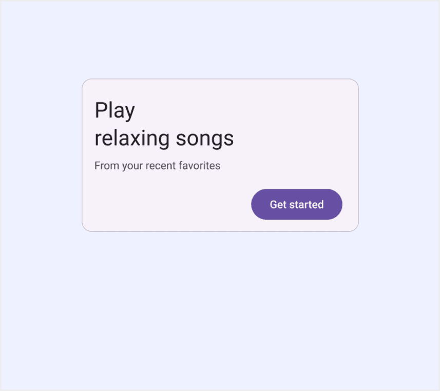
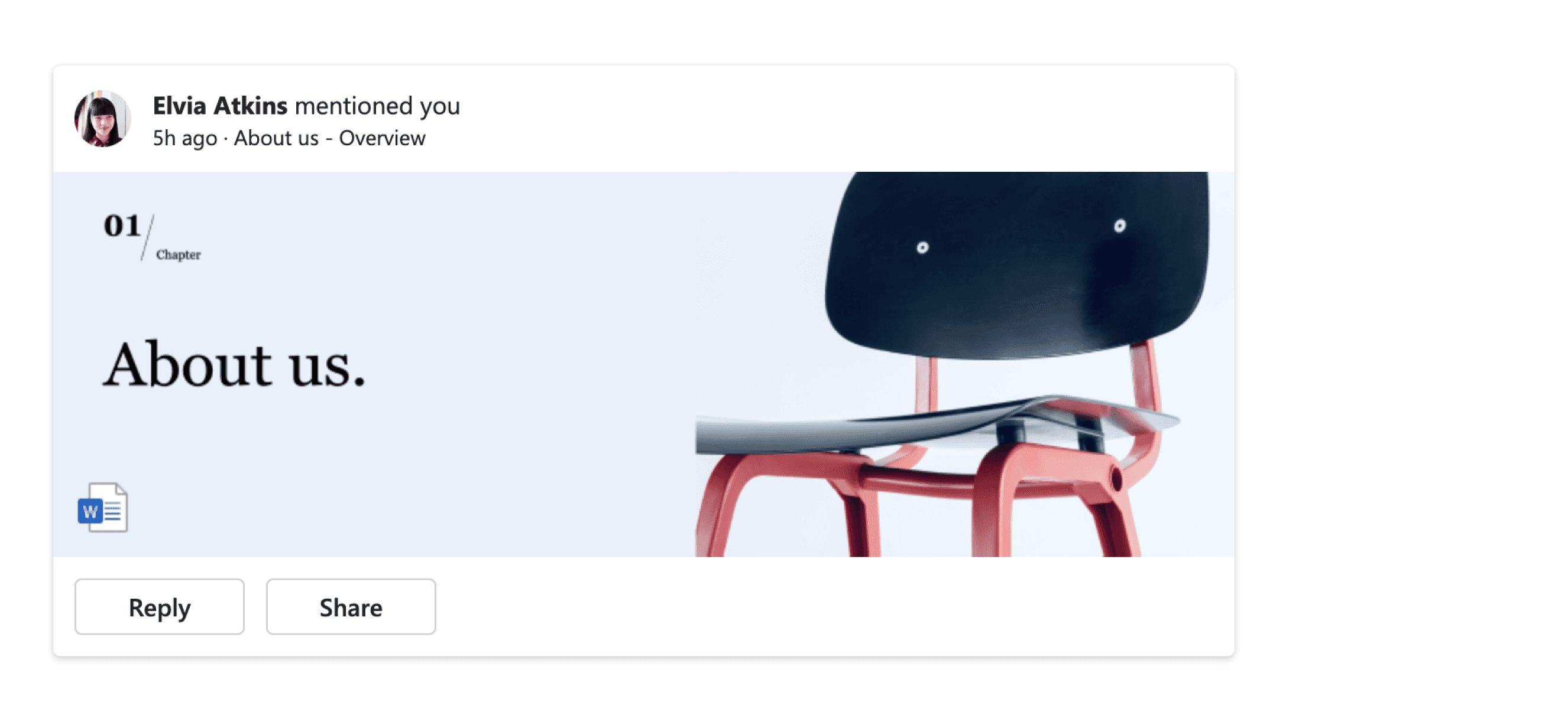
A card is a small box that organizes and highlights related information, helping it stand out on a page. It often has a border or shadow to indicate separation and may include a background, image, text, or buttons. Cards come in various shapes and sizes to suit different content.
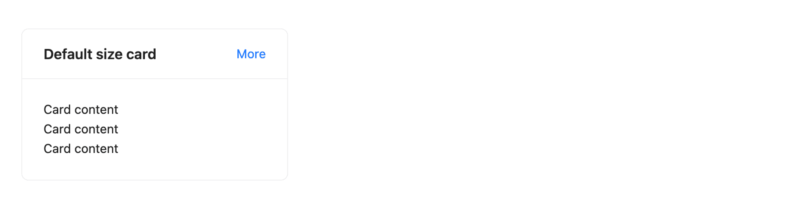
Anatomy Card
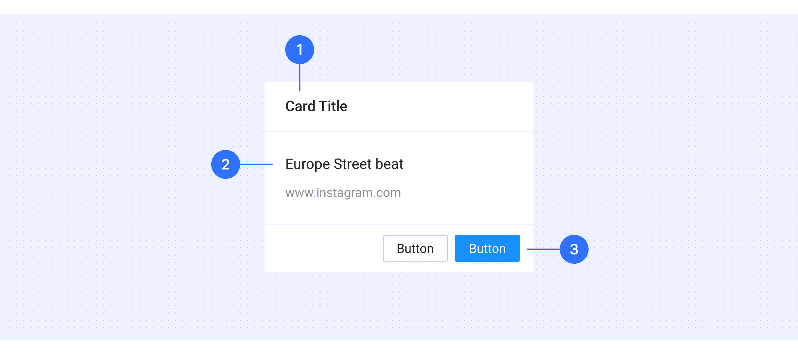
Card header (optional): Top section for titles or key info.
Card preview: The main section with visuals or text to convey primary content, often includes multimedia or concise info.
Card footer (optional): Bottom section for extra info or actions.
Core Features
Content Grouping: Cards organize related information neatly in compact boxes.
Reusable Design: They act as versatile building blocks for various layouts and styles.
Content Variety: Cards can hold images, text, buttons, lists, etc.
Component Integration: They work well with other elements for complex designs.
Flexibility: Cards adapt in size and layout to fit their content.
Comparison of Usage in Popular Design Systems
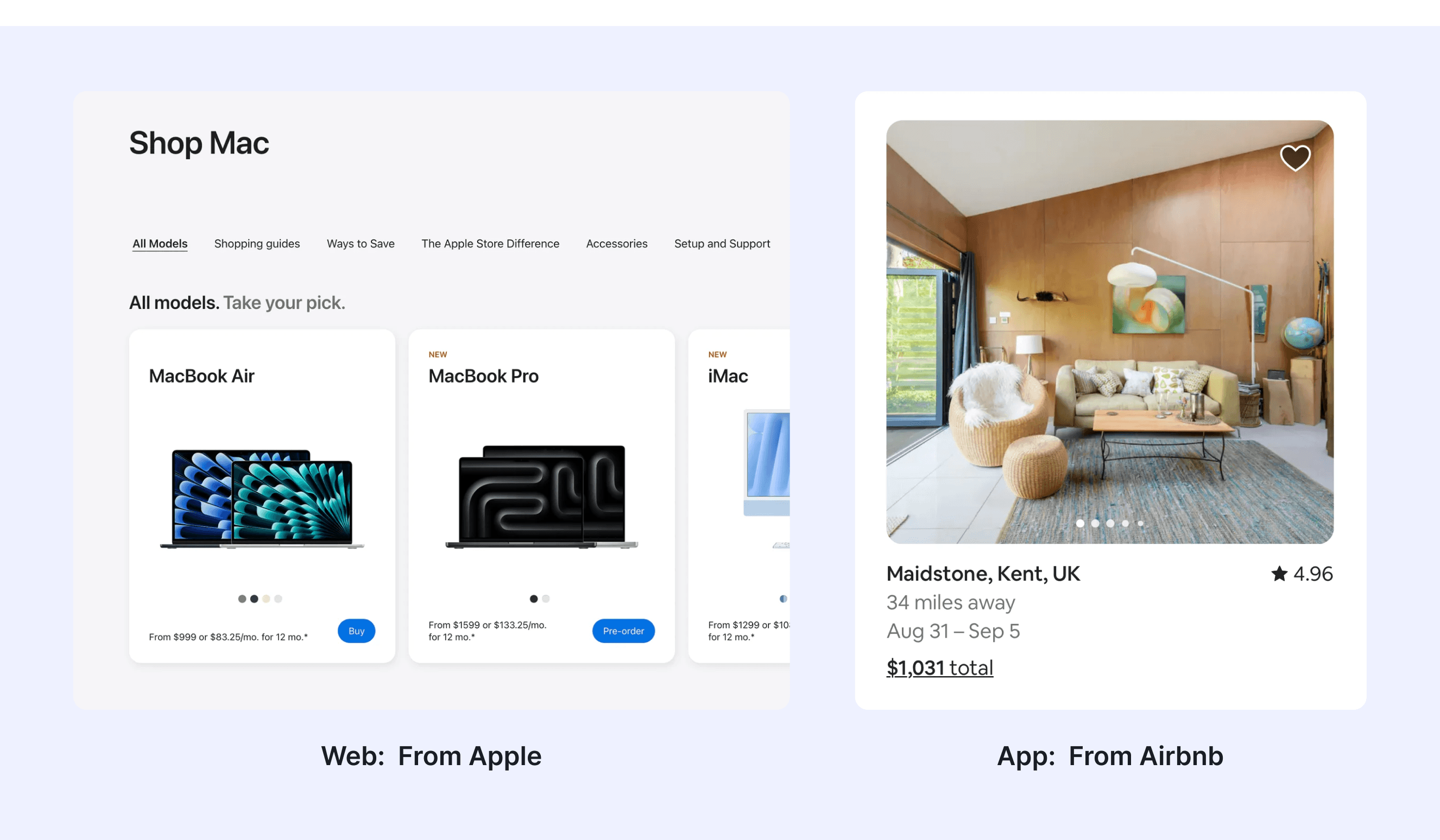
Now, let's look at how some well-known design systems define and implement cards: Explore how design systems like Material Design, Fluent Design, and Ant Design define and use cards. Compare their features, placement, and responsiveness to find the best fit for your project.
Default styles
Enumerates the default appearances of cards across various design systems, highlighting their visual characteristics and usability.
Features comparison in Design Systems
Comparing cards in Material, Orbit, Fluent, Lightning, Ant, and Bootstrap design systems reveals differences in structure and interaction. Some split cards into header, footer, and preview, while others use only header and body. Similarly, some systems include hover effects, while others do not.
Design System
Defines
Structure
Interaction State
Cards display content and actions about a single subject
Container
Headline
Subhead
Supporting text
Image
Button
Hovered
Focused
Pressed
Dragged
Disabled
A card is a container containing information and actions related to a single concept or object, like a document or a contact.
Card Header
Card Preview
Card Footer
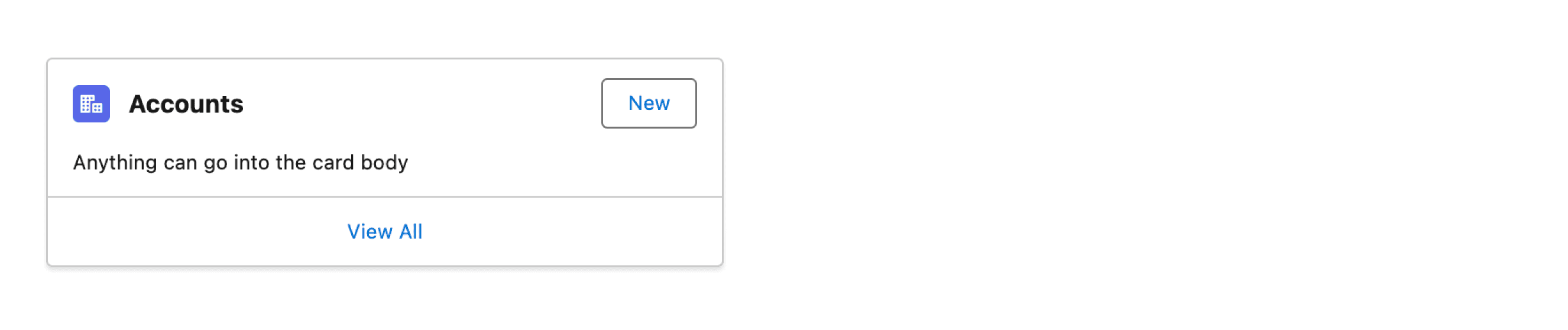
Cards can include buttons and links for multiple actions.
If there’s one main action, the entire card can act as a button.
Cards also support checkboxes or radio groups for selection.
A container for displaying information.
Header
Body
Extra
Title
Actions
Cover
Support interaction with the action buttons.
The card itself has a hover state.
Cards are used to apply a container around a related grouping of information.
Header
Body
Footer
Support interaction with the action buttons.
Bootstrap’s cards provide a flexible and extensible content container with multiple variants and options.
Headers
Body
Support interaction with the action buttons.
Separates content into sections.
Title
Description
Action
Closed card section
Expanded card section
Support interaction with the action buttons in the card.
Special Types
Ant Design supports “With tabs”.
Add navigation to a card’s header using Ant's Tabs component to host more content.

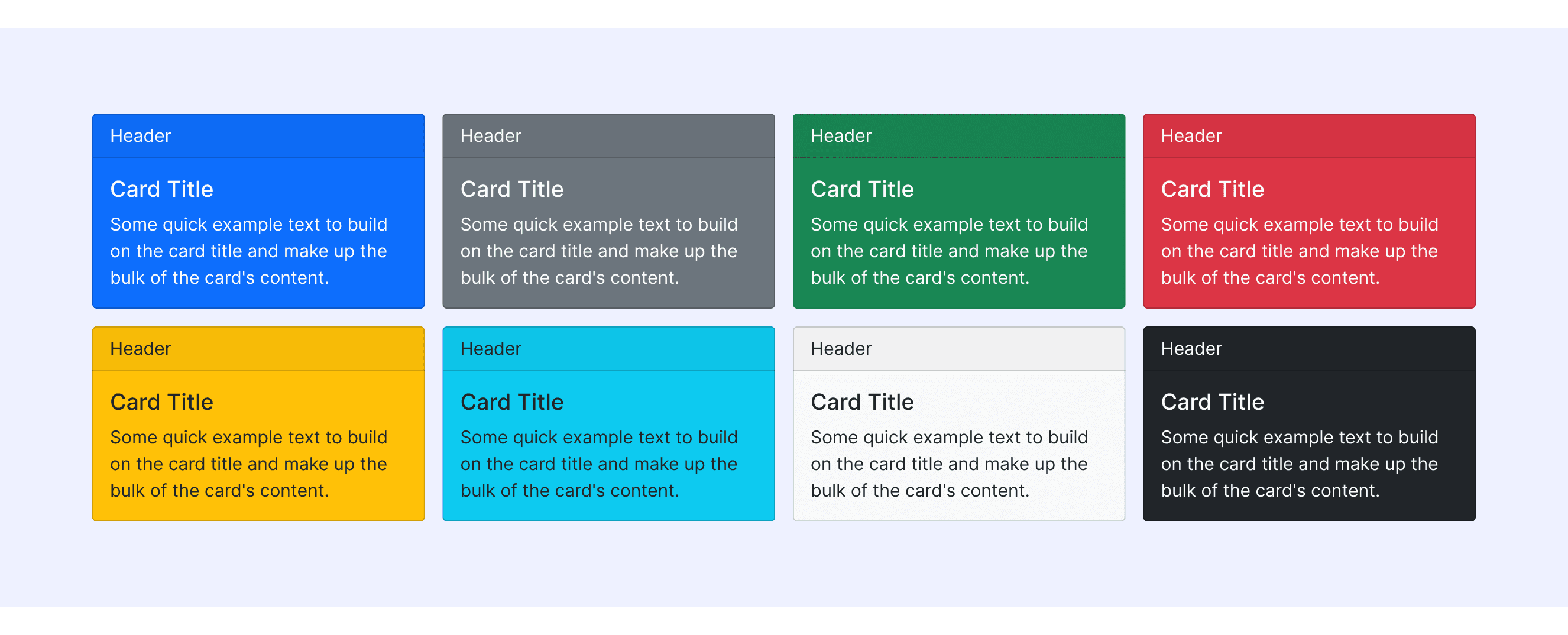
Bootstrap Design supports colorful card styles.
Preset a series of colorful card styles for use in different situations.
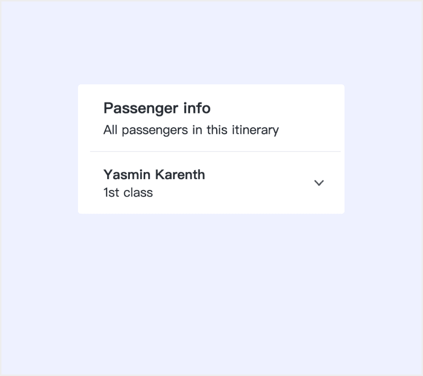
Fluent Design System supports “With checkboxes”.
Cards can also let people make a selection, similar to checkboxes or radio groups.
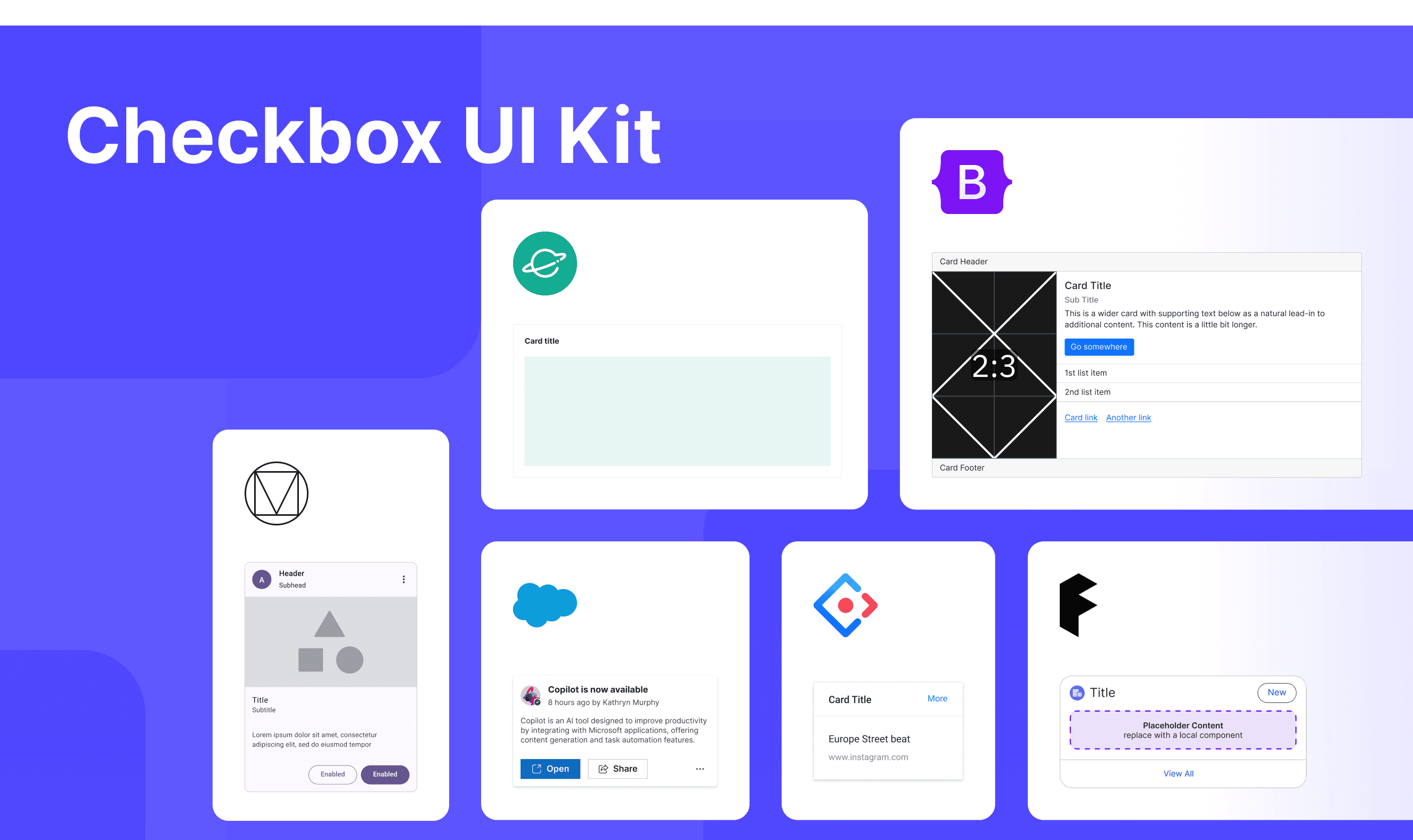
Card Template for Motiff
This UIkit file integrates tooltip components from Material, Fluent, Lightning, Ant, Bootstrap, and Orbit Design Systems, offering styles, usage, and customization options in one place for easy exploration and selection.
What is the difference between card and tile components?
Cards and tiles differ mainly in semantics, use cases, and user expectations. When deciding between a Card and a tile, refer to these key differences, which are adapted from a Stack Overflow discussion
Semantic difference: Tiles are for navigation or quick info and often link to other screens, while cards are self-contained and provide complete information.
Usage and placement: Tiles are flexible, ideal for dashboards or navigation; cards are fixed, and better for detailed content or task tracking.
User expectations: Users expect tiles to provide quick access or updates and links to further details. Cards are expected to display complete information at a glance, with minimal interaction like flipping or expanding. Misusing one in place of the other can lead to confusion or frustration.
Accessibility in Different Design Systems
Common Practices
A card is a modular UI component used to show independent information or functional units.
Layered Structure: Cards typically include a title, body, action area (buttons/links), and optional media (images/videos).
Flexible Layout: Cards are responsive, adapting to various screen sizes.
Information Hierarchy: Font size, color, or icons separate primary and secondary content.
Spacing Guidelines: Padding and margins follow design rules for a clean layout.
Differences Practices
Ant Design: Built-in loading state for asynchronous data loading scenarios.
Material Design (Google): Emphasizes visual effects, enhancing user experience through animations and shadows.
Fluent Design System: Cards can be used to let people make a selection, similar to checkboxes or radio groups.
Orbit Design System: The purpose of a card component is to separate and organize information.
Bootstrap: The text alignment in cards is not limited to left alignment. it also includes center alignment and right alignment.
Lightning Design System: Supports accessible drag-and-drop operations for reordering cards.
Code Examples
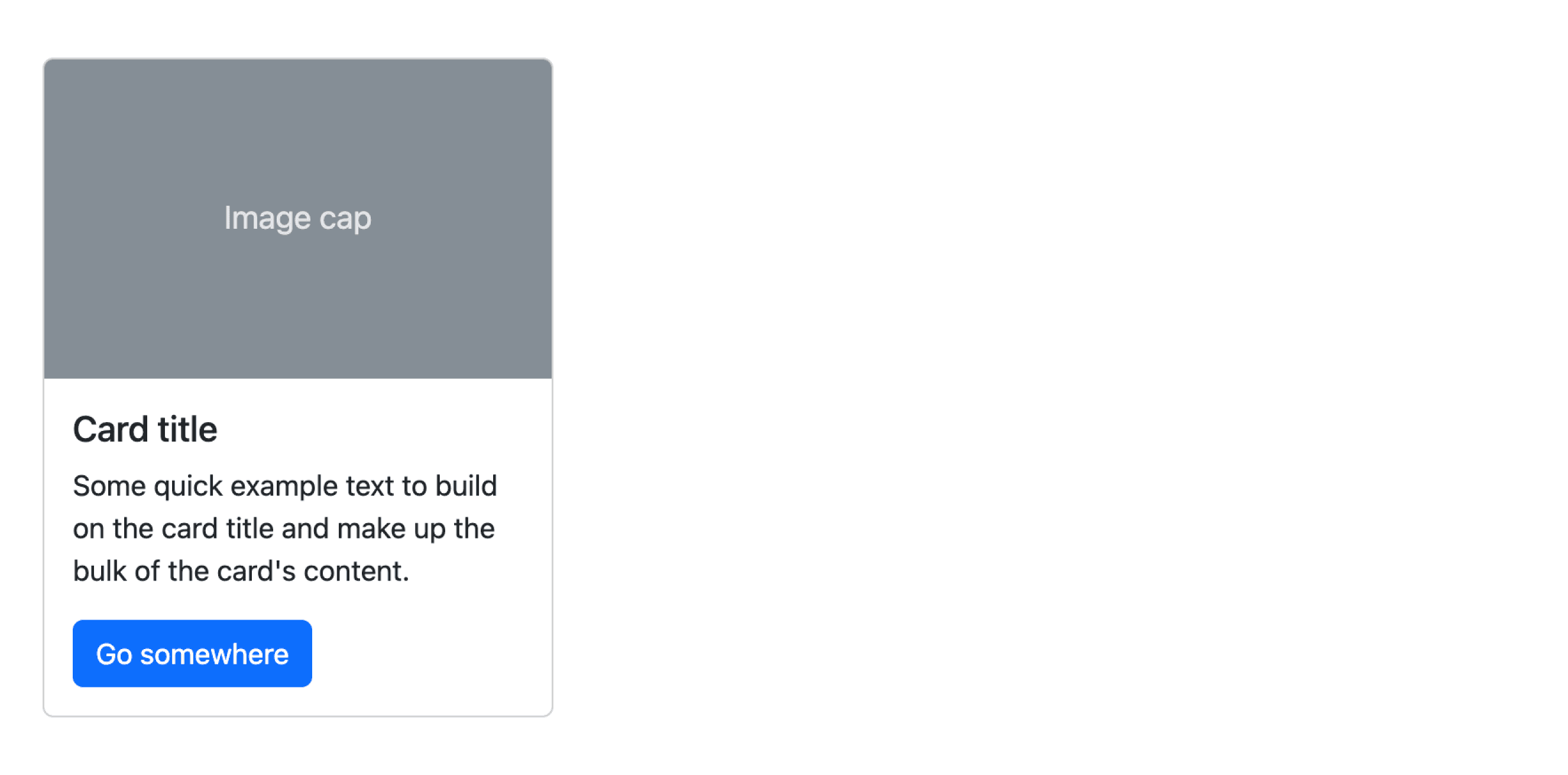
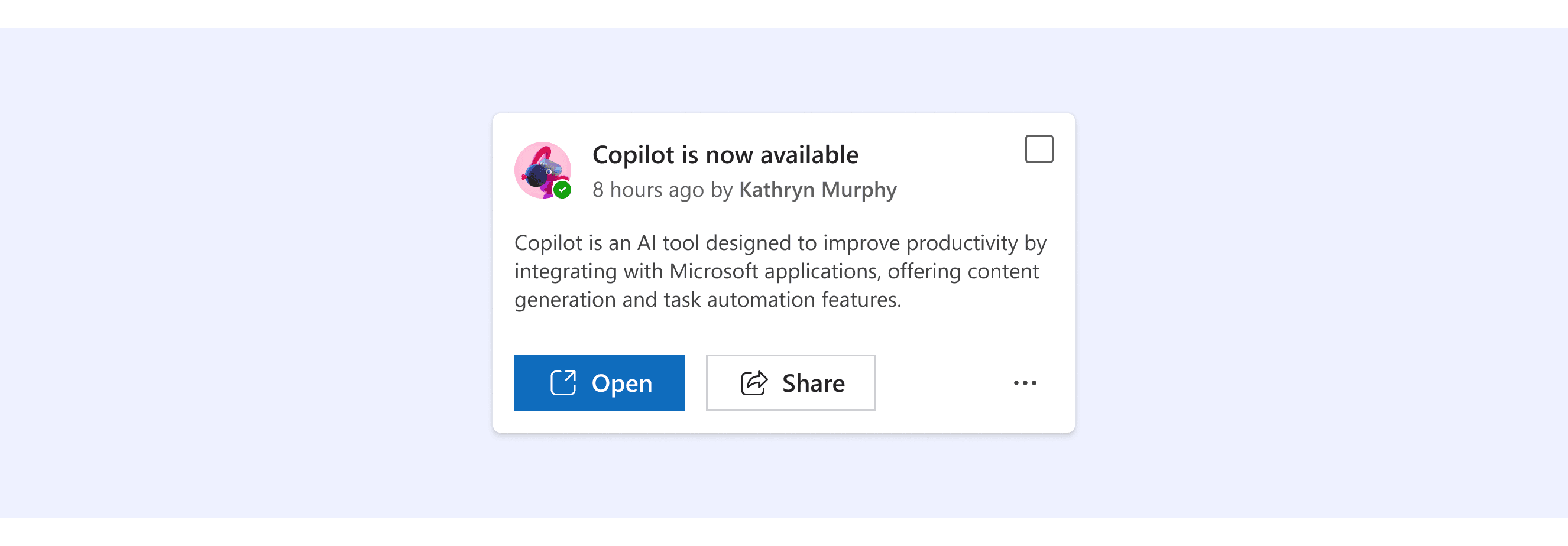
Explore default card implementations in Fluent, Lightning, Ant, and Bootstrap design systems. These examples showcase standard usage, default settings, and core features across design systems.
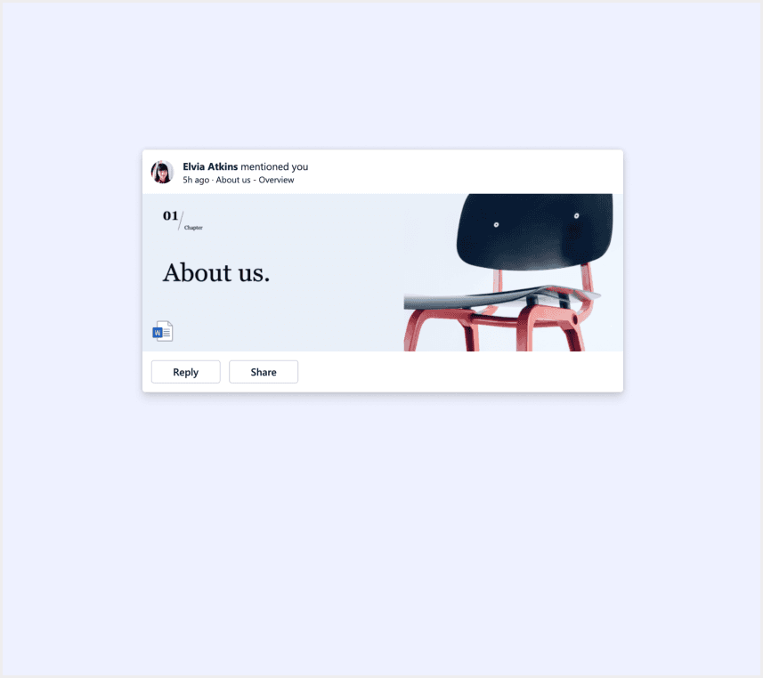
Fluent 2 Design System
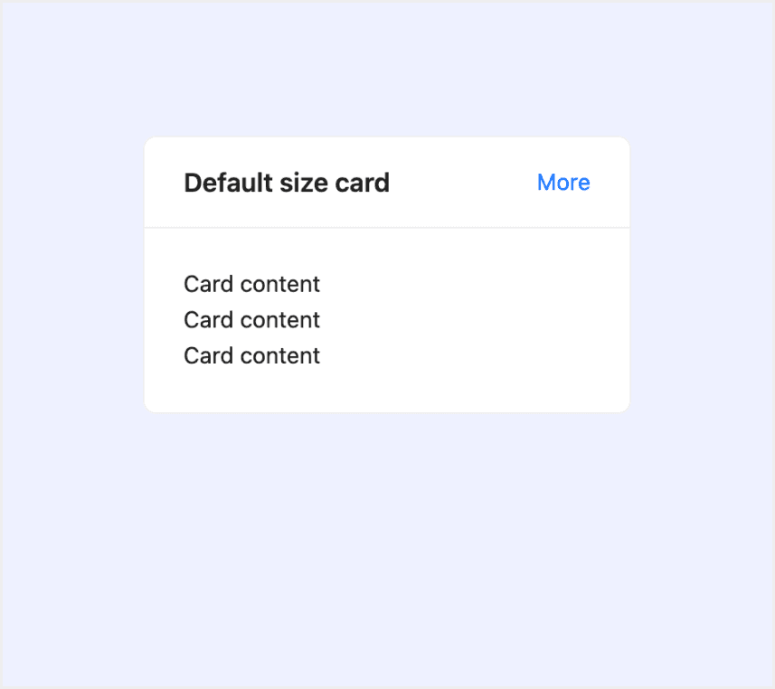
Ant Design
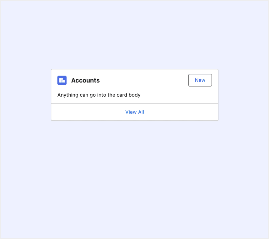
Lightning Design System
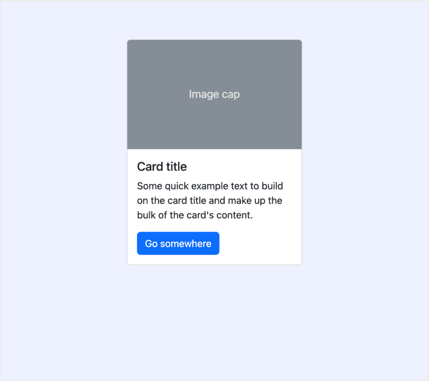
Bootstrap v5.3