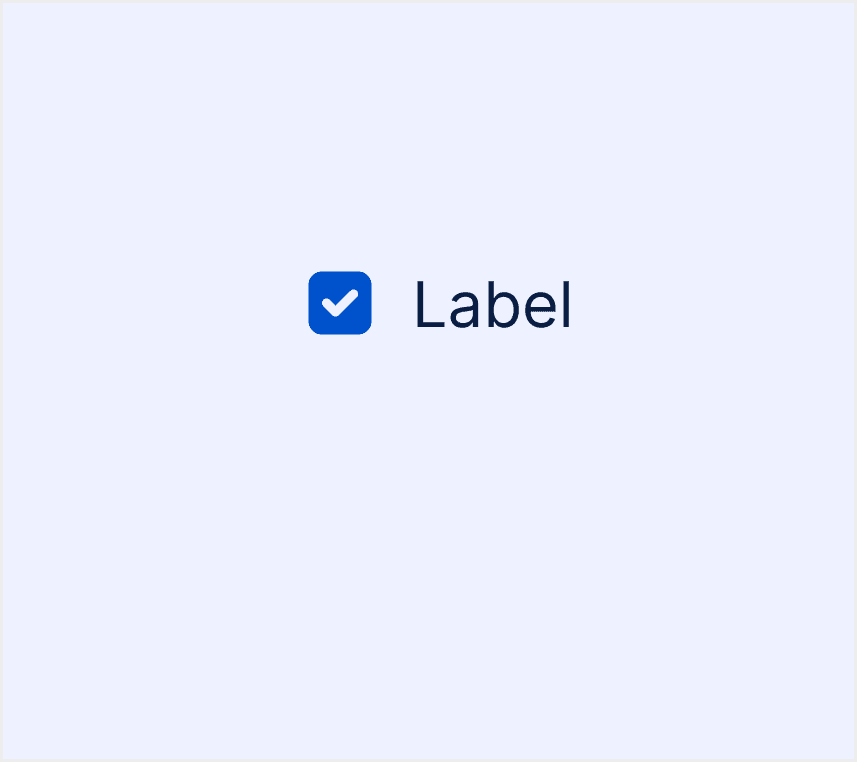
What is Checkbox
A checkbox is a common user interface component used to allow users to select one or more options from a list. It is usually shown as a small square box that you can click to turn on or off. It often comes with a label next to it that tells you what the option is for.
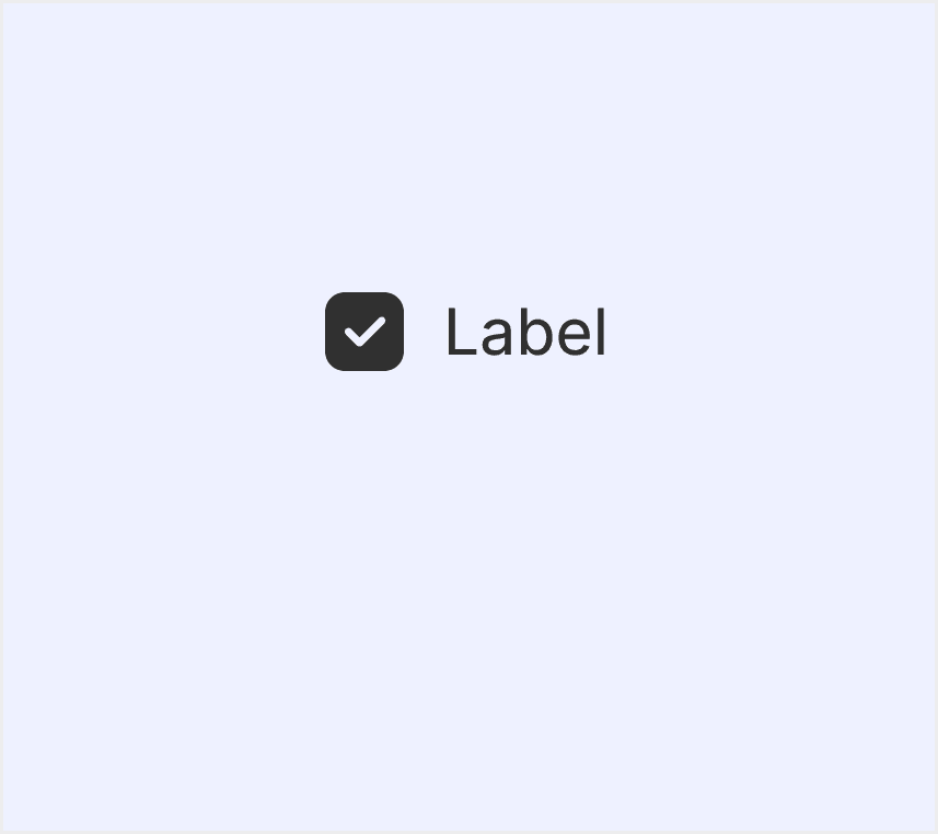
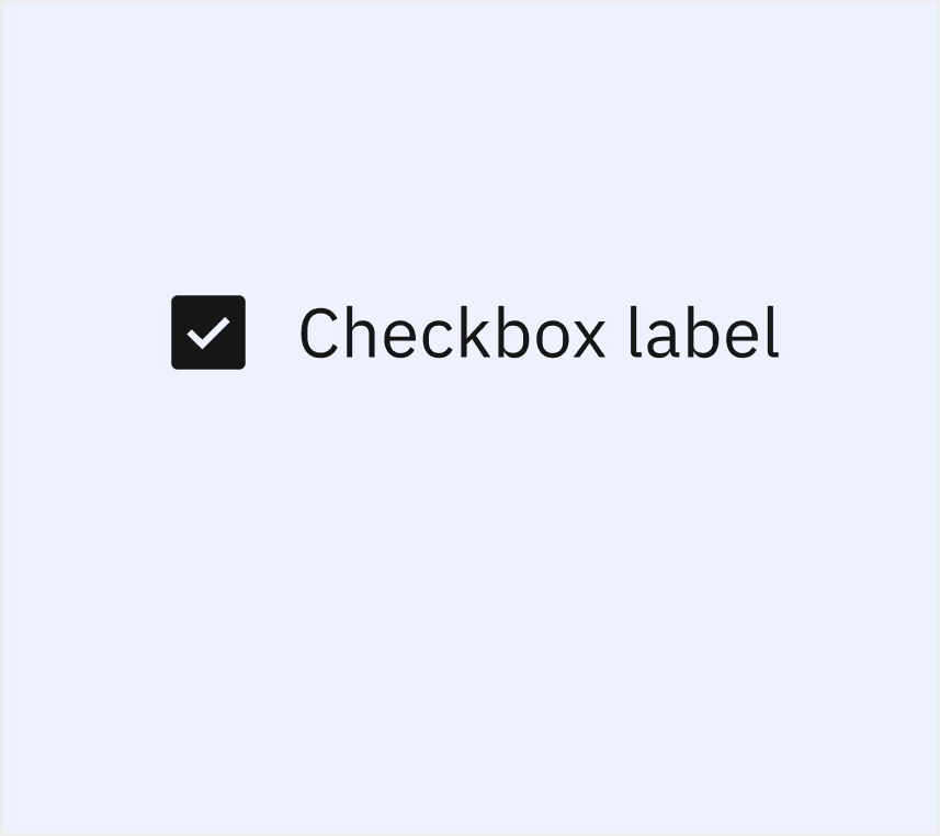
Anatomy Checkbox
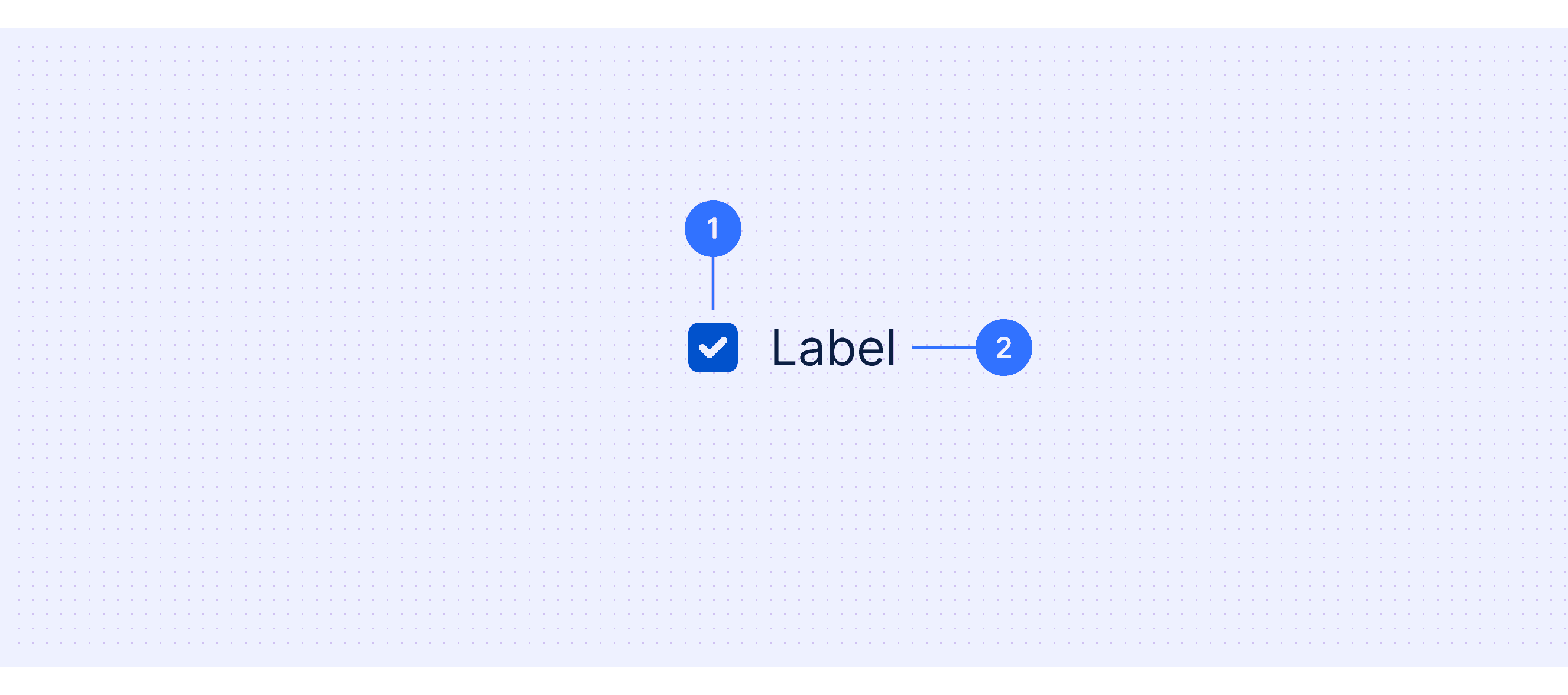
Checkbox: The selection control.
Checkbox label: Use this text label to describe what the checkbox is for.
Core features
Binary Selection: A checkbox lets you choose or unchoose an option, showing something as true/false or on/off.
Multiple Selection: Users can select multiple options from a group of checkboxes independently.
Indeterminate State: Some checkboxes support a third state (indeterminate) to indicate partial selection, often used in hierarchical structures.
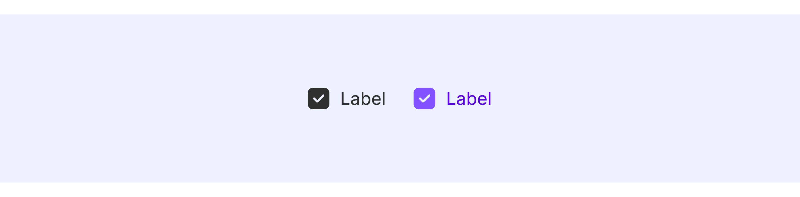
Label Association: A checkbox usually has a label next to it that explains what it does, making it easier to use and understand.
Comparison of Usage in Popular Design Systems
Now, let's look at how some well-known design systems define and implement checkboxes:
Find out how checkboxes are used in different design systems like Material Design, Atlassian Design, and Ant Design. Look at their features and rules, like how they look in different states and how you can use them with a keyboard, to pick the best one for your project.
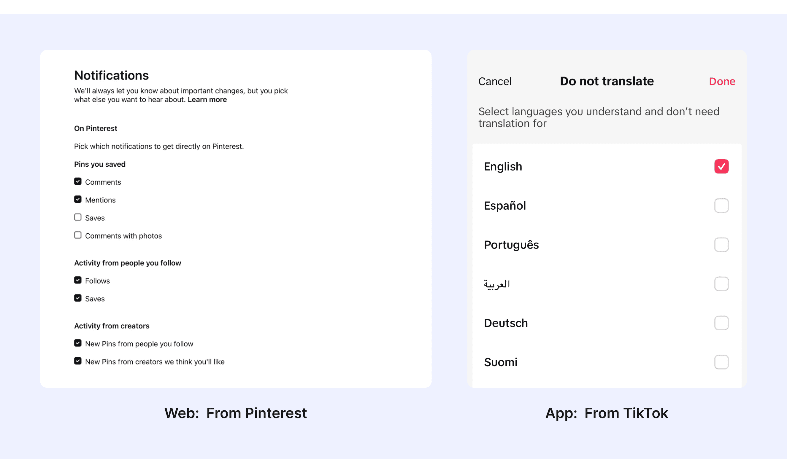
Default Styles
Enumerates the default appearances of tooltips across various design systems, highlighting their visual characteristics and usability.

Features comparison in Design Systems
Comparing checkboxes in Material, Atlassian, Fluent, Polaris, Carbon, and Ant design systems reveals differences in state design and keyboard accessibility. Most design systems support keyboard interactions. Each design system defines the interaction states of checkboxes differently. For example, some include a "warning" state, which is not defined in most design systems.
Design System
Defines
State Design
Keyboard Accessibility
Checkboxes let users select one or more items from a list, or turn an item on or off.
Enabled
Disabled
Hovered
Focused
Pressed
Supports Tab and Space key interactions.
Usually used in forms, checkboxes collect input from users. They can select a number of options ranging from zero to multiple options.
Default
Focus
Disabled
Hover
Active
Provides comprehensive keyboard interaction support, adhering to accessibility standards.
Checkboxes let people select multiple options from a group or switch a single option on or off.
Rest
Hover
Pressed
Disabled
Focus
Fully supports keyboard navigation and state toggling.
Checkboxes are most commonly used to give merchants a way to make a range of selections (zero, one, or multiple). They may also be used as a way to have merchants indicate they agree to specific terms and services.
rest
hover
focus
disabled
error
Emphasizes accessibility, supporting keyboard and screen readers.
Checkboxes are used when there are multiple items to select in a list. Users can select zero, one, or any number of items.
Enabled
Focus
Disabled
Skeleton
Read-only
Invalid
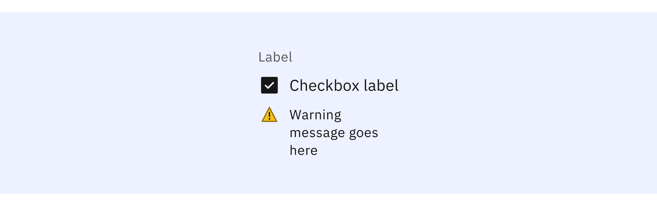
Warning
Offers keyboard interaction support.
Collect user's choices.
Default
Checked
Disabled
Indeterminate
Hover
Focus
Error
Read-only
It supports tab and space key interactions and emphasizes accessibility design.
Special Types
Fluent Design System supports both circular and square checkboxes.
The Fluent Design System provides two types of checkboxes for users to choose from in different scenarios.
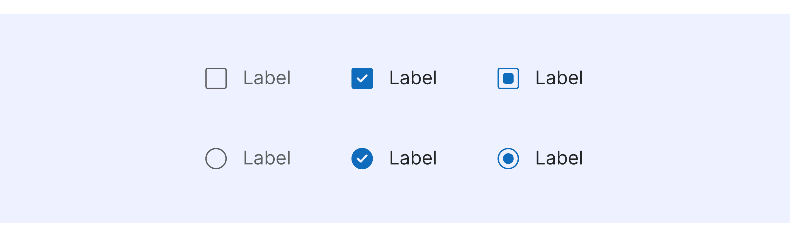
Carbon Design System supports special state checkboxes.
Supports a checkbox in the skeleton state.
Supports a checkbox in the warning state.
Polaris Design System supports checkboxes with different tones.
Users can adjust the color of the checkbox as needed to suit different design scenarios or theme styles.
Checkbox Template for Motiff
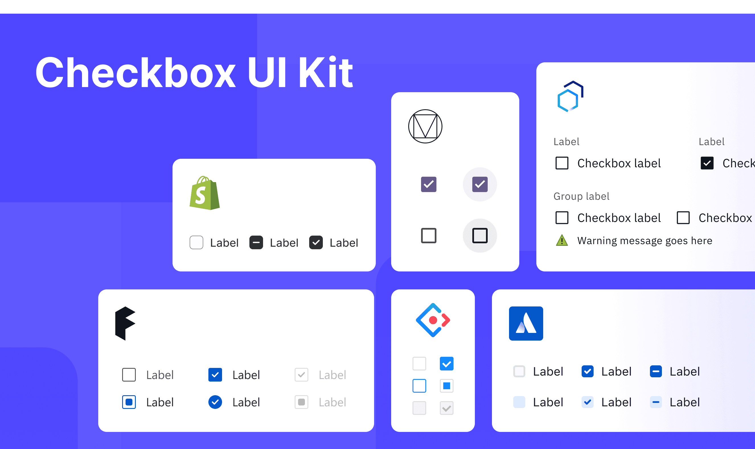
This UIkit file brings together checkbox designs from Material, Atlassian, Fluent, Polaris, Carbon, and Ant Design Systems. It shows their styles, how to use them, and how to customize them, all in one place so you can easily explore and choose.
Checkbox vs. Radio: Difference and When to Use
Checkboxes and tiles differ mainly in Purpose of Use, Behavior, and Use Cases. When deciding between a checkbox and a radio, refer to these key differences, which are adapted from a Justinmind discussion
Purpose of Use
Radio Button: Used for making a single selection from a group of options. Use radio buttons when users can only choose one option.
Checkbox: Used for allowing users to select multiple options from a group. Use checkboxes when users can choose one or more options.
Behavior
Radio Button: Only one option can be selected at a time. Choosing a new option automatically deselects the previous one.
Checkbox: Users can select one, multiple, or no options at all. Each option is independent of the others.
Use Cases
Radio Button: Best for situations where users must choose between mutually exclusive options, such as payment methods like credit card or PayPal.
Checkbox: Ideal for cases where users can select multiple options, such as preferences like receiving emails and SMS notifications.
Accessibility in Different Design Systems
Common Practices
A checkbox is an input control that allows a user to select one or more options from a number of choices.
Keyboard Accessibility: All design systems support keyboard interactions.
Indeterminate State: All design systems have a "partially selected" state. This means some of the child options are selected, but not all of them.
Label Association: All design systems emphasize a clear association between checkboxes and their labels.
Differences Practices
Material Design (M3): Clearly defines the visual style for the indeterminate state.
Atlassian Design: Divides the checkbox anatomy into the checkbox and the checkbox label.
Fluent (Microsoft): Supports checkbox groups, allowing users to select multiple options.
Polaris (Shopify): Offers different checkbox colors to suit various scenarios.
Carbon (IBM): Provides detailed classifications for checkbox states, including special cases like warnings.
Ant Design: Offers best practices for using checkboxes in different scenarios, such as integration with grids.
Code Examples
Explore default checkbox implementations in Atlassian, Fluent, Polaris, Carbon, and Ant design systems. These examples showcase standard usage, default settings, and core features across design systems.
Atlassian Design

Fluent 2 Design System

Shopify Polaris(Shopity)

Carbon Design System