Date Picker

Share This Post

复制链接
分享至X
分享至 LinkedIn
分享至 Facebook

Date Picker

Share This Post

复制链接
分享至X
分享至 LinkedIn
分享至 Facebook

Date Picker

Share This Post

复制链接
分享至X
分享至 LinkedIn
分享至 Facebook

Date Picker

Share This Post

复制链接
分享至X
分享至 LinkedIn
分享至 Facebook

Date Picker

Share This Post

复制链接
分享至X
分享至 LinkedIn
分享至 Facebook

Date Picker

Share This Post

复制链接
分享至X
分享至 LinkedIn
分享至 Facebook

What is Date Picker

In a design system, a Date Picker is a standardized, reusable user interface (UI) component that allows users to select a date (and sometimes time) either by interacting with a visual calendar or by entering text in a specified format. It is a critical part of the design system, ensuring consistency, usability, and accessibility across applications and platforms where date inputs are required.
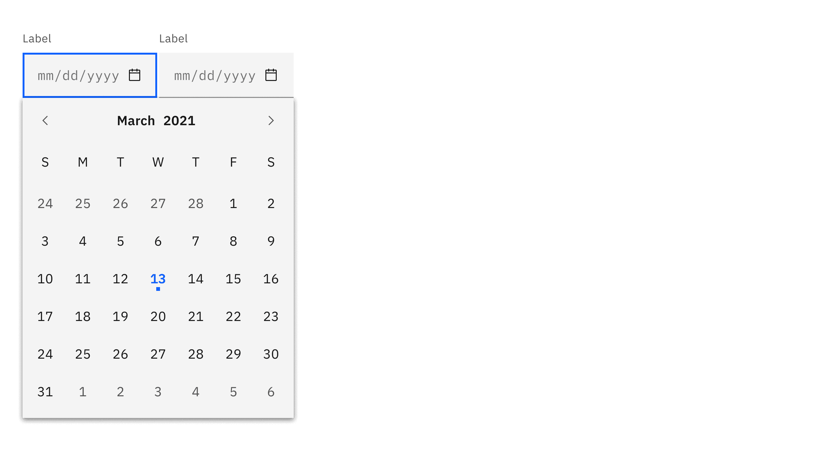
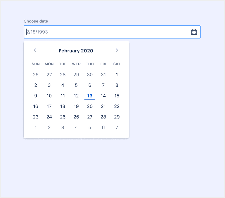
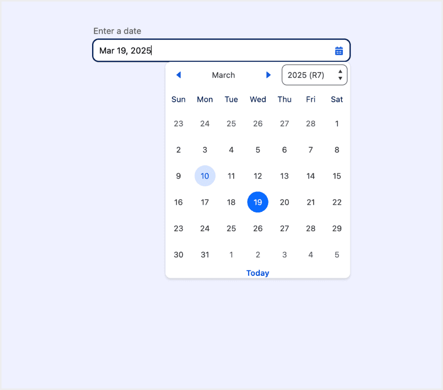
Anatomy Date Picker

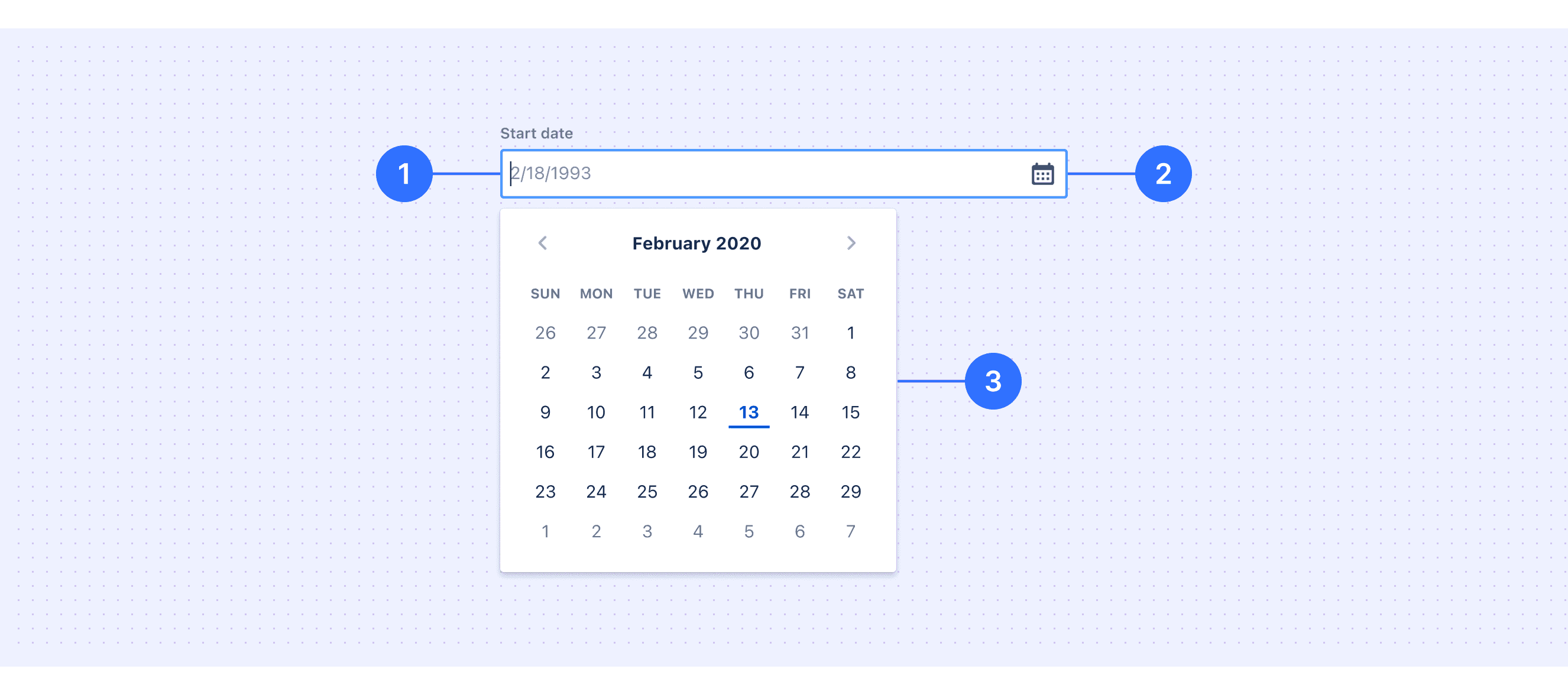
  1. Label: Indicates what information the user needs to input.

  2. Date Input Field: Allows users to manually input a date or open the calendar component for selection.

  3. Calendar Component: Provides a visual interface for users to select a date.

Core features

  • Configurability: Support for different date formats (e.g., YYYY-MM-DD, DD/MM/YYYY, etc.), automatically adjusting based on regional needs.

  • Granularity Selection: Support for selecting by day, week, month, or year, depending on the use case.

  • Input Field Integration: Support for manual input, automatic formatting, and validation.

  • Responsive Design: Adaptation for small screens, providing touch-friendly controls (e.g., larger clickable areas).

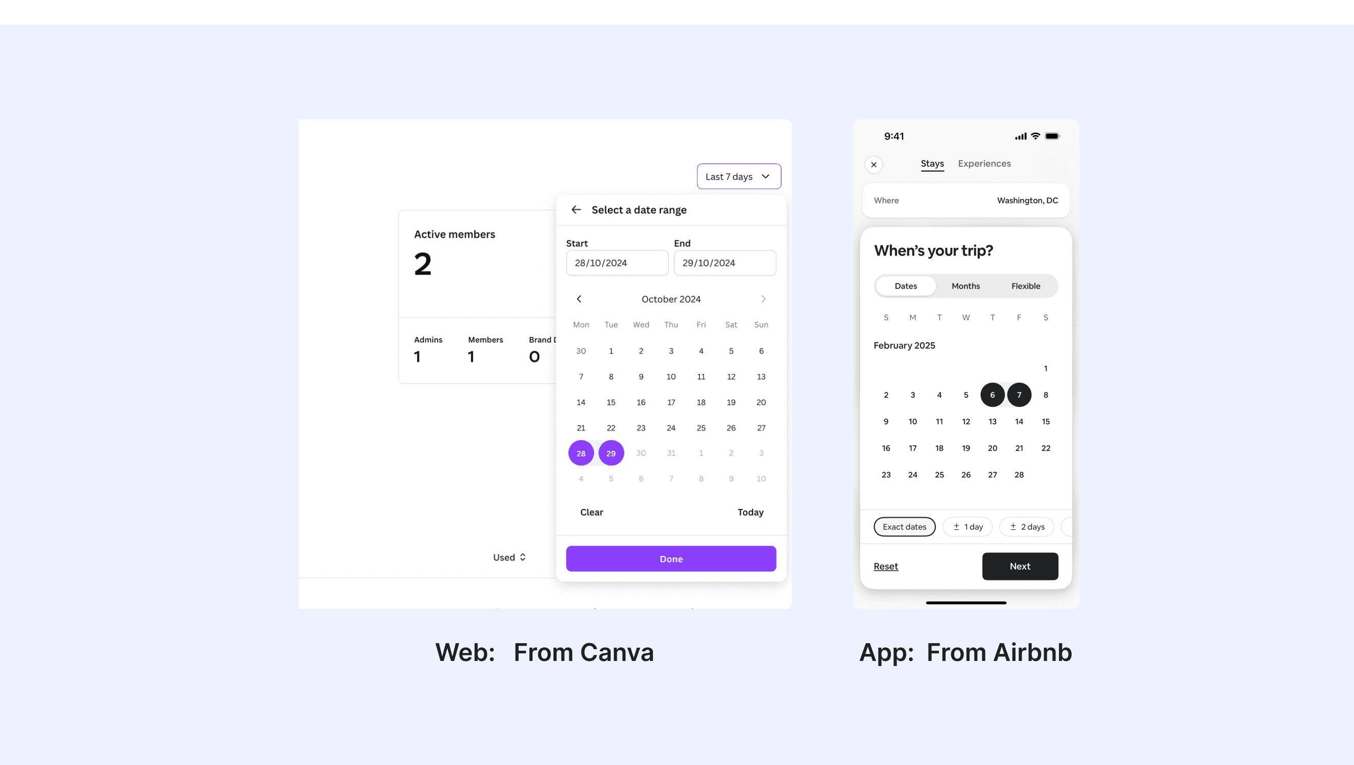
Comparison of Usage in Popular Design Systems

Now, let's look at how some well-known design systems define and implement date pickers:

Learn how date pickers work in different design systems like Atlassian Design, HIG Design, and Ant Design. Check their features and rules, such as types and interaction mode, to find the best fit for your project.

Default Styles

Enumerates the default appearances of date pickers across various design systems, highlighting their visual characteristics and usability.

Material Design Date Picker

Material Design Date Picker

Material Design Date Picker

Material Design Date Picker

Atlassian Design Date Picker

Atlassian Design Date Picker

Atlassian Design Date Picker

Atlassian Design Date Picker

Ant Design Date Picker

Ant Design Date Picker

Ant Design Date Picker

Ant Design Date Picker

HIG Design Date Picker

HIG Design Date Picker

HIG Design Date Picker

HIG Design Date Picker

Carbon Design Date Picker

Carbon Design Date Picker

Carbon Design Date Picker

Carbon Design Date Picker

Lightning Design Date Picker

Lightning Design Date Picker

Lightning Design Date Picker

Lightning Design Date Picker

Features comparison in Design Systems

Comparing date pickers in Material, Atlassian, Ant, HIG, Carbon, Lightning design shows differences in types and content structure. 

Design System

Defines

Types

Interaction Mode

Date pickers let people select a date, or a range of dates.

  • Day selection

  • Month selection

  • Year selection

  • Date range selection

  • Click to select a single day, month, or year

  • Support manual date input

  • Support keyboard navigation

A date picker allows the user to select a particular date.

  • Day selection

  • Click to select a single day

  • Support keyboard navigation

To select or input a date.
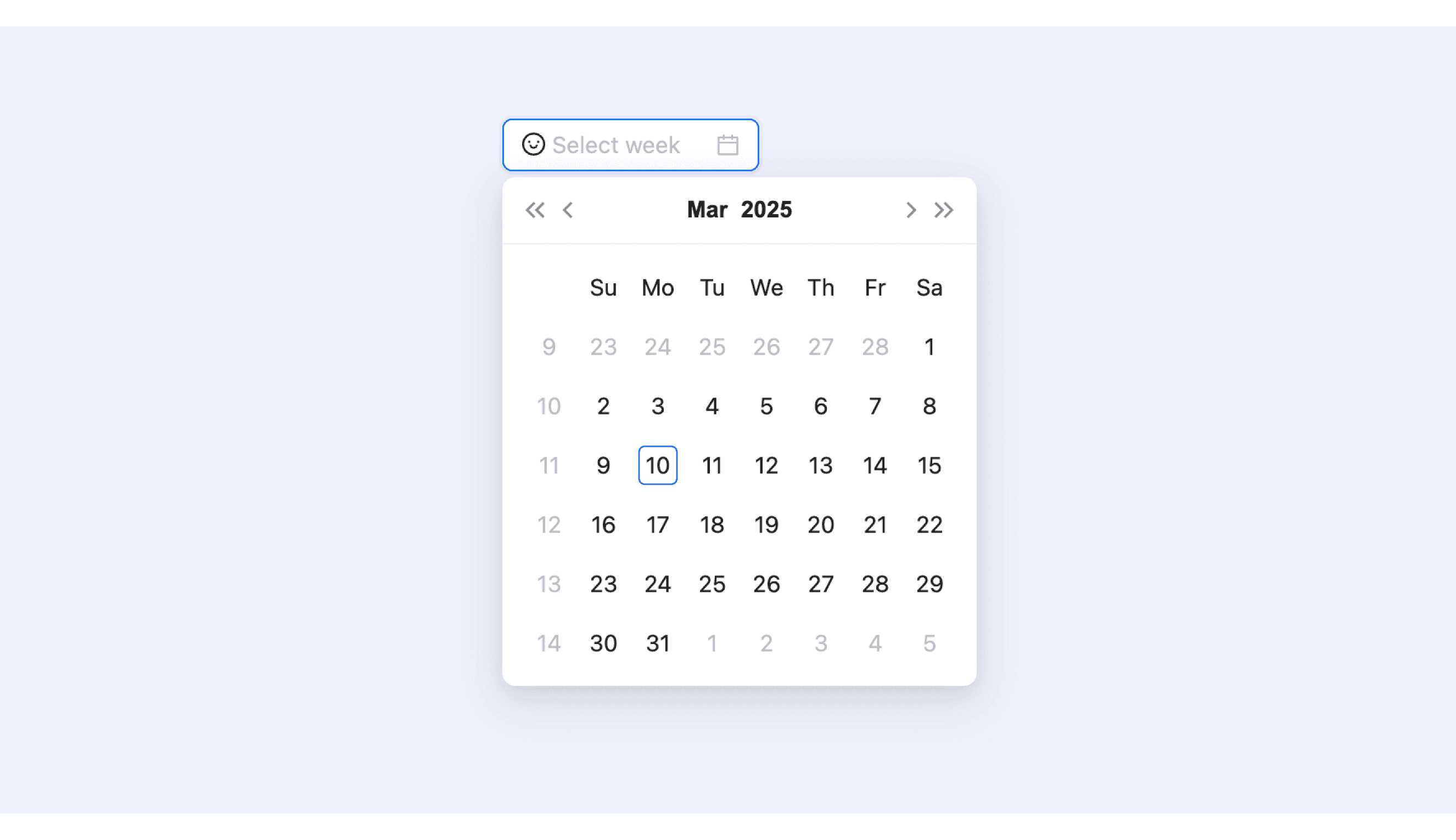
  • Select date

  • Select week

  • Select month

  • Select quarter

  • Select year

  • Range Picker

  • Multiple selections

  • Click to select a single day, week, month, quarter, or year

  • Support manual date input

  • Support date confirmation

  • Support keyboard navigation

A picker displays one or more scrollable lists of distinct values that people can choose from.

  • Day selection

  • Time selection

  • Scroll selection (iOS)

  • Support keyboard navigation

Date and time pickers allow users to select a single instance or range of dates and times.

  • Day selection

  • Date range selection

  • Click to select a single day

  • Support manual date input

  • Support keyboard navigation

The datepicker makes it easy to select dates from a calendar for date-related input fields.

  • Day selection  

  • Date range selection

  • Time selection

  • Click to select a single day

  • Support manual date input (with format validation)

  • Support keyboard navigation

Special Types

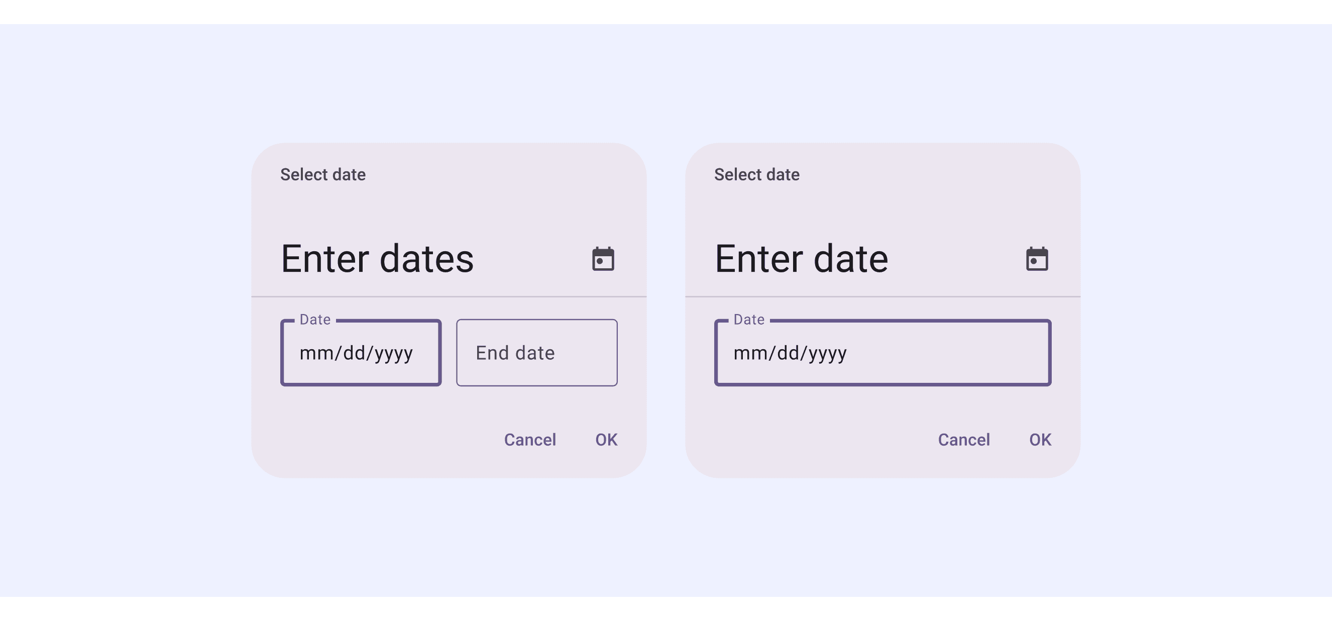
Material Design System supports “Modal date input”.

This date picker uses a modal popup design, allowing users to manually input a date in the specified format or click to select a date.

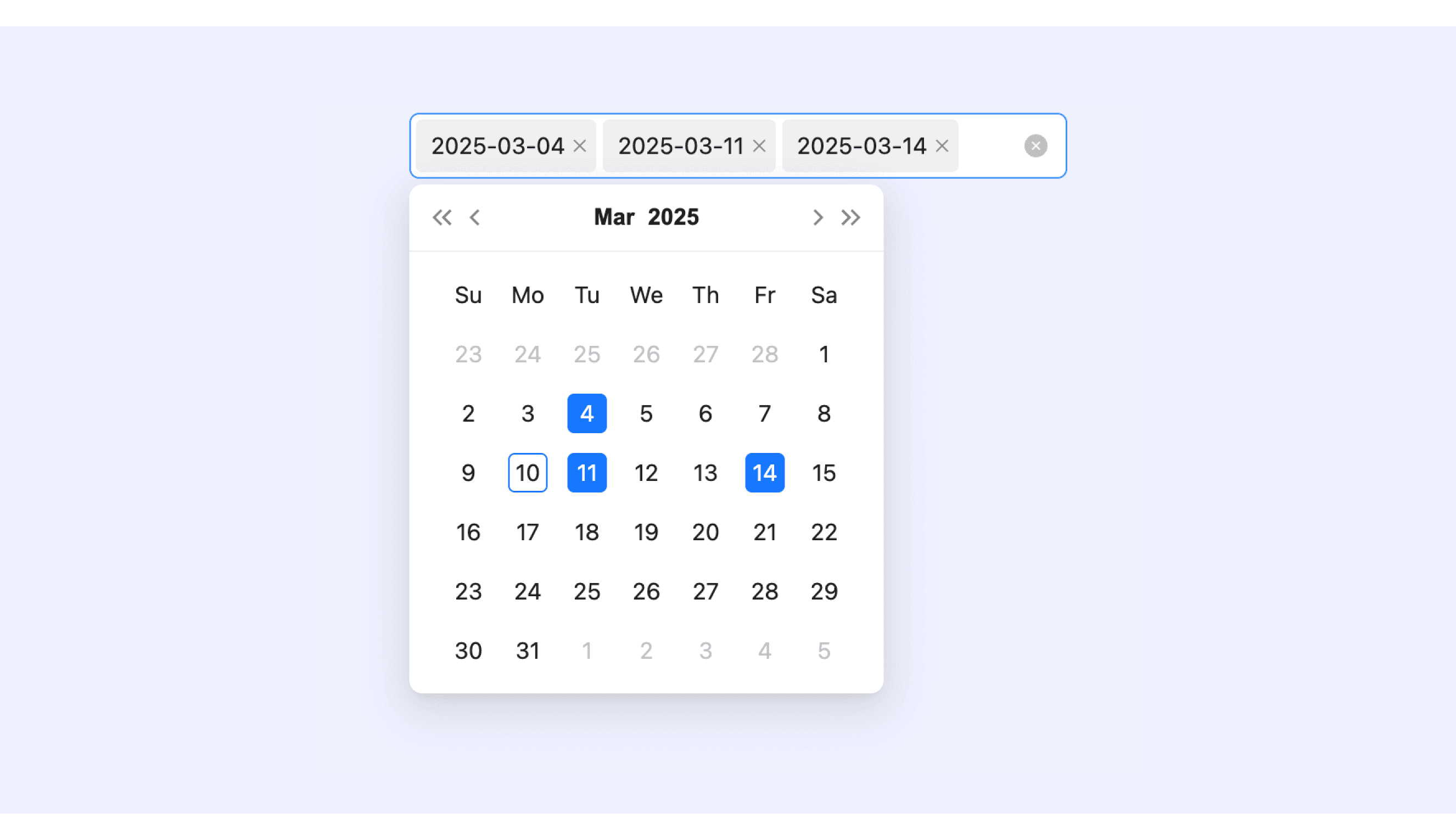
Ant Design’s date picker supports Multiple selections and Prefix and Suffix.

Supports selecting multiple dates, with the selected dates displayed as tags. Users can remove a specific date by clicking the "×" on the tag.

Supports adding custom icons or text before and after the date picker.

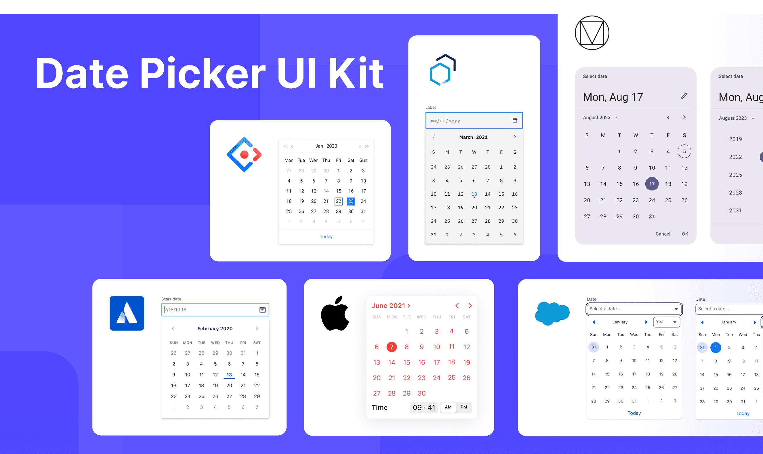
Date Picker Template for Motiff

This UIkit file combines date picker designs from Material, Atlassian, Ant, HIG, Carbon, Lightning design. It showcases their styles, usage, and customization in one place for easy exploration and selection.

Open and edit in Motiff →

6 DateTimePicker components for your web apps

Entering dates and times on websites is something we do a lot—like picking a birthday, booking a trip, or setting up a meeting. A good DateTimePicker makes this super easy and helps avoid mistakes, which are adapted from a vaadin discussion.

  • Flatpickr: A lightweight, modular, and highly customizable date picker that is compatible with Angular, Ember, React, and Vue. Ideal for simple web forms and dashboards.

  • React DateTimePicker: Designed specifically for React applications, it offers comprehensive date and time selection functionality. It supports custom styling and provides desktop, mobile, and responsive variants.

  • jQuery Date and Time Picker: A classic date and time picker widely used in jQuery projects. It features a rich set of themes and configuration options.

  • Ant Design DatePicker: Supports both date and time selection. It is tailored for projects using the Ant Design ecosystem, especially large-scale enterprise applications.

  • Bulma Calendar: Based on the Bulma CSS framework, it is suitable for smaller applications or projects prioritizing a visually cohesive and clean interface.

  • Vaadin DateTimePicker: Comes with built-in support for various formats and locales. It offers both Java and JavaScript versions, allowing users to input dates via keyboard or overlay.

Accessibility in Different Design Systems

Common Practices

  • Keyboard Navigation: Allow users to navigate and select dates using the keyboard (e.g., arrow keys to move between dates).

  • Screen Reader Support: Ensure date pickers are compatible with screen readers by providing clear labels, descriptions, and ARIA attributes.

  • Localization and Time Zones: Support different date formats, languages, and time zones for global accessibility.

  • Error Prevention: Provide feedback or validation to prevent users from selecting invalid dates (e.g., past dates for future events).

Differences Practices

  • Material Design 3: Supports various styles of components, including Modal Date Picker and Input Date Picker.

  • Atlassian Design: Separates date and time pickers and supports disabling specific dates.

  • Ant Design: Offers multiple style variants, including year, month, day, and quarter pickers.

  • Apple HIG: Deeply integrated with the system calendar and supports marking holidays.

  • Carbon Design: Supports date range validation and provides error state feedback.

  • Lightning Design: Binds with Salesforce data and supports automatic format validation (e.g., MM/DD/YYYY).

Code Examples

Explore default date picker implementations in Atlassian, Ant and Carbon design. These examples showcase standard usage, default settings, and core features across design systems.
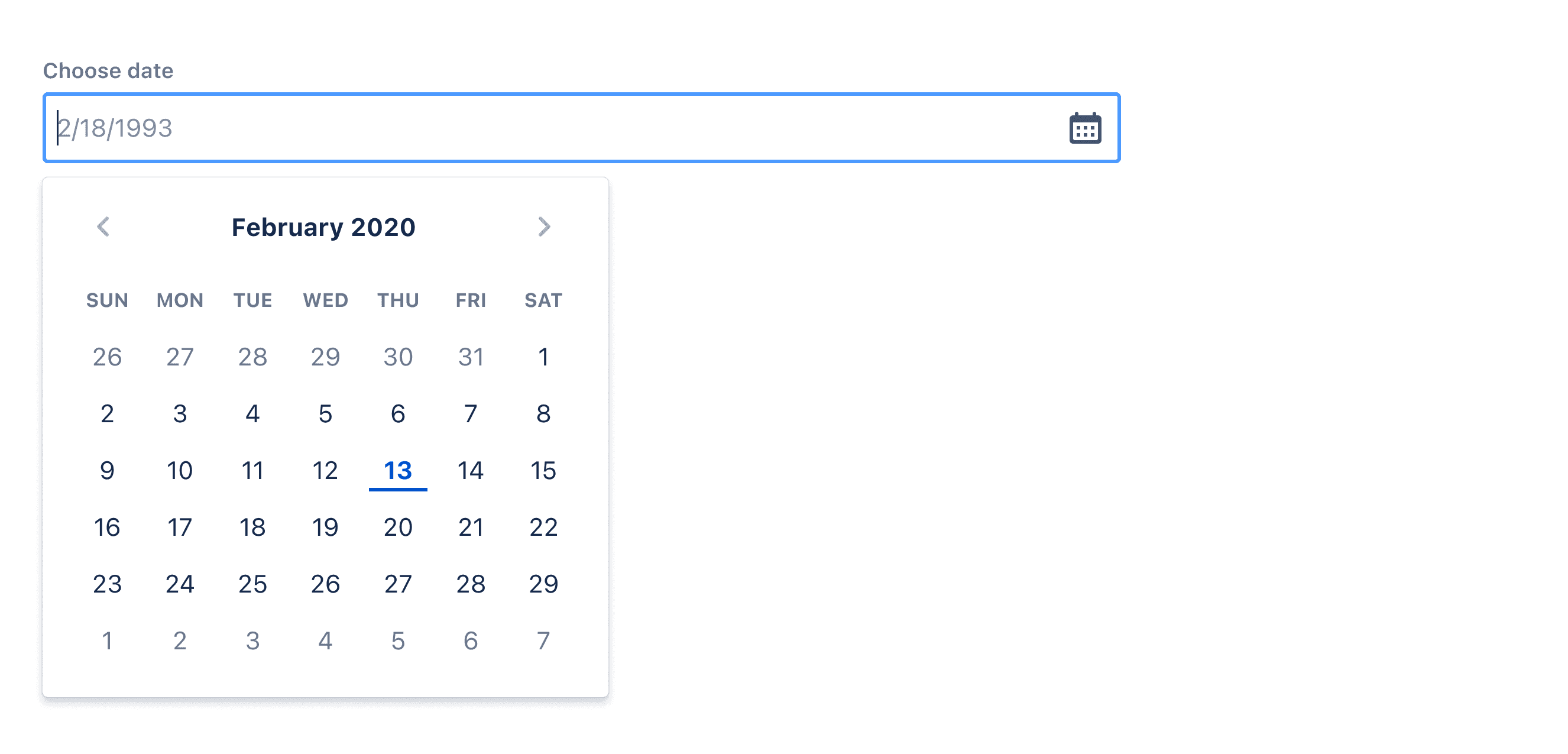
Atlassian Design

import React from 'react';

import { DatePicker } from '@atlaskit/datetime-picker';
import { Label } from '@atlaskit/form';

const DatePickerDefaultExample = () => (
	<>
		<Label id="date" htmlFor="default-date-picker-example">
			Choose date
		</Label>
		<DatePicker
			id="default-date-picker-example"
			clearControlLabel="Clear choose date"
			shouldShowCalendarButton
			inputLabelId="date"
			openCalendarLabel="open calendar"
		/>
	</>
);

export default DatePickerDefaultExample;

Show More

Ant Design

import React from 'react';
import type { DatePickerProps } from 'antd';
import { DatePicker, Space } from 'antd';

const onChange: DatePickerProps['onChange'] = (date, dateString) => {
  console.log(date, dateString);
};

const App: React.FC = () => (
  <Space direction="vertical">
    <DatePicker onChange={onChange} />
    <DatePicker onChange={onChange} picker="week" />
    <DatePicker onChange={onChange} picker="month" />
    <DatePicker onChange={onChange} picker="quarter" />
    <DatePicker onChange={onChange} picker="year" />
  </Space>
);

export default App;

Show More

Carbon Design

/**
 * Copyright IBM Corp. 2016, 2023
 *
 * This source code is licensed under the Apache-2.0 license found in the
 * LICENSE file in the root directory of this source tree.
 */

import DatePicker, { type DatePickerProps } from './DatePicker';

export {
  default as DatePickerSkeleton,
  type DatePickerSkeletonProps,
} from './DatePicker.Skeleton';
export default DatePicker;
export { DatePicker, type DatePickerProps };

Show More

Try AI Design Systems

Create, maintain, and check your design systems with AI in one click.

Try AI Design Systems

Create, maintain, and check your design systems with AI in one click.

Try AI Design Systems

Create, maintain, and check your design systems with AI in one click.

Try AI Design Systems

Create, maintain, and check your design systems with AI in one click.

Try AI Design Systems

Create, maintain, and check your design systems with AI in one click.