What is Input
In a design system, Input refers to components that let users enter data or interact with the system, such as in forms, search bars, or settings. These components are fundamental, designed to be reusable, consistent, and accessible, ensuring a unified experience and improving design and development efficiency.
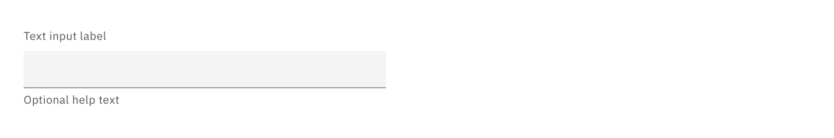
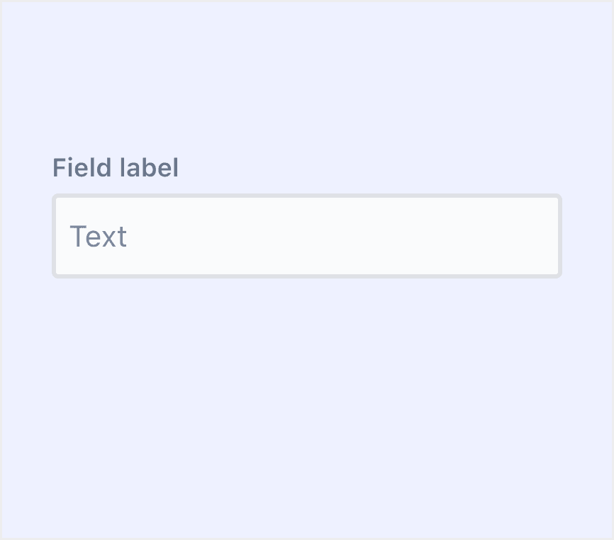
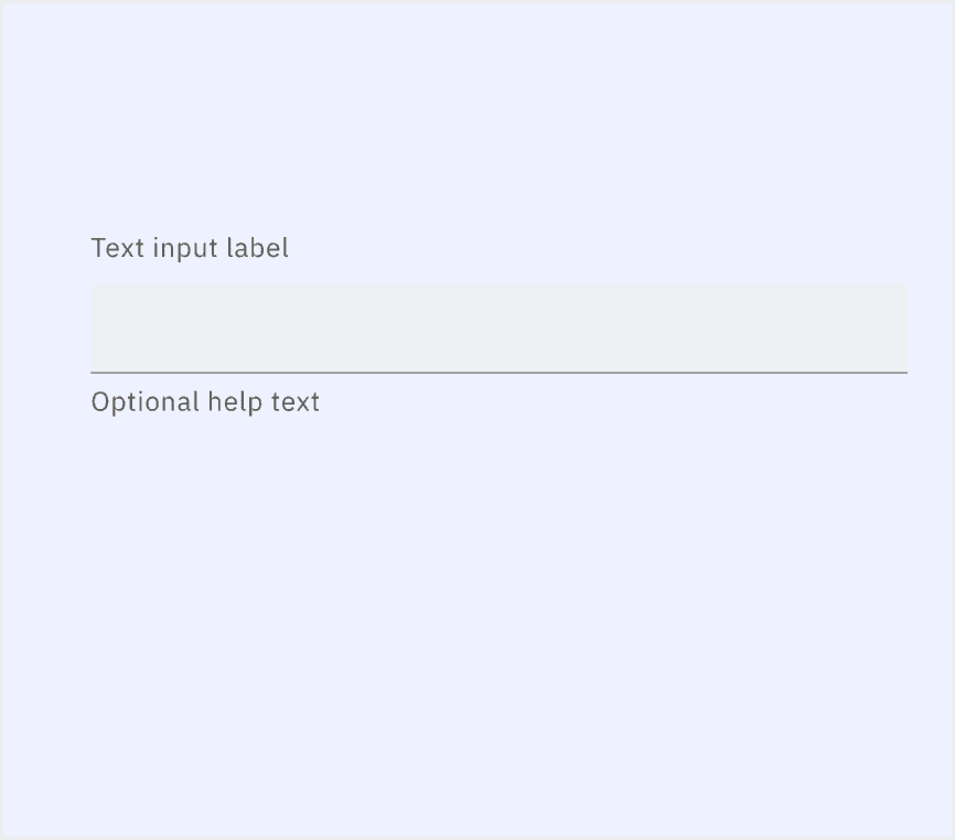
Anatomy Input
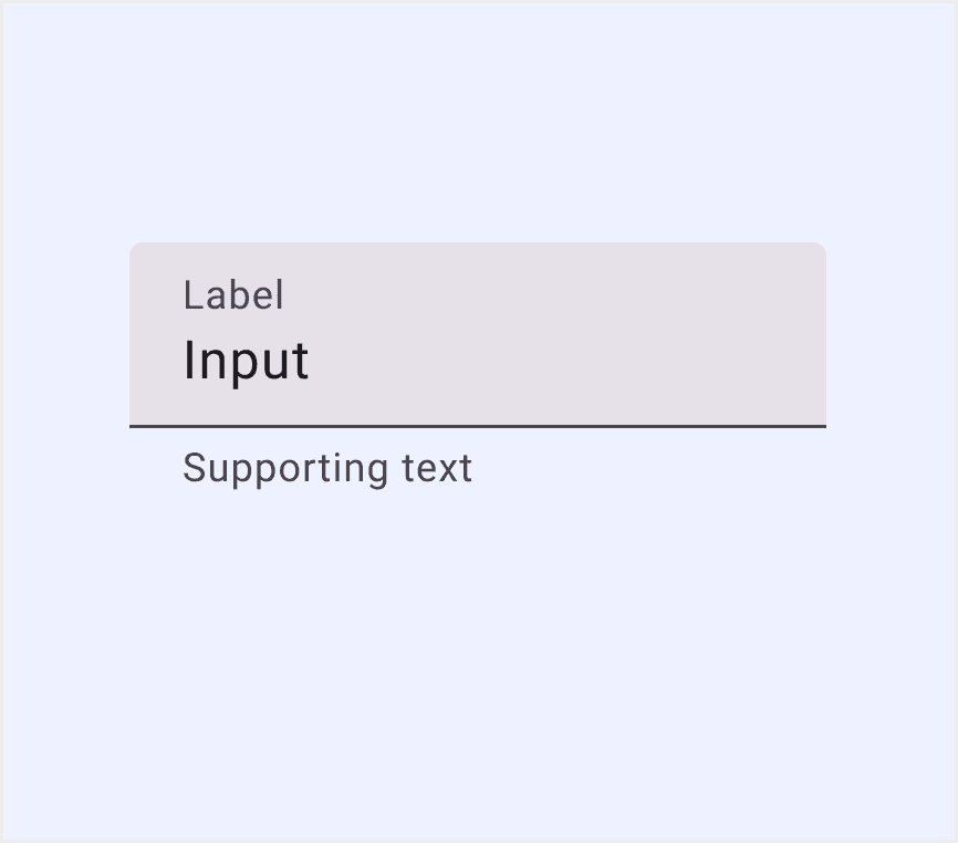
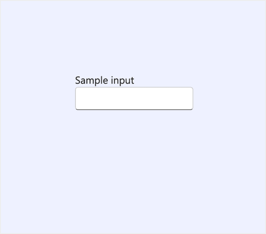
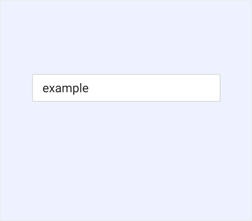
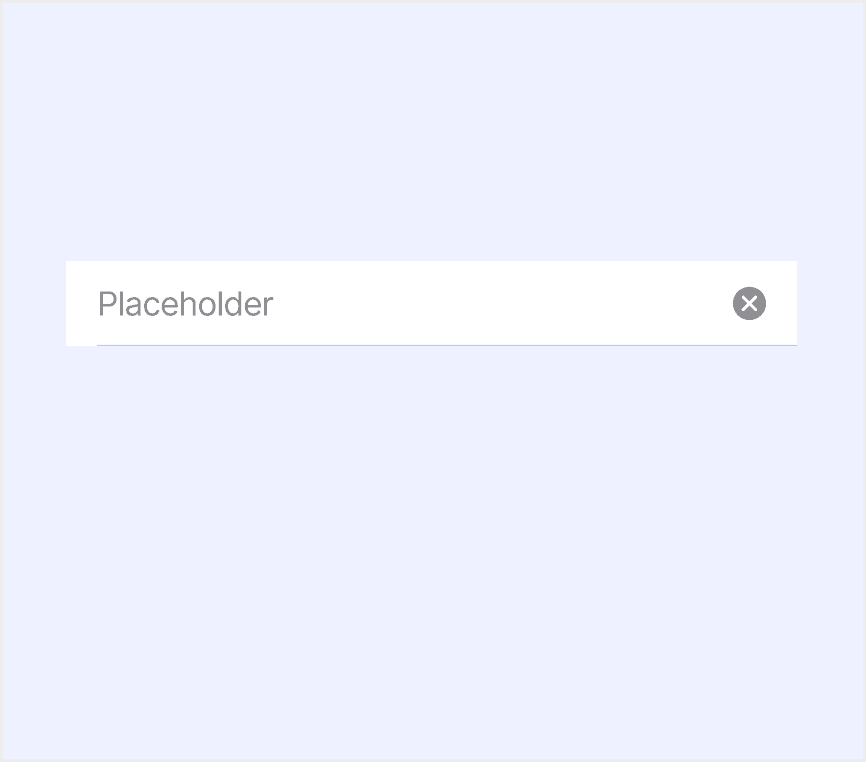
Placeholder text (optional): Use field labels or helper text to explain the field's purpose or usage. Placeholders can be used for search fields or simple example inputs.
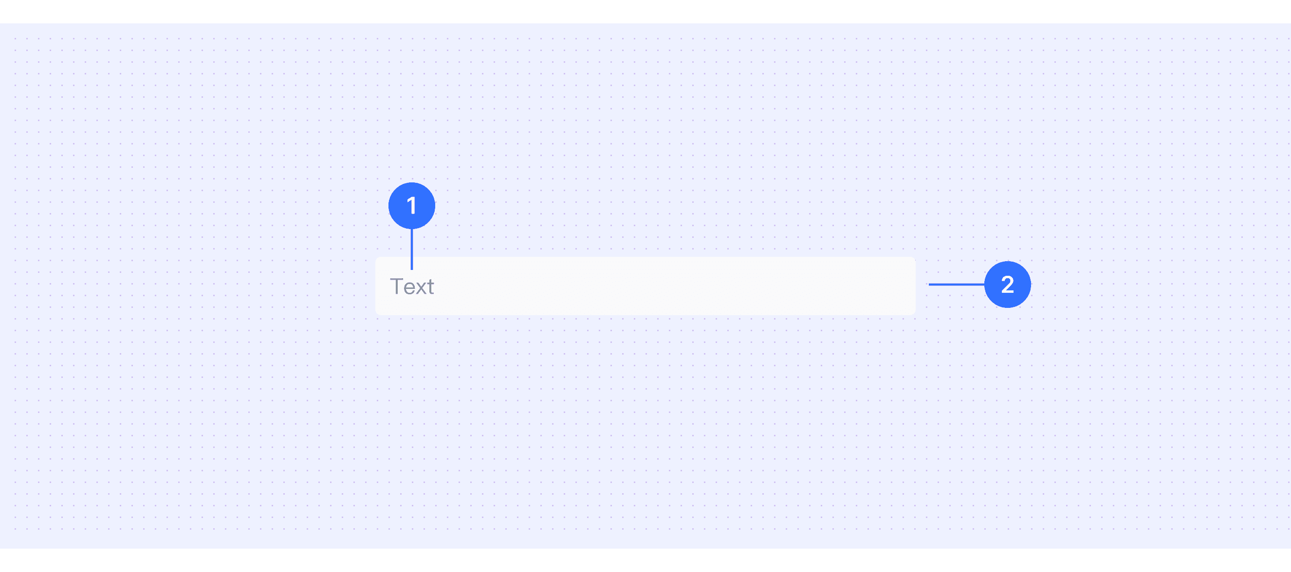
Input area: This is where people enter text.
Core features
Types and Variations: Supports many input types like text, number, password, email, and date.
Validation and Feedback: Checks your input instantly and shows errors or success messages.
Labels and Placeholders: Labels and hints help you understand what to enter.
Customization: Allows customization of styles, sizes, and content to fit different design systems and use scenarios.
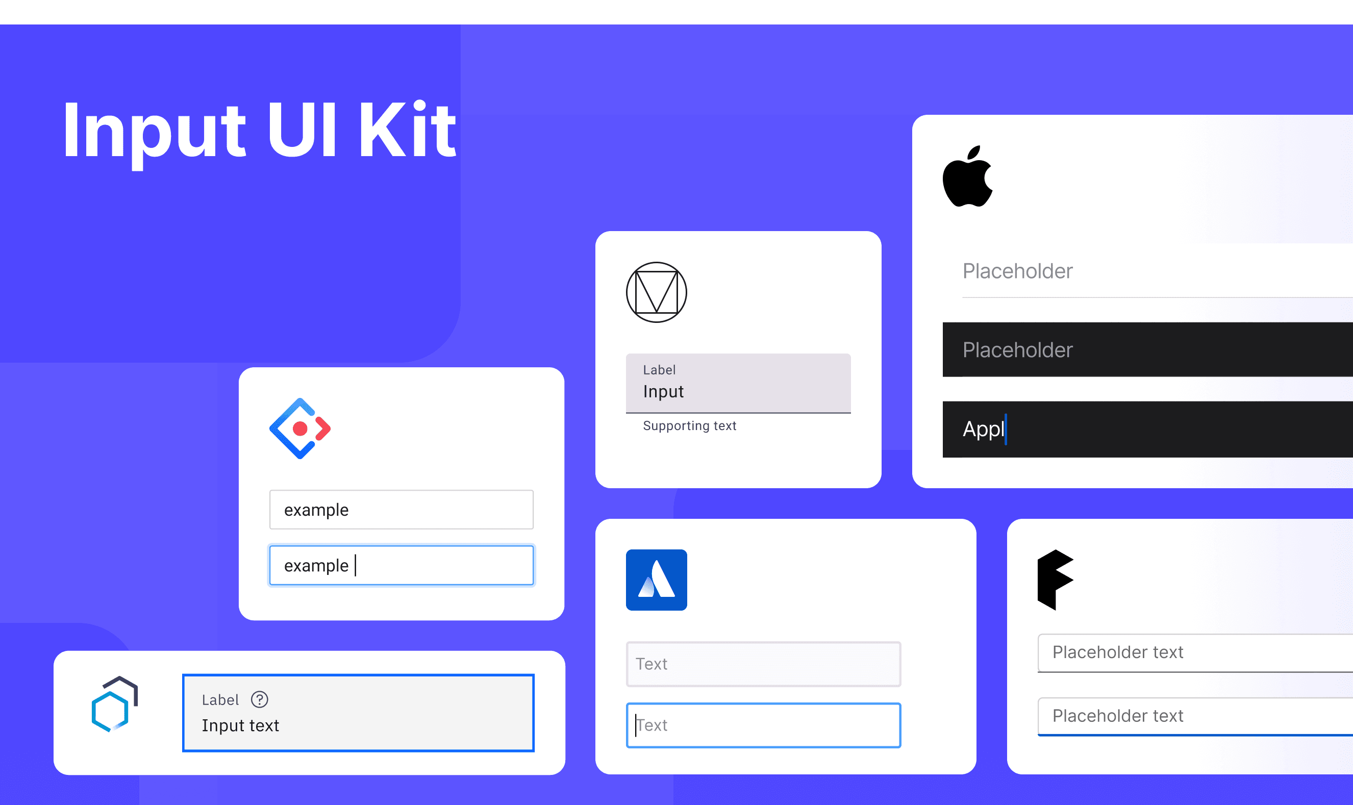
Comparison of Usage in Popular Design Systems
Now, let's look at how some well-known design systems define and implement inputs:
Discover how inputs are implemented across different design systems like Fluent Design, Carbon Design, Ant Design, etc. Look at their features and rules, like size, and state to choose the best fit for your project.
Default Styles
Enumerates the default appearances of inputs across various design systems, highlighting their visual characteristics and usability.
Features comparison in Design Systems
Comparing inputs in Material, Atlassian, Fluent, Ant, Human, and Carbon shows differences in size and state.
Design System
Defines
Size
State
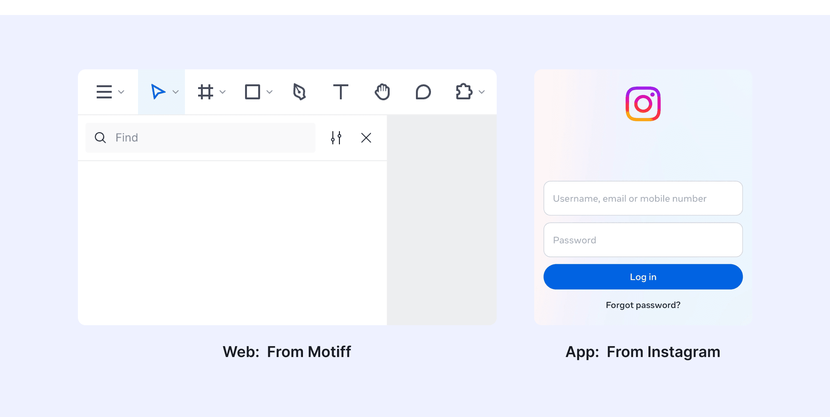
Text fields let users enter text into a UI.
Default container height 56dp.
Enabled (empty)
Focused (empty)
Hovered (empty)
Disabled (empty)
Enabled (populated)
Focused (populated)
Hovered (populated)
Disabled (populated)
A text field is an input that allows a user to write or edit text.
Container height 40dp and 32dp.
Disabled
Invalid
Focus
Default
Validated
Hover
An input allows people to enter short, free-form text data.
Small
Medium
Large
Rest
Hover
Pressed
Focused
Error
Disabled
Read only
Through mouse or keyboard input content, it is the most basic form field wrapper.
Small
Default
Large
Normal
Focused
Disabled
A text field is a rectangular area in which people enter or edit small, specific pieces of text.
Default
Default
Active
Typing
Typed
Text inputs enable users to enter free-form text data. You can use them for long and short-form entries.
Small
Medium
Large
Enabled
Active
Focus
Error
Warning
Disabled
Skeleton
Read-only
Special Types
Atlassian Design System supports “Input with the leading element”.
Text fields can include elements before and after the input. This is useful for adding elements like icons or buttons into the text field.
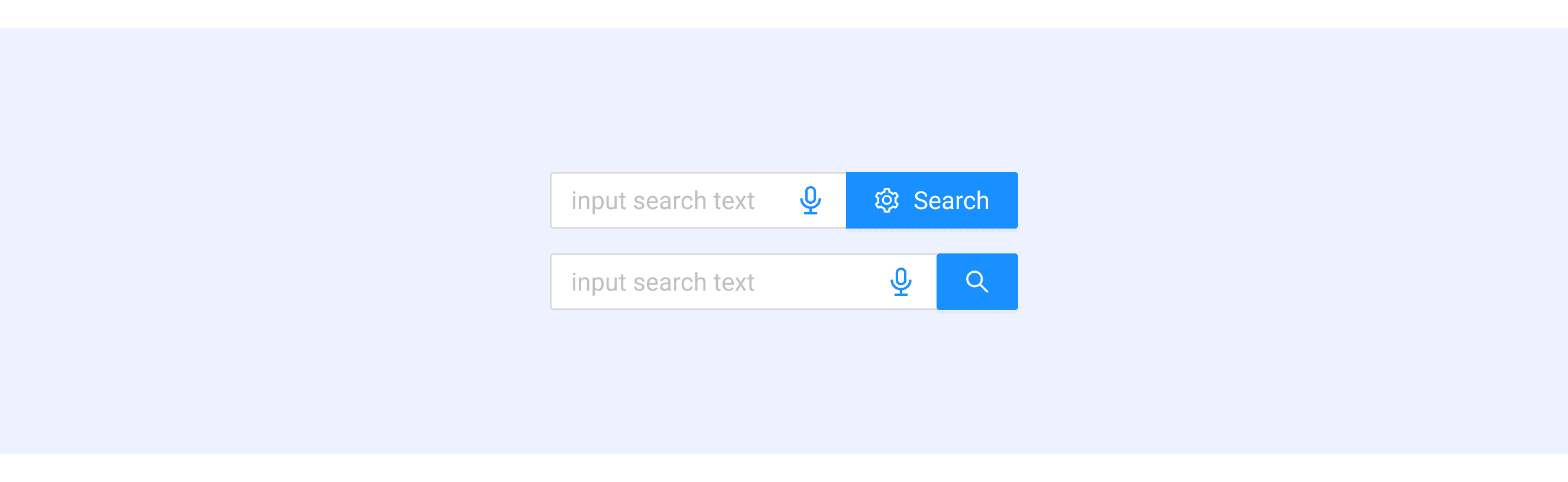
Ant Design supports “Input with pre & post tabs” and “Input with a search button”.
In the scenario of filling in a URL, you can add pre-tabs or post-tabs before or after the input field.
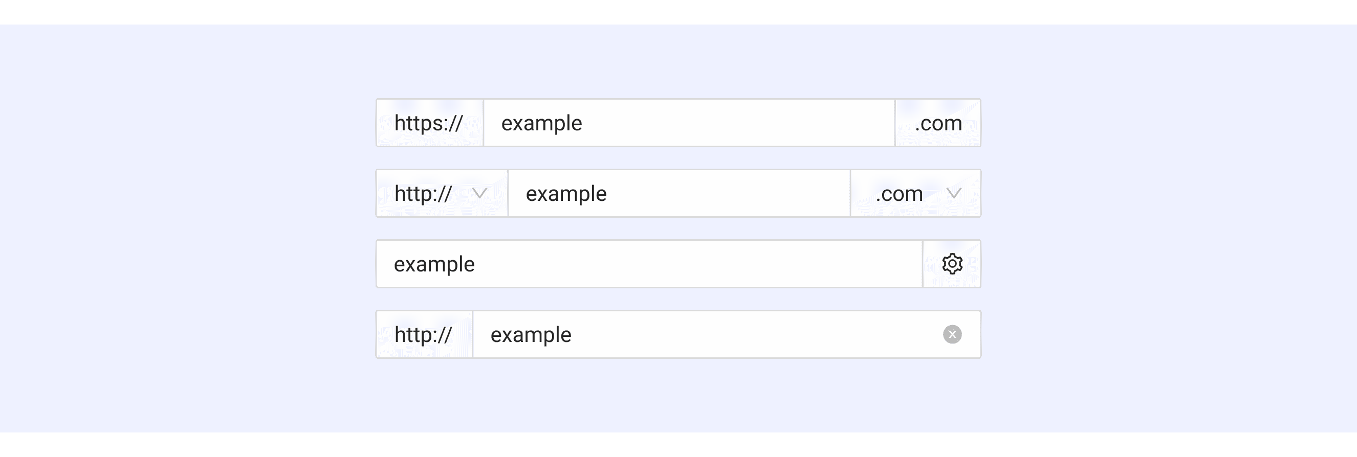
Users can create a search box by grouping a standard input with a search button.
Input Template for Motiff
This UIkit file combines input designs from Material, Atlassian, Fluent, Ant, Human, and Carbon Design. It showcases their styles, usage, and customization in one place for easy exploration and selection.
What is the difference between text area and input text
In user interface (UI) design, the terms "text area" and "input text" are often used interchangeably, but they have distinct meanings, which are adapted from a Stackoverflow discussion.
Purpose: Input text is for one-line inputs like names or emails. Textarea is for multi-line inputs like comments or messages.
Multi-line Support: Input text only allows one line, extra text scrolls sideways. Textarea allows multiple lines and "Enter" for new lines.
Styling and Layout: Input text is simple and fixed in height. Textarea is flexible in size and can look like a single-line input.
Structure: Input text is a single tag with no inner content. Textarea has opening and closing tags with content inside.
Accessibility in Different Design Systems
Common Practices
Visual Feedback: Input fields should provide clear visual feedback in focus, disabled, or error states to help users understand their current status.
Labels: Input fields should have clear labels properly associated with them to help users understand the purpose of the input.
Error Messages: Provide clear error messages and use visual and assistive technologies (e.g., aria-describedby) to help users understand the cause of the error.
Responsive Design and Touch Support: Input fields should work well on all devices and be easy to use on touchscreens.
Differences Practices
Material Design: Label text is placed inside the input field, while most other design systems place it outside.
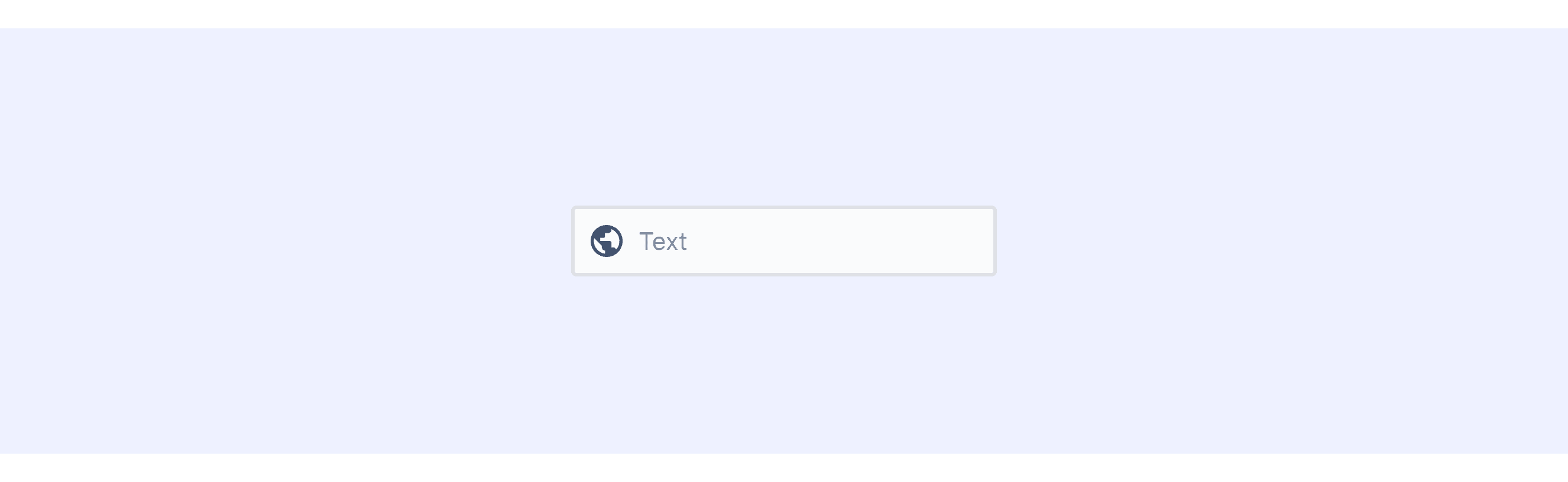
Atlassian Design: A leading visual can be added before the input field to emphasize its purpose.
Fluent Design System: Features unique visual interactions on click, with a single-sided border as feedback.
Apple Human Interface Guidelines: A component library designed for iOS systems, offering both light and dark modes.
Ant Design: Offers rich input variants, including OTP (One-Time Password) inputs.
Carbon Design System: Divides inputs into two types: default and fluid, with fluid being a type not commonly defined in other design systems.
Code Examples
Explore default modal implementations in Ant, Carbon Design. These examples showcase standard usage, default settings, and core features across design systems.
Ant Design
Carbon Design