Share This Post

复制链接
分享至X
分享至 LinkedIn
分享至 Facebook

List

Share This Post

复制链接
分享至X
分享至 LinkedIn
分享至 Facebook

Share This Post

复制链接
分享至X
分享至 LinkedIn
分享至 Facebook

List

Share This Post

复制链接
分享至X
分享至 LinkedIn
分享至 Facebook

Share This Post

复制链接
分享至X
分享至 LinkedIn
分享至 Facebook

List

Share This Post

复制链接
分享至X
分享至 LinkedIn
分享至 Facebook

What is List

In a design system, a list is a reusable UI component used to display a collection of related items in an organized manner. Lists are commonly used to present data, content, or options in a structured and easily scannable format. They are a fundamental building block in user interface design and can adapt to various use cases.

Anatomy List

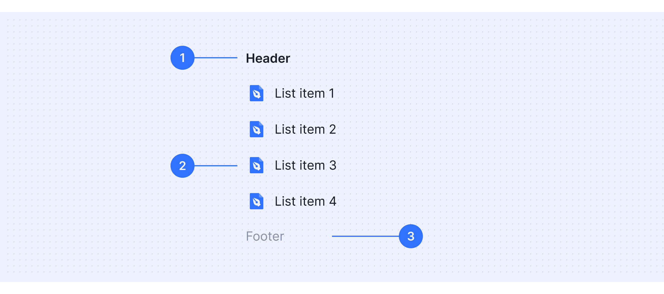
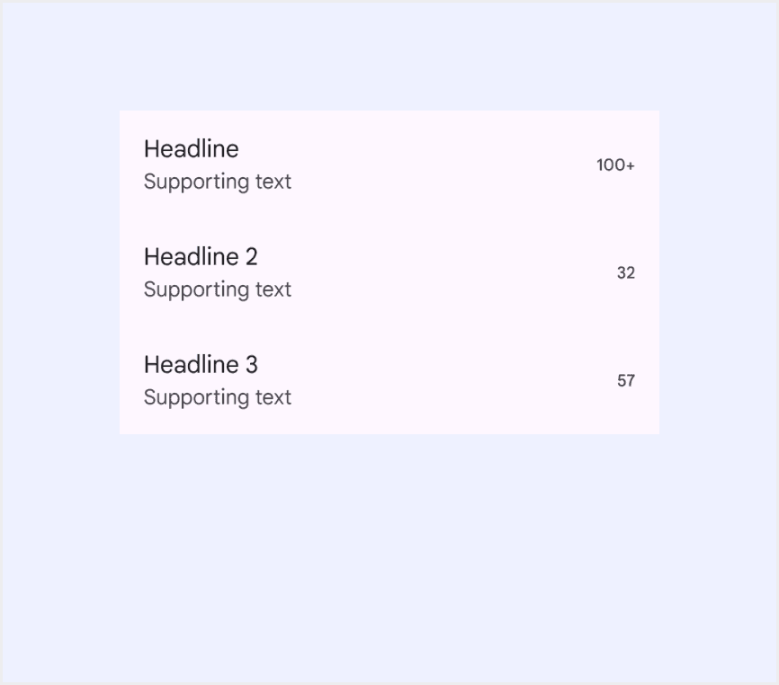
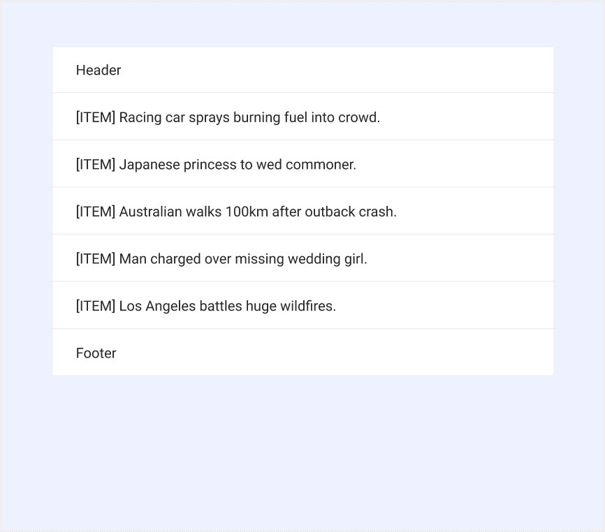
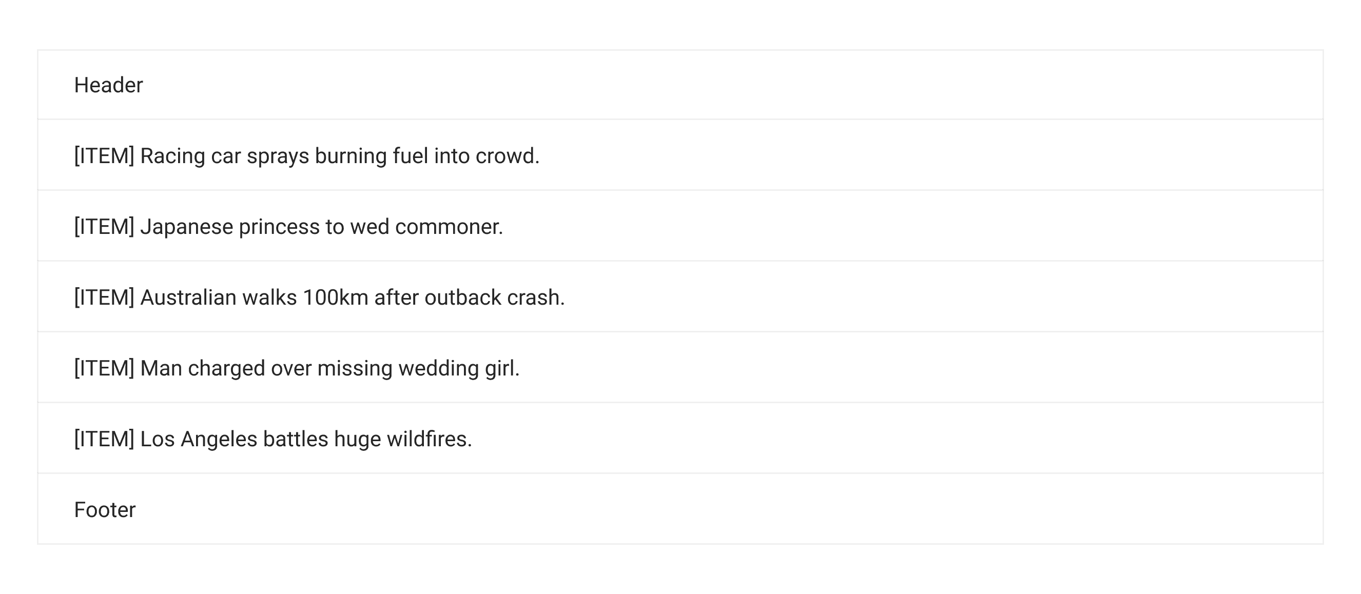
  • Header: The main text of the item, conveys the core information.

  • Body: Fully customizable content area.

  • Footer: A selection control at the end of the item, such as a checkbox, radio button, or toggle, allowing for interactive actions.

Core features

  • Structure and Hierarchy: Item collections help organize things clearly. You can group or nest elements to show how they are related, making it easier to understand.

  • Content Layout: Items in a collection can include text, pictures, or icons. This helps you show both the main information and extra details for different needs.

  • Customization Options: You can change how collections look, like making them more compact, aligning items differently, or adding buttons. This makes them work well for different situations and match different styles.

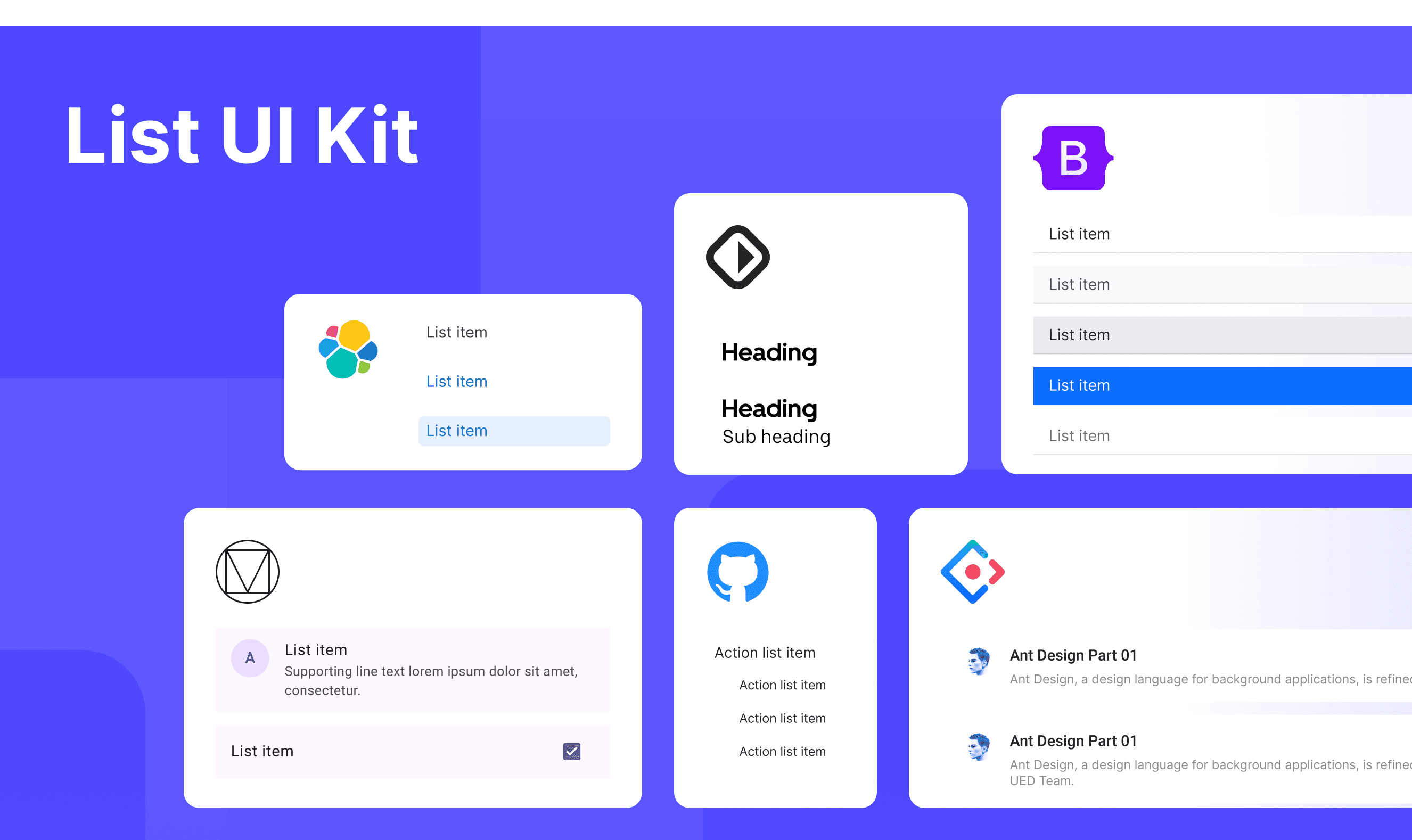
Comparison of Usage in Popular Design Systems

Now, let's look at how some well-known design systems define and implement lists:

Discover how inputs are implemented across different design systems like Material Design, Ant Design, etc. Look at their features and rules, like size, and state to choose the best fit for your project.

Default Styles

Enumerates the default appearances of lists across various design systems, highlighting their visual characteristics and usability.

Material Design List

Material Design List

Material Design List

Material Design List

Ant Design List

Ant Design List

Ant Design List

Ant Design List

Bootstrap Design List

Bootstrap Design List

Bootstrap Design List

Bootstrap Design List

Elastic Design List

Elastic Design List

Elastic Design List

Elastic Design List

Base Web Design List

Base Web Design List

Base Web Design List

Base Web Design List

Primer Design List

Primer Design List

Primer Design List

Primer Design List

Features comparison in Design Systems

Comparing inputs in Material, Ant, Bootstrap, Elastic UI, Baseweb, and Primer shows differences in size and state. 

Design System

Defines

Size

State

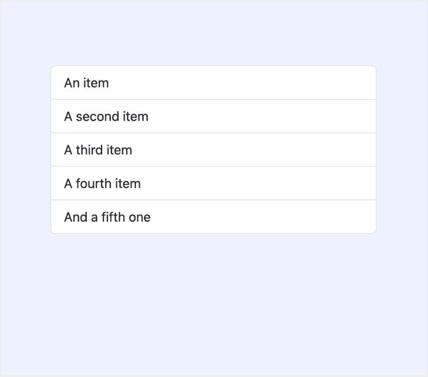
Lists are continuous, vertical indexes of text and images.

The "tallest" element within a list item determines the list item’s height – either 56dp, 72dp, or 88dp
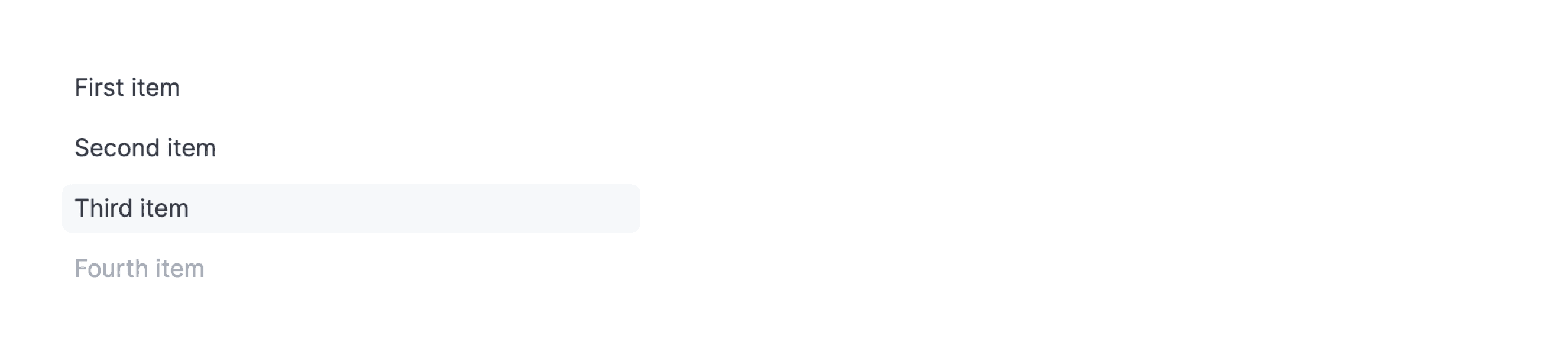
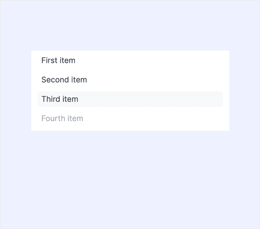
  • Enabled / default

  • Disabled

  • Hover

  • Focus

  • Pressed

  • Dragged

Basic list display, which can carry text, lists, pictures, paragraphs.

  • Small

  • Default

  • Large

  • Default

List groups are a flexible and powerful component for displaying a series of content. Modify and extend them to support just about any content within.

  • Default

  • Normal

  • Hovered

  • Pressed

  • Active

  • Disabled

The EuiListGroup component is used to present EuiListGroupItems in a neatly formatted list. Use the flush and bordered properties for full-width and bordered presentations, respectively.

  • Medium

  • Small

  • X-Small

  • Large

  • Default

  • Active

  • Hover

  • Disabled

An input allows people to enter short, free-form text data.

  • Compact

  • Standard

  • Enabled

  • Disabled

  • Loading

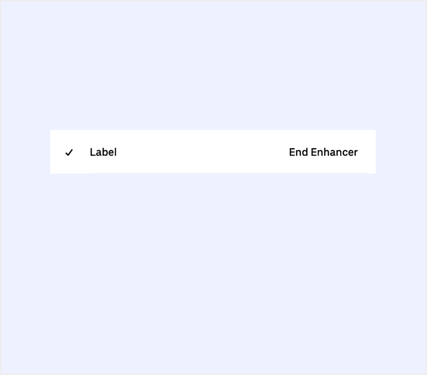
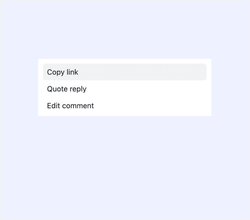
Action list is a vertical list of interactive actions or options. It's composed of items presented in a consistent, single-column format, with room for icons, descriptions, side information, and other rich visuals.

  • Small (default)

  • Medium

  • Large

  • Rest

  • Hover

  • Pressed

  • Focus

  • Disabled

Special Types

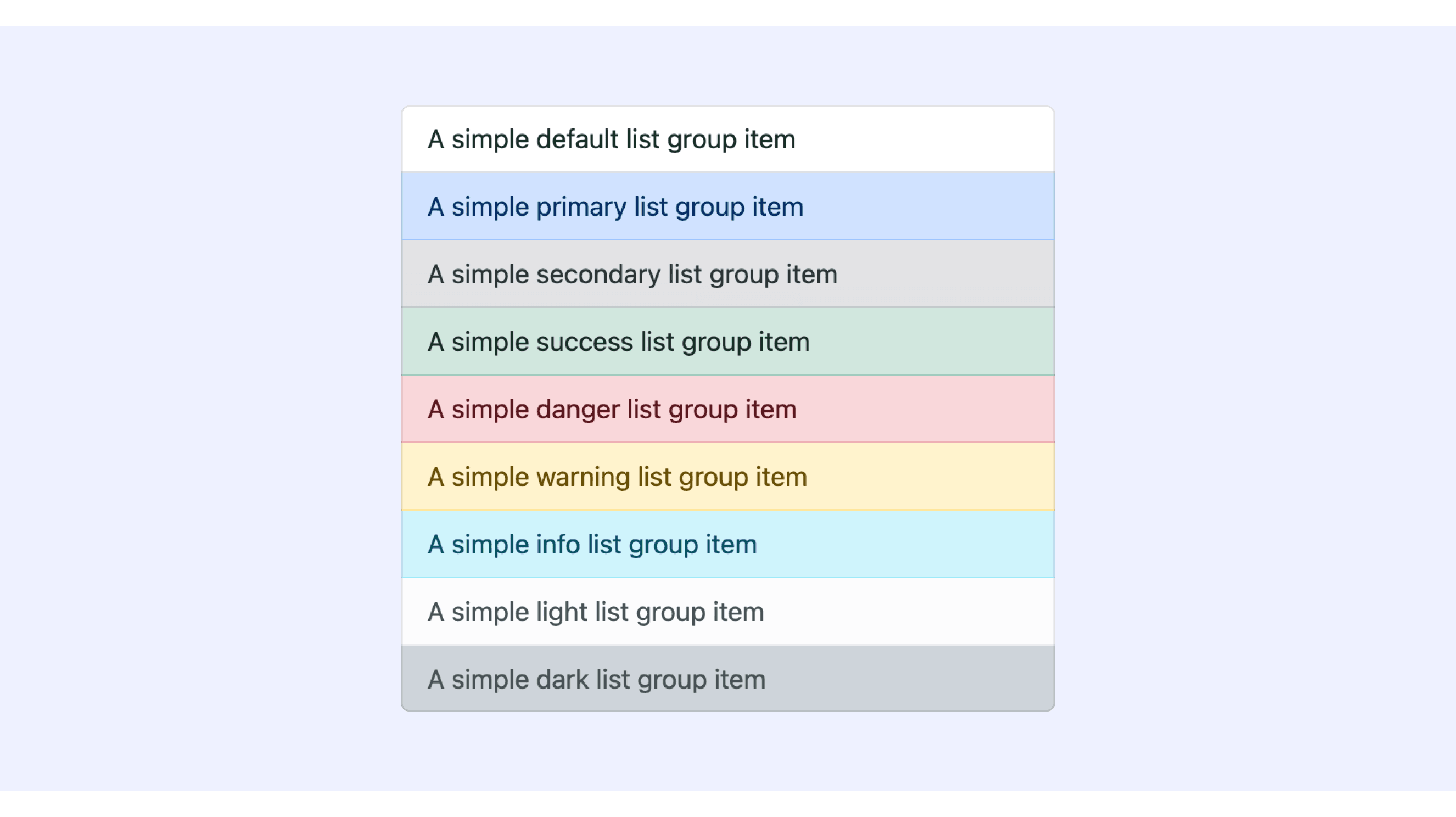
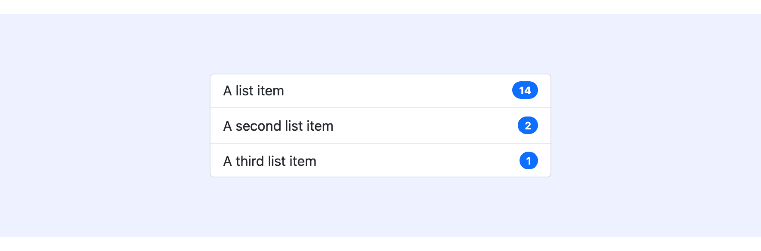
Bootstrap Design System supports “List with colors” and “List with badges”.

  • Use contextual classes to style list items with a stateful background and color.

  • Add badges to any list group item to show unread counts, activity, and more with the help of some utilities.

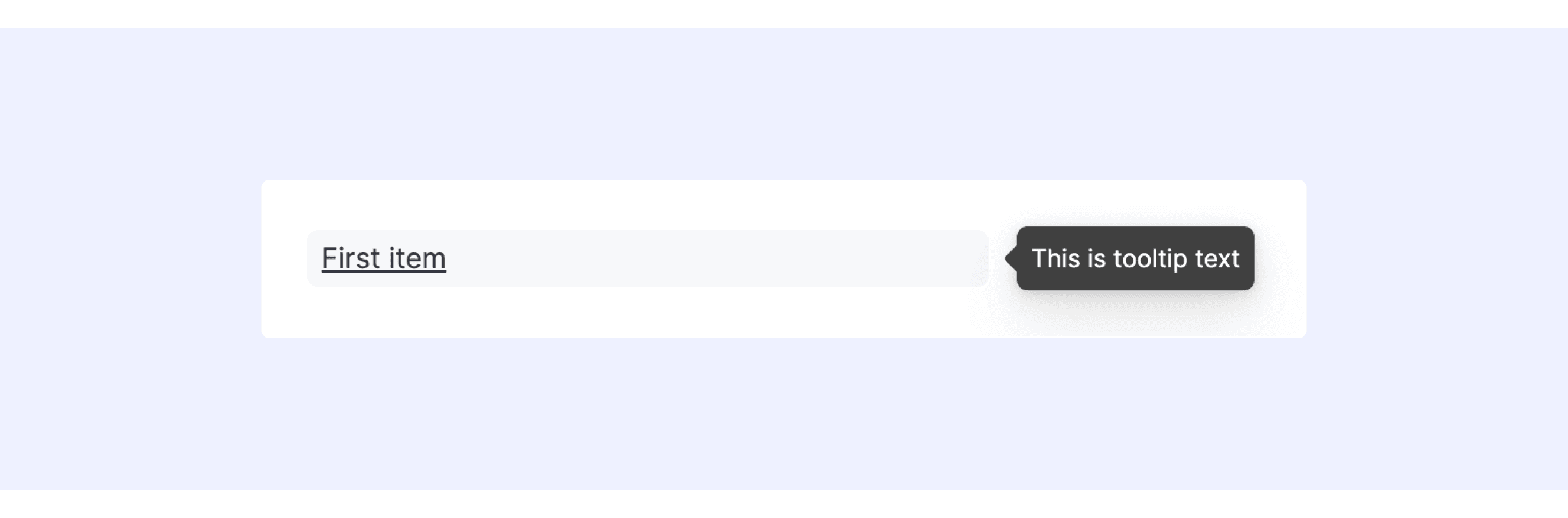
Elastic UI supports “List with text wrapping and tooltips”.

Tooltip text can be used to provide tooltip text. By default, the tooltip will have the text same as the label.

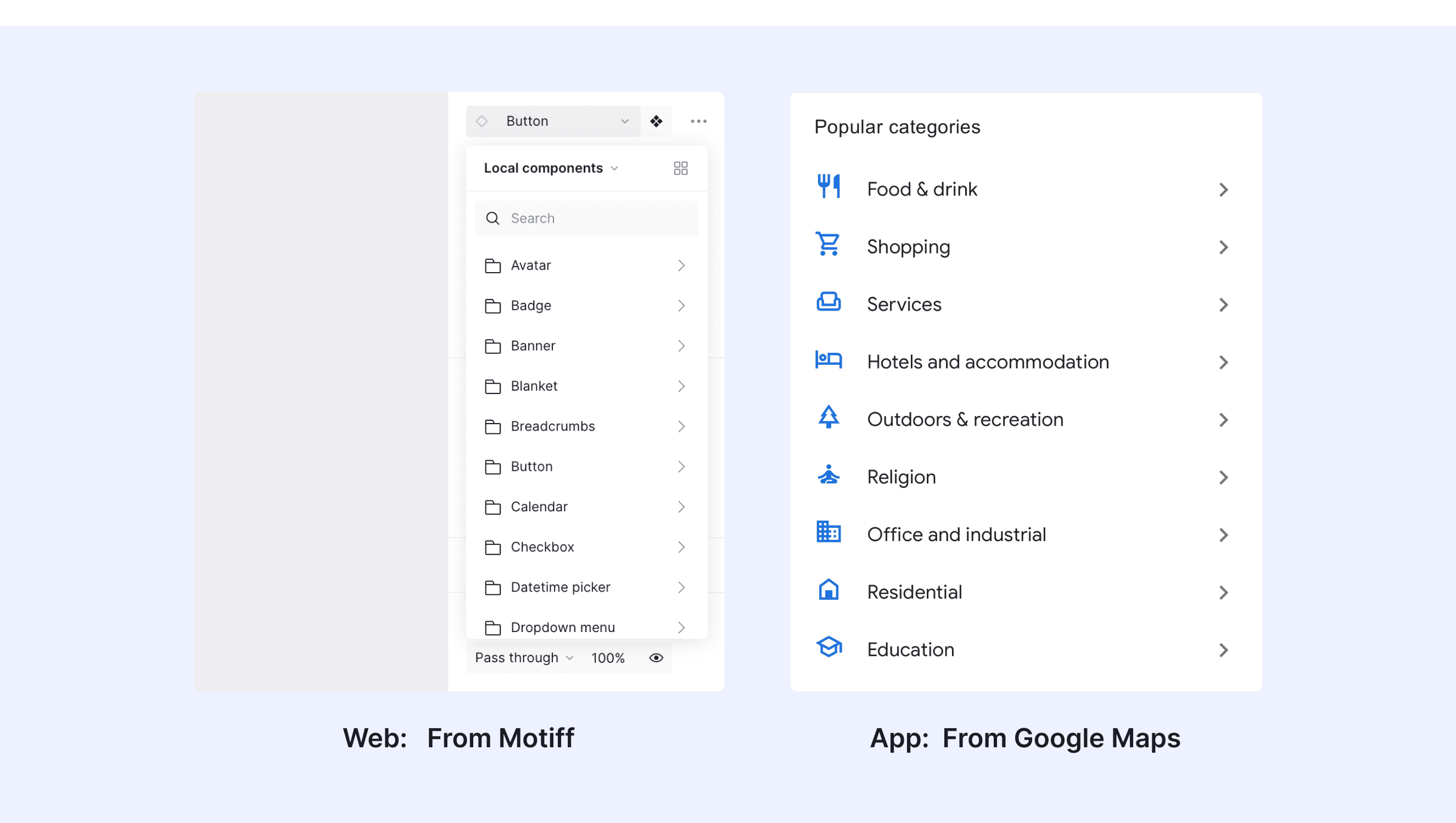
List Template for Motiff

This UIkit file combines a list of designs from Material, Ant, Bootstrap, Elastic UI, Baseweb, and Primer. It showcases their styles, usage, and customization in one place for easy exploration and selection.

Open and edit in Motiff →

List vs. Table: Difference and When to Use

In user interface (UI) design, the terms "list" and "table" are often used interchangeably, but they have distinct meanings, which are adapted from a Core design system discussion.

  • Key Differences

    • Table: A table organizes data in rows and columns, making it suitable for data comparison, grouping, and calculations. It supports both horizontal and vertical scrolling, with content displayed in a uniform structure.

    • List: A list displays related items in a vertically stacked format, making it better for quick browsing, showing parent-child relationships, or incorporating visual elements. It offers a more flexible and simplified layout.

  • Use Cases

    • Table: When you need to compare, group, sort, or edit data, or when all data needs to be displayed at once for calculations, a table is the better choice.

    • List: When you need to quickly browse high-level data, display parent-child relationships, incorporate visual elements, or require a more flexible layout, a list is the ideal choice.

Accessibility in Different Design Systems

Common Practices

  • Clear Structure: Collections of items use special tags like <ul> and <li> so computers can "read" them properly for people who need help seeing.

  • Keyboard Friendly: You can move through items using keys like Tab or arrow keys, no mouse needed.

  • Easy to See: Focused elements are highlighted with clear colors or borders, so you always know where you are.

  • Works Everywhere: These components look good and are easy to use on phones, tablets, and computers.

Differences Practices

  • Material Design: Distinguishes between light and dark modes and provides more detailed breakdowns for grouped components.

  • Ant Design: Includes options for components to have built-in pagination functionality.

  • Bootstrap: Supports "Collections with colors" and "Collections with badges" for enhanced visual differentiation.

  • Elastic UI: Presents grouped elements in clusters rather than as standalone components.

  • Base Web: The List component is more basic, primarily providing a simple list structure with support for grouping and custom styling.

  • Primer: The Action List focuses more on action-oriented lists, where each list item typically represents an actionable option.

Code Examples

Explore default modal implementations in Ant, Bootstrap, and Elastic UI Design. These examples showcase standard usage, default settings, and core features across design systems.

Ant Design

import React from 'react';
import { Divider, List, Typography } from 'antd';

const data = [
  'Racing car sprays burning fuel into crowd.',
  'Japanese princess to wed commoner.',
  'Australian walks 100km after outback crash.',
  'Man charged over missing wedding girl.',
  'Los Angeles battles huge wildfires.',
];

const App: React.FC = () => (
  <>
    <Divider orientation="left">Default Size</Divider>
    <List
      header={<div>Header</div>}
      footer={<div>Footer</div>}
      bordered
      dataSource={data}
      renderItem={(item) => (
        <List.Item>
          <Typography.Text mark>[ITEM]</Typography.Text> {item}
        </List.Item>
      )}
    />
    <Divider orientation="left">Small Size</Divider>
    <List
      size="small"
      header={<div>Header</div>}
      footer={<div>Footer</div>}
      bordered
      dataSource={data}
      renderItem={(item) => <List.Item>{item}</List.Item>}
    />
    <Divider orientation="left">Large Size</Divider>
    <List
      size="large"
      header={<div>Header</div>}
      footer={<div>Footer</div>}
      bordered
      dataSource={data}
      renderItem={(item) => <List.Item>{item}</List.Item>}
    />
  </>
);

export default App;

Show More

Bootstrap Design

<ul class="list-group">
  <li class="list-group-item">An item</li>
  <li class="list-group-item">A second item</li>
  <li class="list-group-item">A third item</li>
  <li class="list-group-item">A fourth item</li>
  <li class="list-group-item">And a fifth one</li>
</ul>
<ul class="list-group">
  <li class="list-group-item">An item</li>
  <li class="list-group-item">A second item</li>
  <li class="list-group-item">A third item</li>
  <li class="list-group-item">A fourth item</li>
  <li class="list-group-item">And a fifth one</li>
</ul>
<ul class="list-group">
  <li class="list-group-item">An item</li>
  <li class="list-group-item">A second item</li>
  <li class="list-group-item">A third item</li>
  <li class="list-group-item">A fourth item</li>
  <li class="list-group-item">And a fifth one</li>
</ul>
<ul class="list-group">
  <li class="list-group-item">An item</li>
  <li class="list-group-item">A second item</li>
  <li class="list-group-item">A third item</li>
  <li class="list-group-item">A fourth item</li>
  <li class="list-group-item">And a fifth one</li>
</ul>

Elastic UI 

import React, { useState, Fragment } from 'react';

import {

  EuiListGroup,

  EuiListGroupItem,

  EuiSpacer,

  EuiSwitch,

  EuiCode,

  EuiFlexGroup,

  EuiFlexItem,

} from '@elastic/eui';


export default () => {

  const [flushWidth, setFlushWidth] = useState(false);

  const [showBorder, setShowBorder] = useState(false);


  return (

    <Fragment>

      <EuiFlexGroup alignItems="center">

        <EuiFlexItem grow={false}>

          <EuiSwitch

            label={

              <span>

                Show as <EuiCode>flush</EuiCode>

              </span>

            }

            checked={flushWidth}

            onChange={() => setFlushWidth(!flushWidth)}

          />

        </EuiFlexItem>

        <EuiFlexItem grow={false}>

          <EuiSwitch

            label={

              <span>

                Show as <EuiCode>bordered</EuiCode>

              </span>

            }

            checked={showBorder}

            onChange={() => {

              setShowBorder(!showBorder);

            }}

          />

        </EuiFlexItem>

      </EuiFlexGroup>


      <EuiSpacer size="l" />


      <EuiListGroup flush={flushWidth} bordered={showBorder}>

        <EuiListGroupItem onClick={() => {}} label="First item" />


        <EuiListGroupItem onClick={() => {}} label="Second item" />


        <EuiListGroupItem onClick={() => {}} label="Third item" isActive />


        <EuiListGroupItem onClick={() => {}} label="Fourth item" isDisabled />

      </EuiListGroup>

    </Fragment>

  );

};

Show More

Try AI Design Systems

Create, maintain, and check your design systems with AI in one click.

Try AI Design Systems

Create, maintain, and check your design systems with AI in one click.

Try AI Design Systems

Create, maintain, and check your design systems with AI in one click.

Try AI Design Systems

Create, maintain, and check your design systems with AI in one click.

Try AI Design Systems

Create, maintain, and check your design systems with AI in one click.