What is Modal
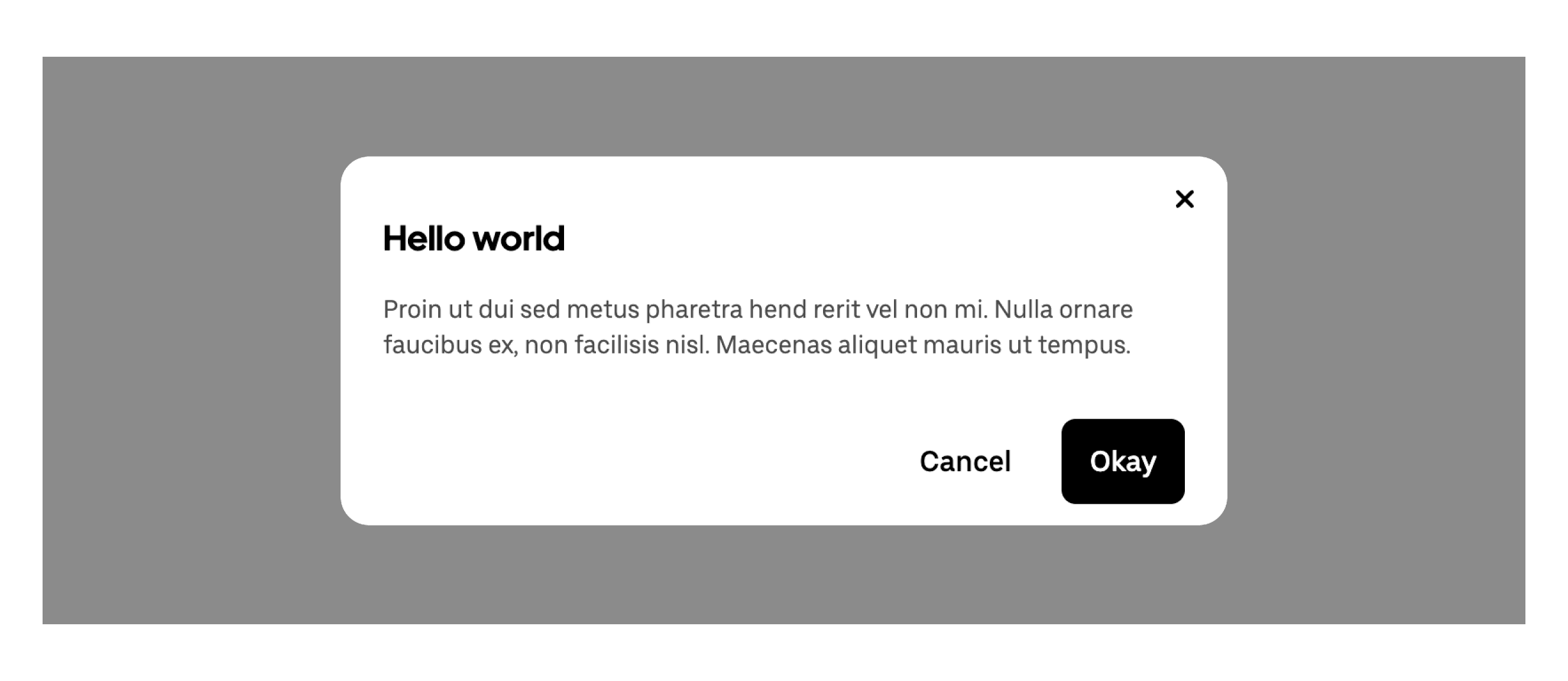
A modal is a pop-up window that shows important information or asks for user input. It blocks the main page until you finish or close it. Modals should be used carefully to avoid interrupting users too much.
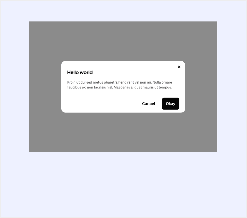
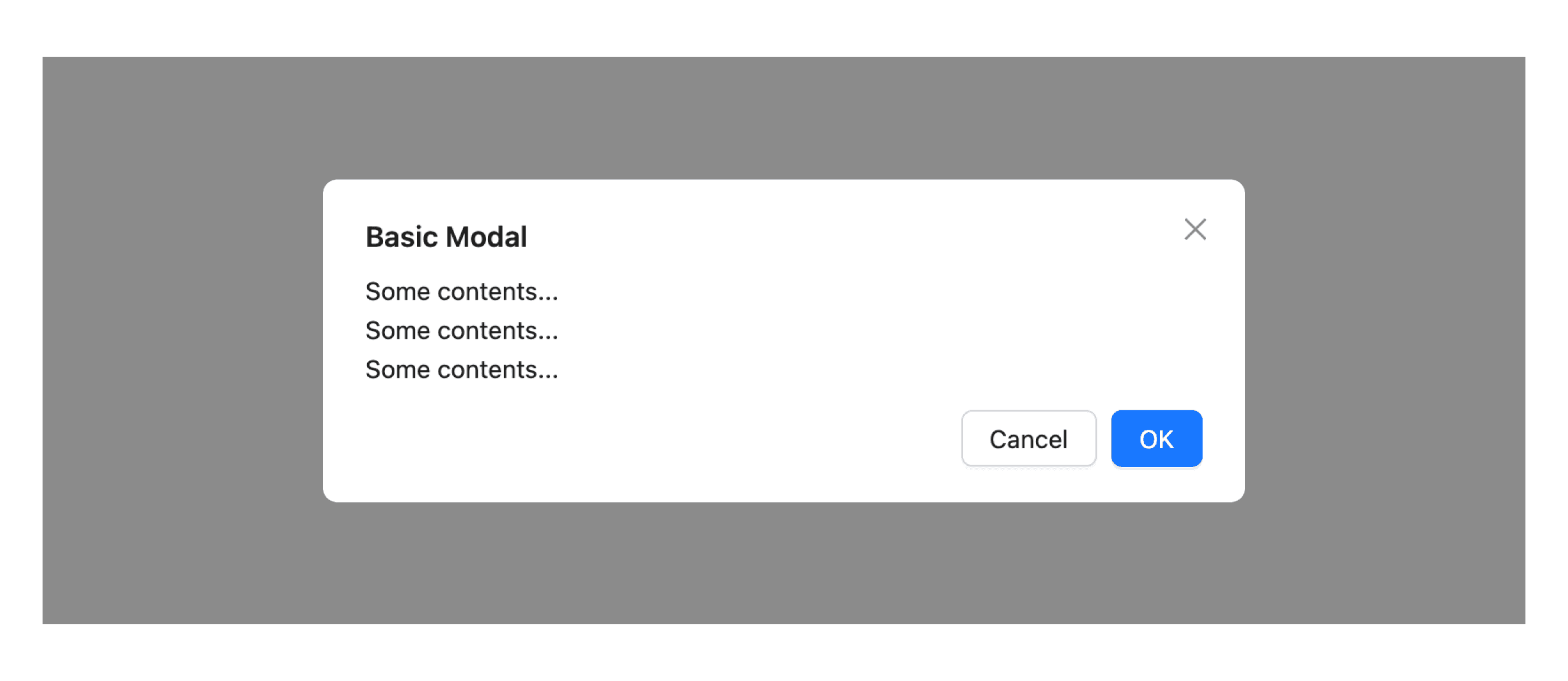
Anatomy Modal
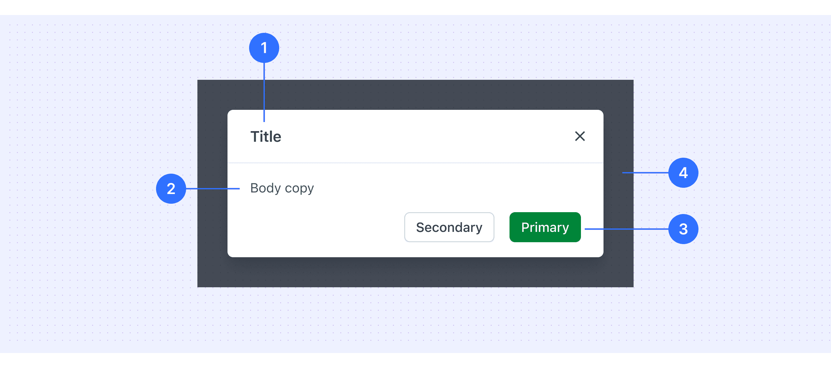
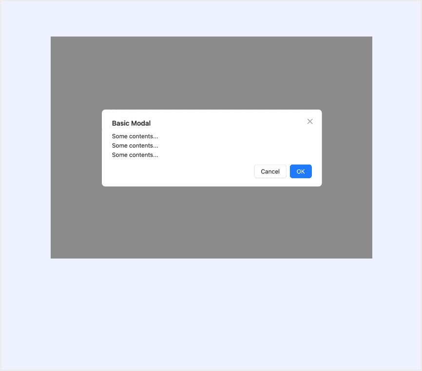
Header: Includes a title, optional label, and the close icon.
Body: Contains the information and controls, or both that are needed to complete the modal’s task. It can include message text and components.
Footer: Contains the main actions needed to complete or cancel the modal task. Button groupings change based on the modal variant.
Overlay: Screen overlay that obscures the on-page content.
Core features
Overlay Effect: Modals appear on top of the main screen, dimming the background and preventing interaction with it to keep focus on the modal.
Blocking Interaction: Users can’t interact with the page until they complete or close the modal.
Clear Call-to-Action: Modals include action buttons like "Confirm," "Cancel," or "Close."
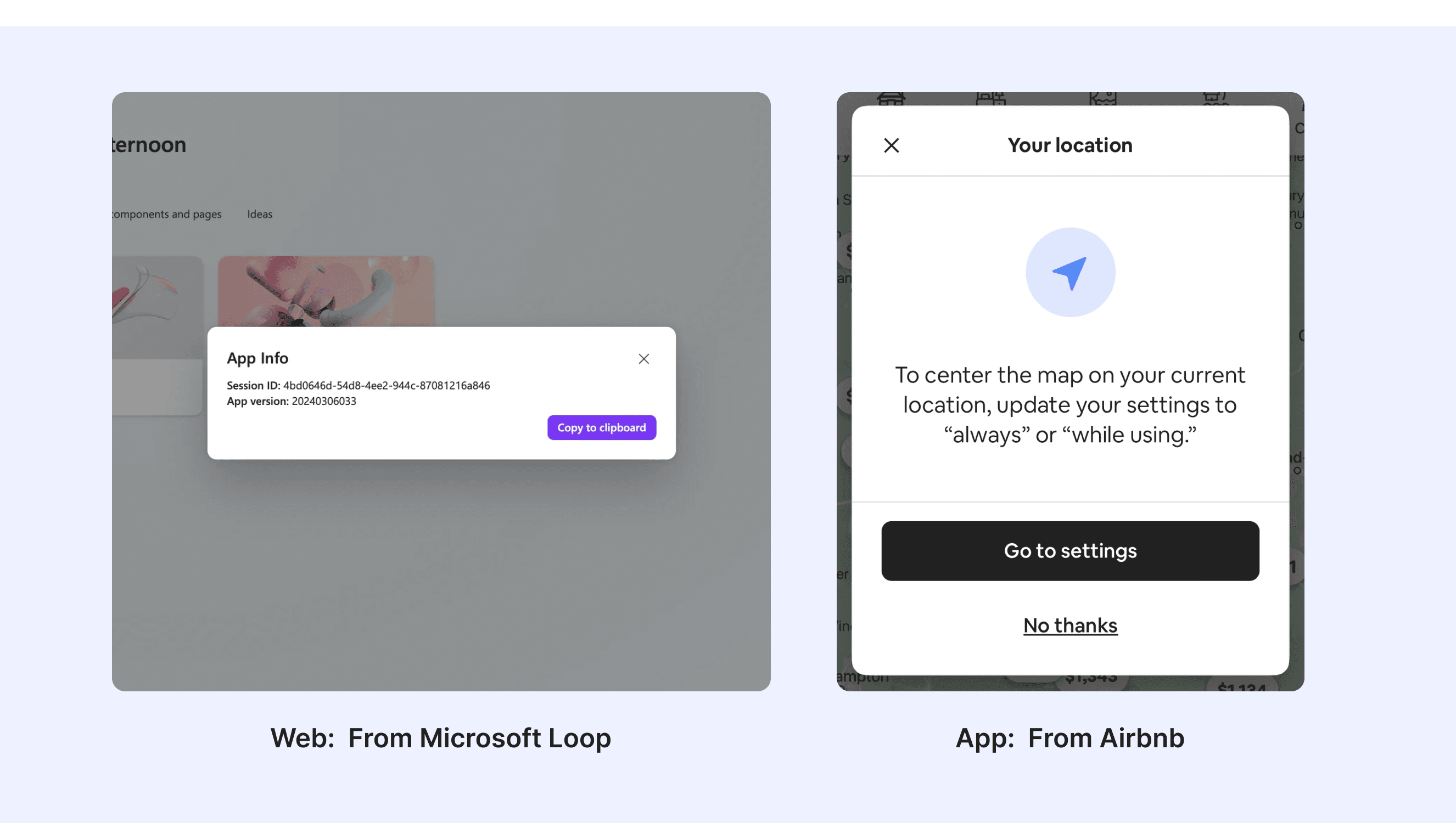
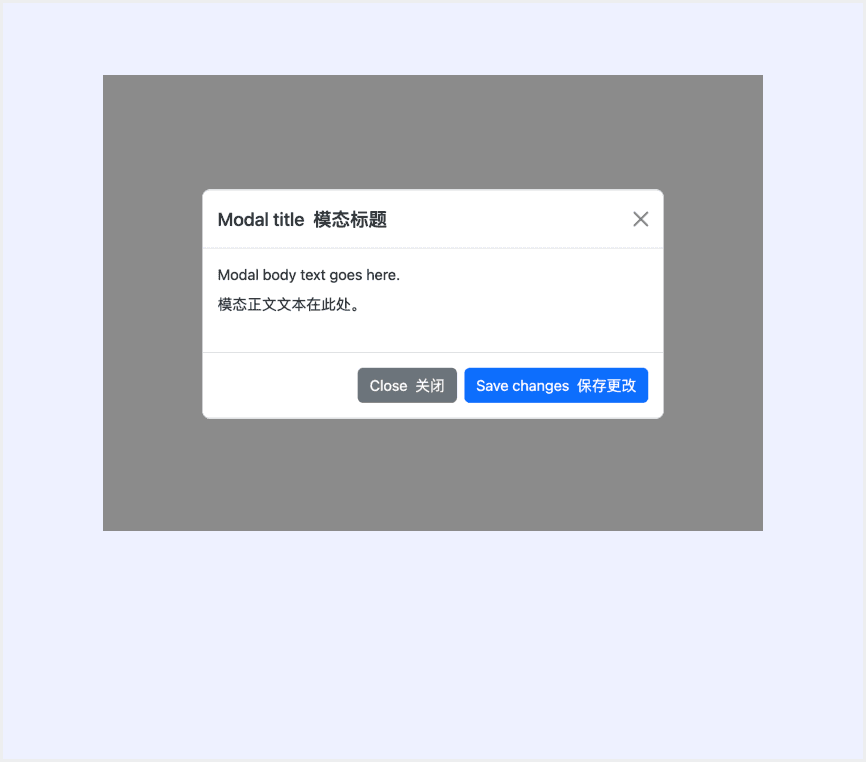
Content Flexibility: Modals can display forms, messages, images, videos, etc.
Comparison of Usage in Popular Design Systems
Now, let's look at how some well-known design systems define and implement modals:
Discover how models are implemented across different design systems like Polaris Design, Carbon Design, Ant Design, etc. Look at their features and rules, like size, and close method to choose the best fit for your project.
Default Styles
Enumerates the default appearances of tooltips across various design systems, highlighting their visual characteristics and usability.
Features comparison in Design Systems
Comparing modals in Polaris, Carbon, Ant, Base Web, Forma 36, and Bootstrap shows differences in size and closing methods. Some support custom modal sizes, while others do not.
Design System
Defines
Size
Close Method
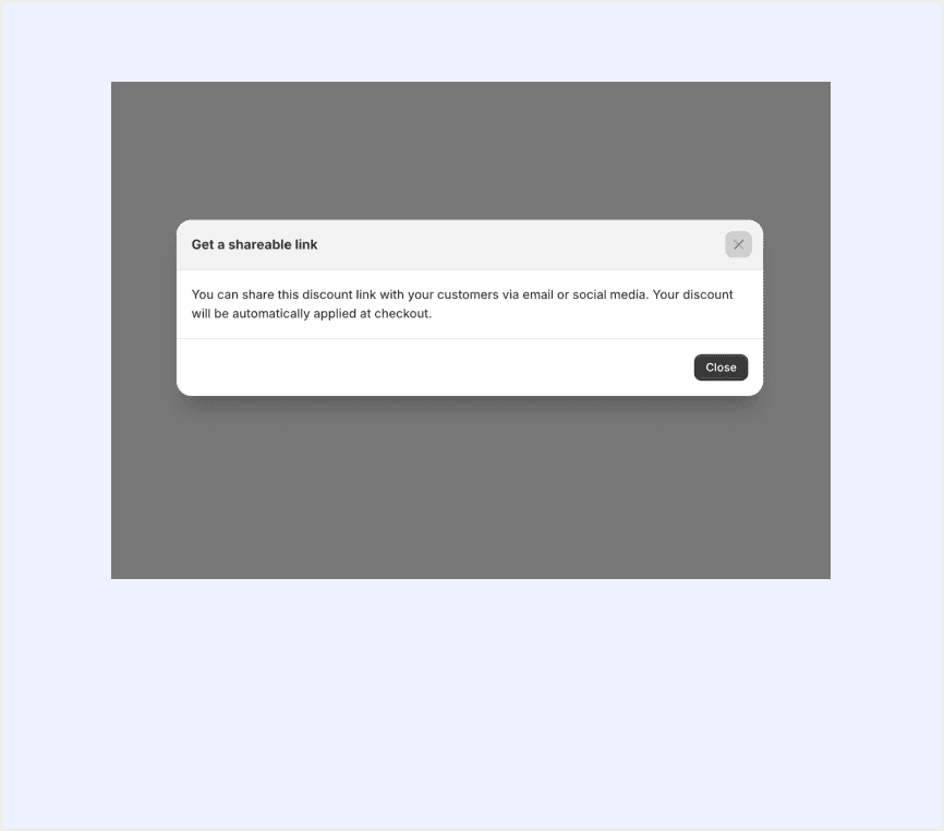
Modals are overlays that require merchants to take an action before they can continue interacting with the rest of Shopify. They can be disruptive and should be used thoughtfully and sparingly.
Large
Small
Close Button
Click elsewhere
Esc
Modals focus the user’s attention exclusively on one task or piece of information by using a window that is displayed on top of the page content.
Extra small
Small
Medium
Large
Close Button
Click elsewhere
Esc
Display a modal dialog box, providing a title, content area, and action buttons.
The modal size can be freely adjusted based on the content.
Close Button
Click elsewhere
Esc
Automatically close after a certain period of time
A design structure to organize and hide content, so as not to overwhelm the user.
Default
Full
Auto
Close Button
Click elsewhere
Esc
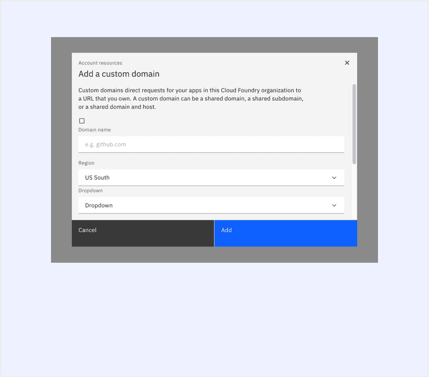
Modal appears on top of the main content and moves the system into a special mode requiring user interaction. It blocks interaction with the main content until an action is taken.
Small
Medium
Large
Full width
Full screen
Specific width value
Close Button
Click elsewhere
Esc
Use Bootstrap’s JavaScript modal plugin to add dialogs to your site for lightboxes, user notifications, or completely custom content.
Small
Default
Large
Extra large
Close Button
Click elsewhere (When backdrop is set to static, the modal will not close when clicking outside of it. )
Esc
Special Types
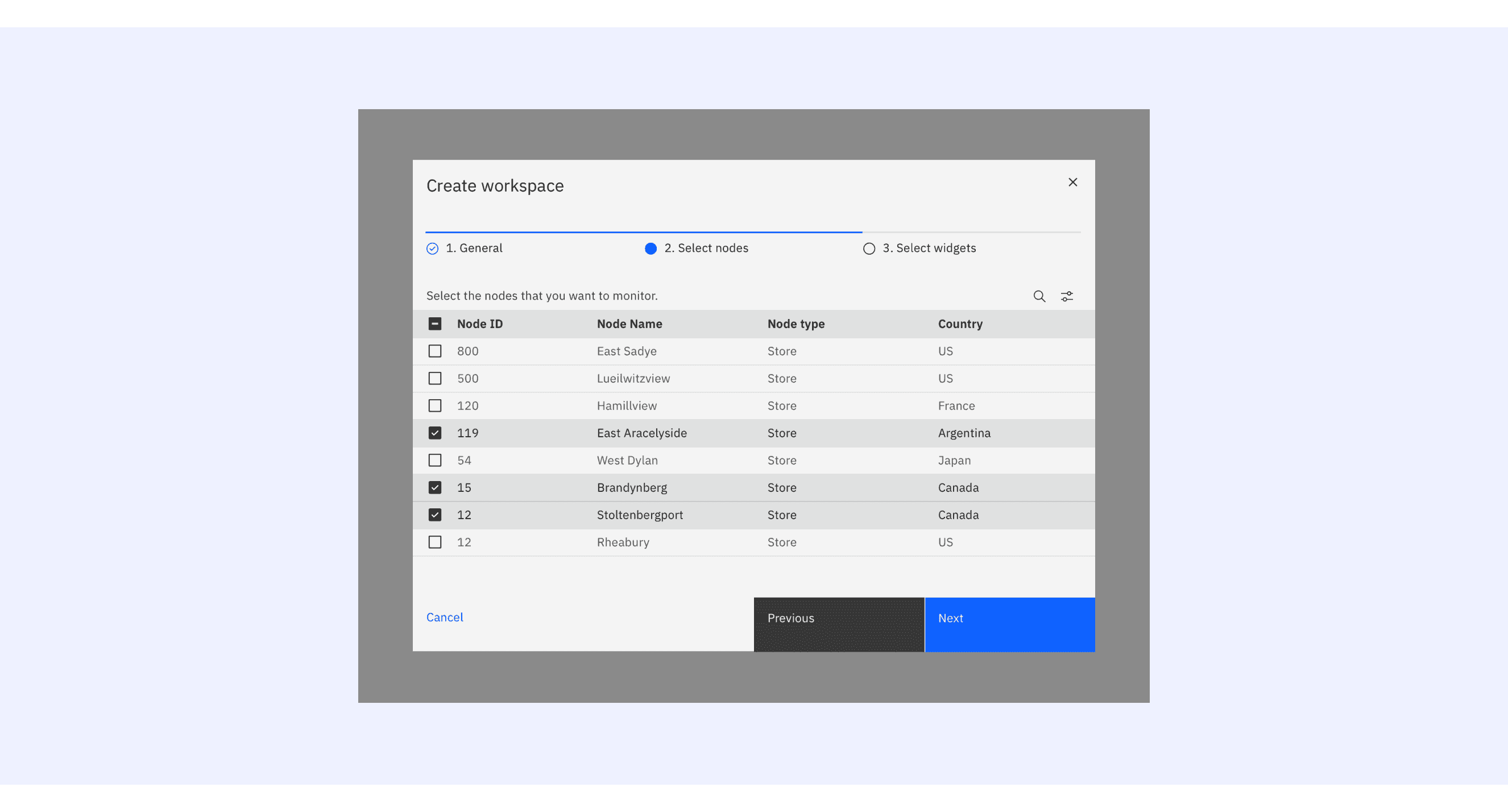
Carbon Design System supports “progress modal”.
There are three buttons in the progress modal footer: Cancel, Previous, and Next. The Next button label should change to reflect the final action.
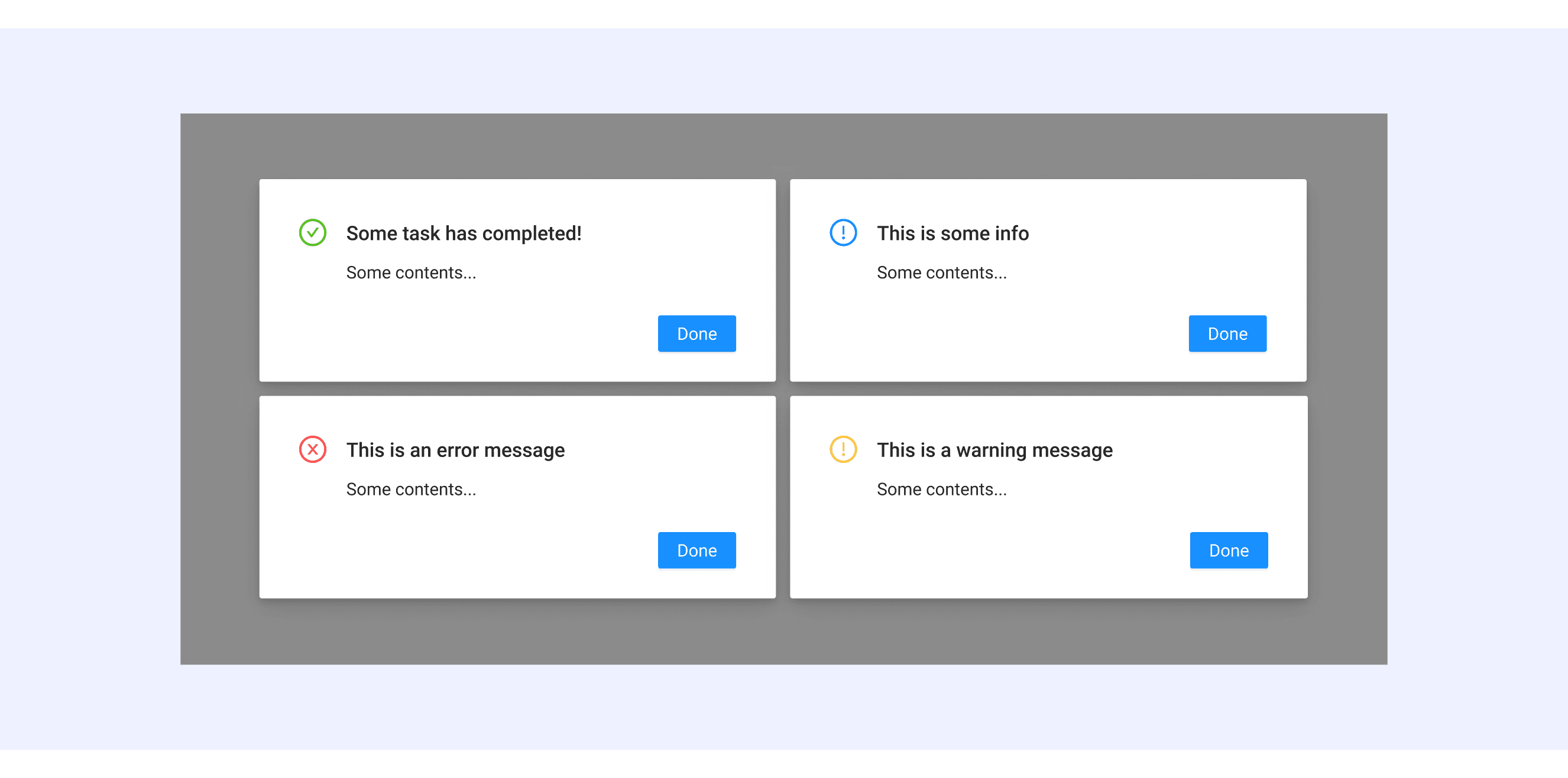
Ant Design distinguishes modals based on the nature of the content.
There are five ways to display the information based on the content's nature.
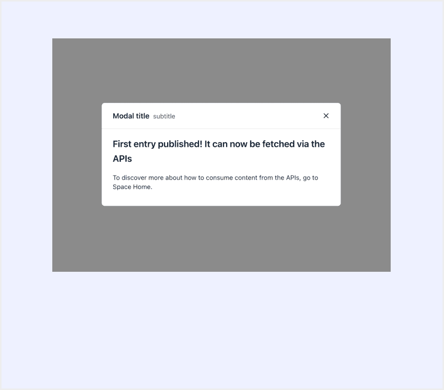
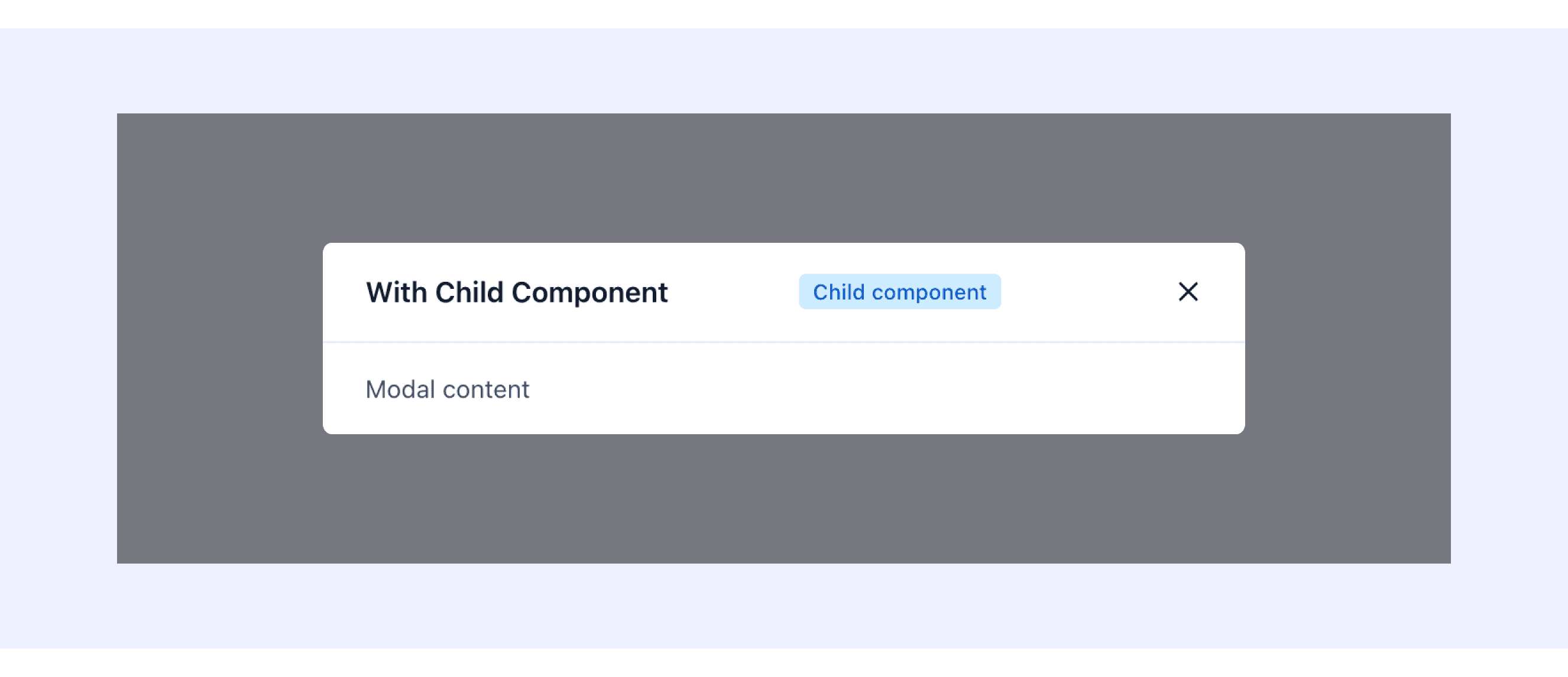
Forma 36 Design System supports Modal with child component in header.
It can add extra components in the header.
Modal Template for Motiff
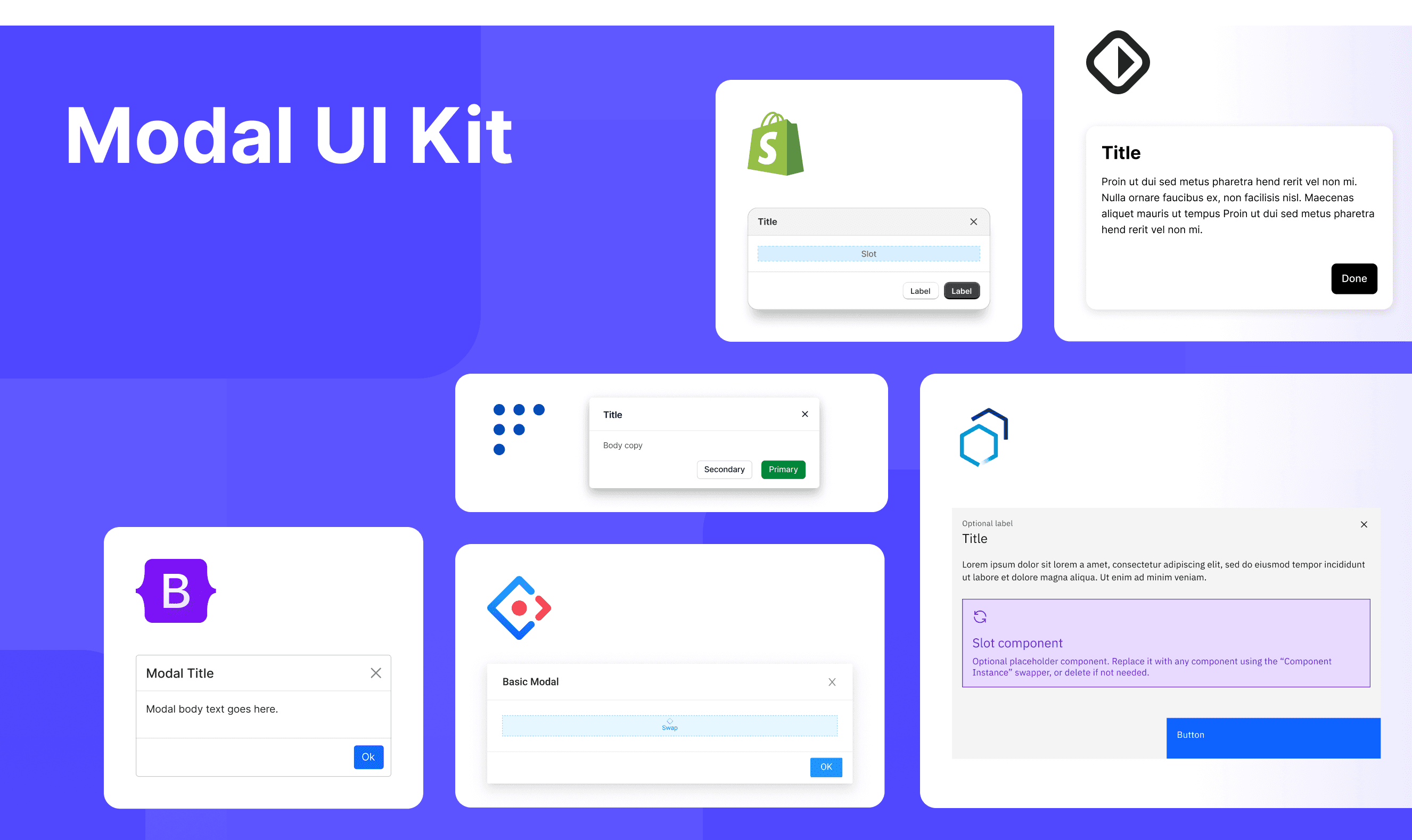
This UIkit file combines modal designs from Polaris, Carbon, Base Web, Forma 36, Bootstrap, and Ant Design. It showcases their styles, usage, and customization in one place for easy exploration and selection.
Modal vs. Dialog: Difference and When to Use
In user interface (UI) design, the terms "modal" and "dialog" are often used interchangeably, but they have distinct meanings, which are adapted from a DEV Community discussion.
Interaction Blocking:
Modal: Modal blocks the main interface. Users must handle or close it before continuing with the main interface.
Dialog: Dialog doesn’t always block the main interface. Non-modal dialogs let users interact with the main interface.
Use Case:
Modal: Modal is used when the user’s full attention is needed, like for confirmations, error messages, or login.
Dialog: Dialog has broader uses, like showing information, filling forms, or handling multi-step tasks. It can block or not block the main interface.
Definition Scope:
Modal: Modal is a type of dialog that forces user interaction.
Dialog: Dialog is a broader term that includes both modal and non-modal types.
User Interaction Focus:
Modal: Modal makes users focus on its content and requires action before continuing other tasks.
Dialog: Non-modal dialogs let users keep interacting with other content while the dialog is open.
Accessibility in Different Design Systems
Common Practices
Focus Management: When a modal opens, focus shifts to the first interactive element and returns to the trigger when closed.
Content Masking: A transparent layer covers the background to highlight the modal and block background interaction.
Content Adaptation: Long content adds a scrollbar inside the modal instead of scrolling the whole page.
Differences Practices
Polaris (Shopify): Limits footers to two buttons (primary and secondary) to avoid clutter, especially on mobile.
Carbon (IBM): Supports specialized modals, like progress modals.
Ant Design: Modal size is fully adjustable based on content.
Base Web: Supports nested modals and buried interactive elements.
Forma 36: Allows extra child components in the header.
Bootstrap (Twitter): Static backdrops prevent closing on outside clicks.
Code Examples
Explore default modal implementations in Polaris Design, Carbon Design System, Base Web, Forma 36, and Ant Design. These examples showcase standard usage, default settings, and core features across design systems.
Shopify Polaris(Shopity)
Carbon Design System
Ant Design
Base Web