Share This Post

复制链接
分享至X
分享至 LinkedIn
分享至 Facebook

Popover

Share This Post

复制链接
分享至X
分享至 LinkedIn
分享至 Facebook

Share This Post

复制链接
分享至X
分享至 LinkedIn
分享至 Facebook

Popover

Share This Post

复制链接
分享至X
分享至 LinkedIn
分享至 Facebook

Share This Post

复制链接
分享至X
分享至 LinkedIn
分享至 Facebook

Popover

Share This Post

复制链接
分享至X
分享至 LinkedIn
分享至 Facebook

What is Popover

A popover is a small, temporary UI element that shows up when a user clicks or hovers on something. It gives extra information or actions without leaving the current page. Popovers are simple, easy to close, and don’t block the main content.
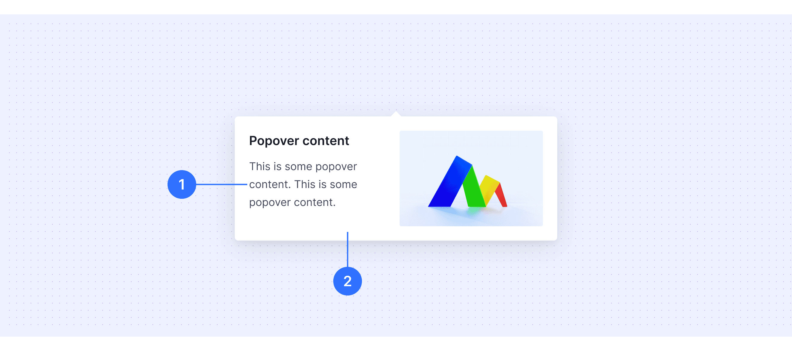
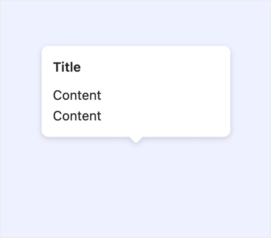
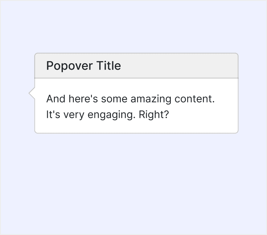
Anatomy Popover

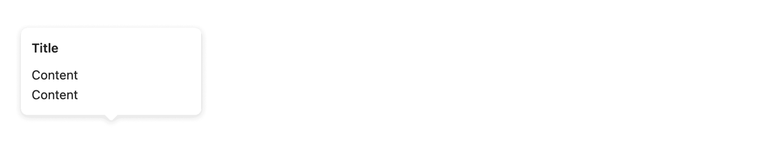
  • Content area: The area used to place text and interactive elements (such as text, paragraphs, links, buttons, images, etc.).

  • Container: The background container of the popover card, used to hold the text and interactive elements.

Core features

  • Temporary and Contextual: These floating elements appear temporarily and provide extra information or actions related to a specific element or user interaction.

  • Trigger-Based: They are activated by user actions, such as clicking, hovering, or focusing on a particular element.

  • Lightweight and Non-Intrusive: They are simple and don’t get in your way, so you can keep doing what you’re working on without being distracted.

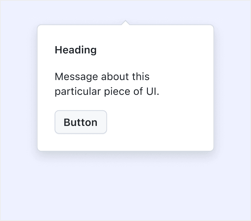
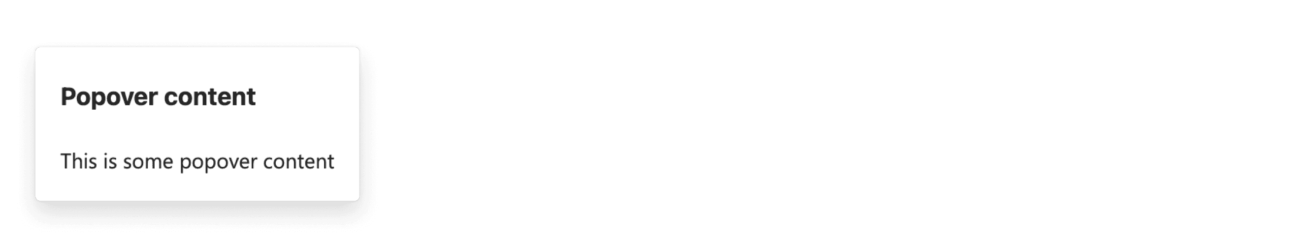
  • Content Flexibility: Popovers can contain various types of content, such as text, buttons, links, images, or forms.

Comparison of Usage in Popular Design Systems

Now, let's look at how some well-known design systems define and implement popovers:

Discover how popovers are implemented across different design systems like Fluent Design, Carbon Design, Ant Design, etc. Look at their features and rules, like size, and close method to choose the best fit for your project.

Default Styles

Enumerates the default appearances of popovers across various design systems, highlighting their visual characteristics and usability.

Fluent Design System

Fluent Design System

Fluent Design System

Fluent Design System

Ant Deisgn System

Ant Deisgn System

Ant Deisgn System

Ant Deisgn System

HIG Deisgn System

HIG Deisgn System

HIG Deisgn System

HIG Deisgn System

Carbon Deisgn System

Carbon Deisgn System

Carbon Deisgn System

Carbon Deisgn System

Primer Deisgn System

Primer Deisgn System

Primer Deisgn System

Primer Deisgn System

Bootstrap Deisgn System

Bootstrap Deisgn System

Bootstrap Deisgn System

Bootstrap Deisgn System

Features comparison in Design Systems

Comparing popovers in Fluent 2, Ant, HIG, Primer, Carbon, and Bootstrap shows differences in position and trigger methods. 

Design System

Defines

Position

Trigger Method

A popover is a small surface that appears when someone interacts with a component to give nonessential, contextual information without blocking them.

  • Top

  • Bottom

  • Left

  • Right

Support click-triggered popover

The floating card pops up when clicking/mouse hovering over an element.

  • Bottom left  

  • Right  

  • Right bottom  

  • Top right  

  • Right top  

  • Bottom  

  • Left  

  • Left top  

  • Left bottom  

  • Top left  

  • Bottom right  

  • Top

  • Mouse to click

  • Focus

  • Move in

A popover is a transient view that appears above other content when people click or tap a control or interactive area.

  • North 

  • East 

  • South 

  • West 

Support click-triggered popover

A popover is a layer that pops up over all other elements on a page.

  • Left

  • Right

  • Bottom

  • Top

  • Click

  • Hover

  • Focus

  • Manual

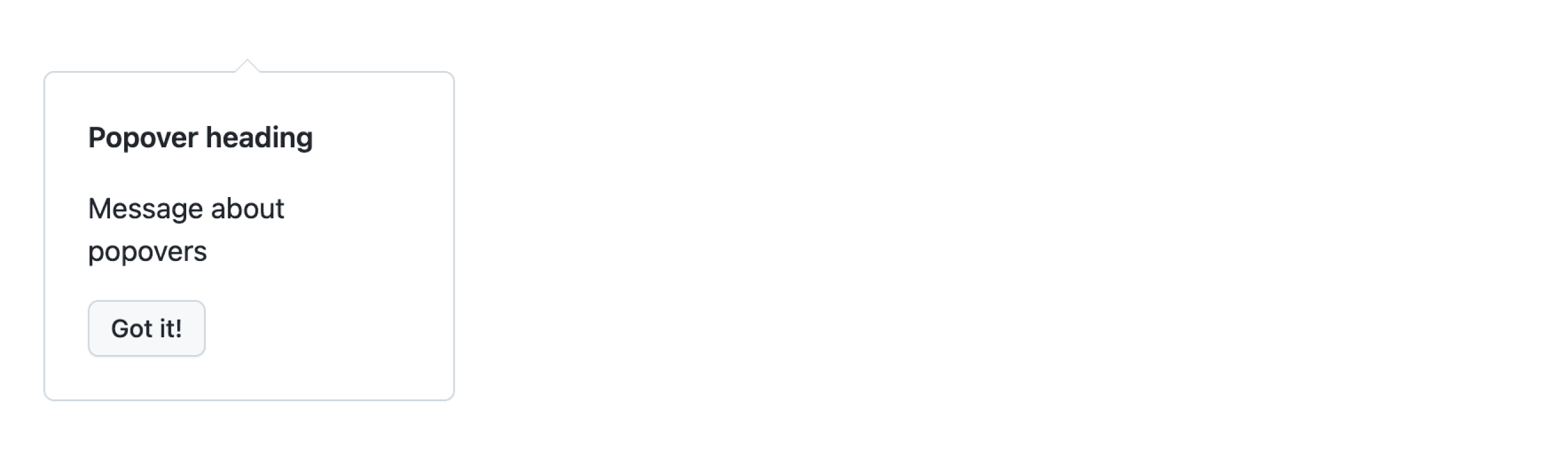
Popover is used to bring attention to specific user interface elements.

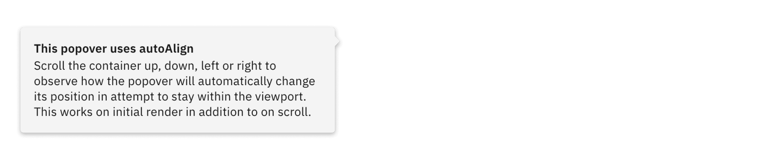
Popover supports various caret positions, which you can specify, though the default is top. 

Popovers should be operable using the keyboard alone, without requiring the use of a mouse or other pointing device.

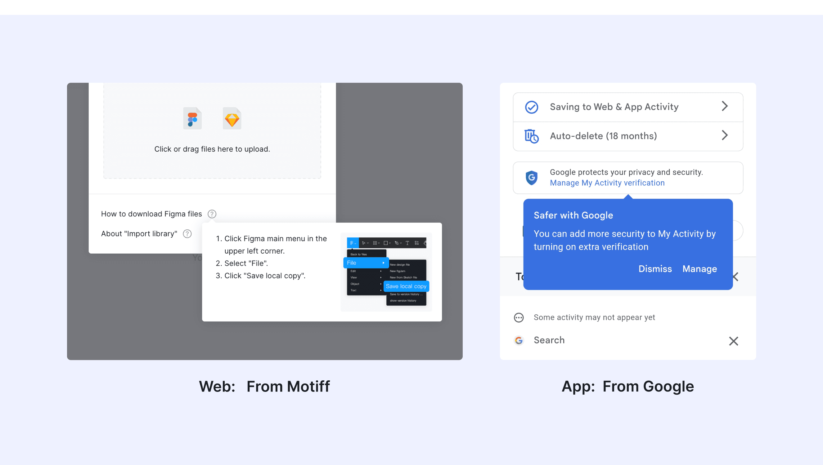
Documentation and examples for adding Bootstrap popovers, like those found in iOS, to any element on your site.

  • Top

  • Bottom

  • Left

  • Right

  • Hover

  • Focus

Special Types

Carbon Design System supports “popover that supports nested placement”.

Tab tip popovers nest within another layer on a page. The tab tip can appear on the left and right of the container and the edges should be flush with the layer edges it sits within.

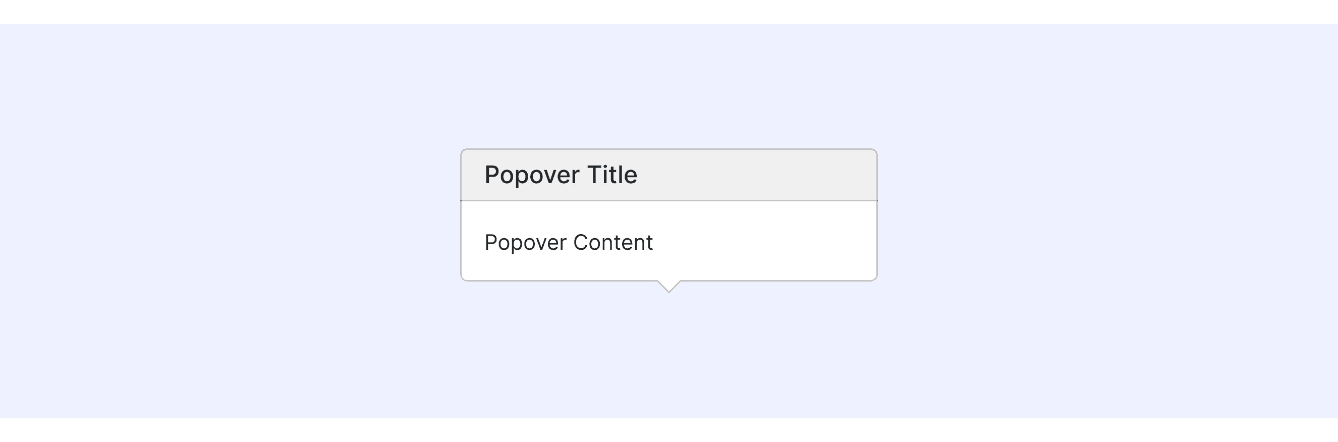
Bootstrap Design supports “popover with a header”.

There are two main types of Bootstrap: popovers with a title and without a title.

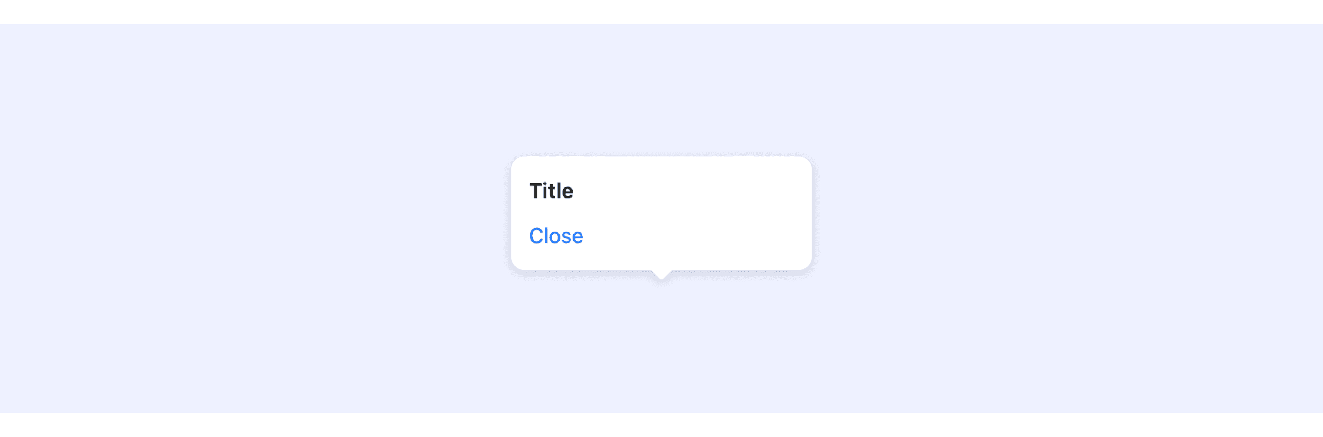
Ant Design System supports popover with close button.

User can use open prop to control the display of the card.

Popover Template for Motiff

This UIkit file combines popover designs from Fluent, Ant, Apple HIG, Carbon, Primer, and Bootstrap design. It showcases their styles, usage, and customization in one place for easy exploration and selection.

Open and edit in Motiff →

Popover vs Tooltip: Difference and When to Use

Tooltips and Popovers are both tools used to give extra information in a user interface. While they might seem similar, they have clear differences in how they work, when to use them, and how they look.

When deciding between a Tooltip and a Popover, you can explore these key differences, which are summarized from Stack Overflow discussion.

Accessibility in Different Design Systems

Common Practices

  • Trigger Methods: Supports multiple trigger methods, including click, hover, and keyboard interactions, ensuring accessibility for different user groups.

  • Dismissal Mechanisms: Pop-ups usually give you several ways to close them, like clicking outside the pop-up, pressing the Escape key on the keyboard, or clicking a "close" button.

  • ARIA Attributes Usage: Many designs use a special code called aria-haspopup="true" to tell the computer that this button opens a pop-up. This helps tools for people with disabilities understand what’s happening.

Differences Practices

  • Fluent UI: By default, it supports click-to-trigger but can be configured to support hover-trigger as well.

  • Ant Design: Ant Design’s tooltip is simple. By default, it doesn’t lock your focus inside the tooltip, but you can change how it shows up by using the "trigger" setting.

  • Apple HIG: Apple’s design rules make sure things look the same and are easy to use. They have clear instructions about where floating panels should go and what they should say.

  • Carbon Design System: In Carbon Design, floating tabs can be placed inside another layer on the page. This makes it easier to arrange things the way you want.

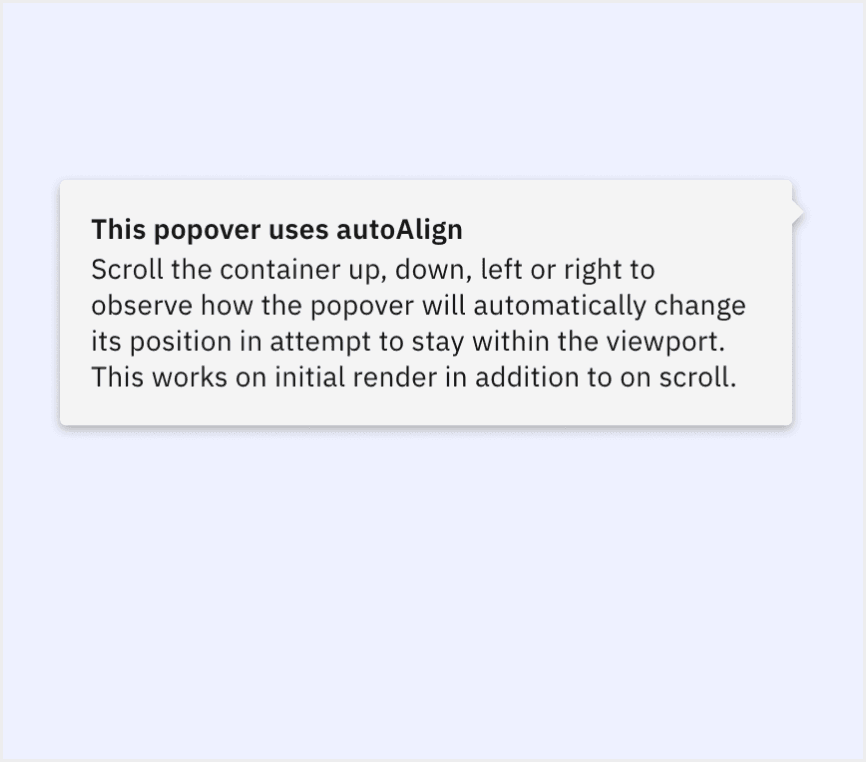
  • Primer Design: Primer's components automatically adjust their position based on the page layout to prevent them from overflowing or going outside the screen boundaries.

  • Bootstrap: Allows users to customize the appearance of floating elements, including titles, colors, and more.

Code Examples

Explore default popoverl implementations in Fluent, Ant, Carbon, and Primer design. These examples showcase standard usage, default settings, and core features across design systems.

Fluent

import {
  makeStyles,
  Button,
  Popover,
  PopoverSurface,
  PopoverTrigger,
  PopoverProps,
} from "@fluentui/react-components";
import * as React from "react";

const useStyles = makeStyles({
  contentHeader: {
    marginTop: "0",
  },
});

const ExampleContent = () => {
  const styles = useStyles();
  return (
    <div>
      <h3 className={styles.contentHeader}>Popover content</h3>

      <div>This is some popover content</div>
    </div>
  );
};

export const Default = (props: PopoverProps) => (
  <Popover {...props}>
    <PopoverTrigger disableButtonEnhancement>
      <Button>Popover trigger</Button>
    </PopoverTrigger>

    <PopoverSurface>
      <ExampleContent />
    </PopoverSurface>
  </Popover>
);

Show More

Ant Design

import React from 'react';
import { Button, Popover } from 'antd';

const content = (
  <div>
    <p>Content</p>
    <p>Content</p>
  </div>
);

const App: React.FC = () => (
  <Popover content={content} title="Title">
    <Button type="primary">Hover me</Button>
  </Popover>
);

export default App;

Show More

Carbon design

{
  render: () => {
    const handleClick = id => {
      const popover = document.querySelector(id);
      const open = popover?.hasAttribute('open');
      open ? popover?.removeAttribute('open') : popover?.setAttribute('open', '');
    };
    return html`
      <style>
        ${styles}
      </style>
      <div class="popover-tabtip-story" style="display: 'flex'">
        <cds-popover open tabTip id="popover-one">
          <button
            aria-label="Settings"
            type="button"
            @click="${() => handleClick('#popover-one')}">
            ${Settings16()}
          </button>
          <cds-popover-content>
            <div class="p-3">
              <cds-form-item>
                <cds-radio-button-group
                  legend-text="Row height"
                  name="radio-button-group"
                  value="small"
                  style="align-items: flex-start; flex-direction: column">
                  <cds-radio-button
                    label-text="Small"
                    value="small"
                    id="radio-small"></cds-radio-button>
                  <cds-radio-button
                    label-text="Large"
                    value="large"
                    id="radio-large"></cds-radio-button>
                </cds-radio-button-group>
              </cds-form-item>
              <hr />
              <fieldset class="${prefix}--fieldset">
                <legend class="${prefix}--label">Edit columns</legend>
                <cds-checkbox
                  checked
                  label-text="Name"
                  id="checkbox-label-1"></cds-checkbox>
                <cds-checkbox
                  checked
                  label-text="Type"
                  id="checkbox-label-2"></cds-checkbox>
                <cds-checkbox
                  checked
                  label-text="Location"
                  id="checkbox-label-3"></cds-checkbox>
              </fieldset>
            </div>
          </cds-popover-content>
        </cds-popover>
        <cds-popover tabTip id="popover-two" align="bottom-right">
          <button
            aria-label="Settings"
            type="button"
            @click="${() => handleClick('#popover-two')}">
            ${Settings16()}
          </button>
          <cds-popover-content>
            <div class="p-3">
              <cds-form-item>
                <cds-radio-button-group
                  legend-text="Row height"
                  name="radio-button-group"
                  value="small"
                  style="align-items: flex-start; flex-direction: column">
                  <cds-radio-button
                    label-text="Small"
                    value="small"
                    id="radio-small"></cds-radio-button>
                  <cds-radio-button
                    label-text="Large"
                    value="large"
                    id="radio-large"></cds-radio-button>
                </cds-radio-button-group>
              </cds-form-item>
              <hr />
              <fieldset class="${prefix}--fieldset">
                <legend class="${prefix}--label">Edit columns</legend>
                <cds-checkbox
                  checked
                  label-text="Name"
                  id="checkbox-label-1"></cds-checkbox>
                <cds-checkbox
                  checked
                  label-text="Type"
                  id="checkbox-label-2"></cds-checkbox>
                <cds-checkbox
                  checked
                  label-text="Location"
                  id="checkbox-label-3"></cds-checkbox>
              </fieldset>
            </div>
          </cds-popover-content>
        </cds-popover>
      </div>
    `;
  }
}

Show More

Primer

() => (
  <Popover relative open={true} caret="top">
    <Popover.Content
      sx={{
        marginTop: 2,
      }}
    >
      <Heading
        sx={{
          fontSize: 2,
        }}
      >
        Popover heading
      </Heading>
      <Text as="p">Message about popovers</Text>
      <Button>Got it!</Button>
    </Popover.Content>
  </Popover>
)

Show More

Try AI Design Systems

Create, maintain, and check your design systems with AI in one click.

Try AI Design Systems

Create, maintain, and check your design systems with AI in one click.

Try AI Design Systems

Create, maintain, and check your design systems with AI in one click.

Try AI Design Systems

Create, maintain, and check your design systems with AI in one click.

Try AI Design Systems

Create, maintain, and check your design systems with AI in one click.