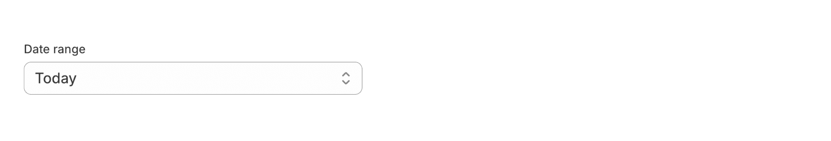
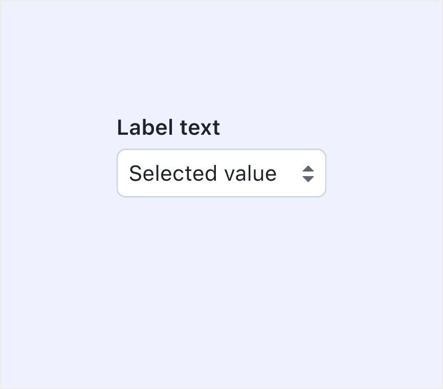
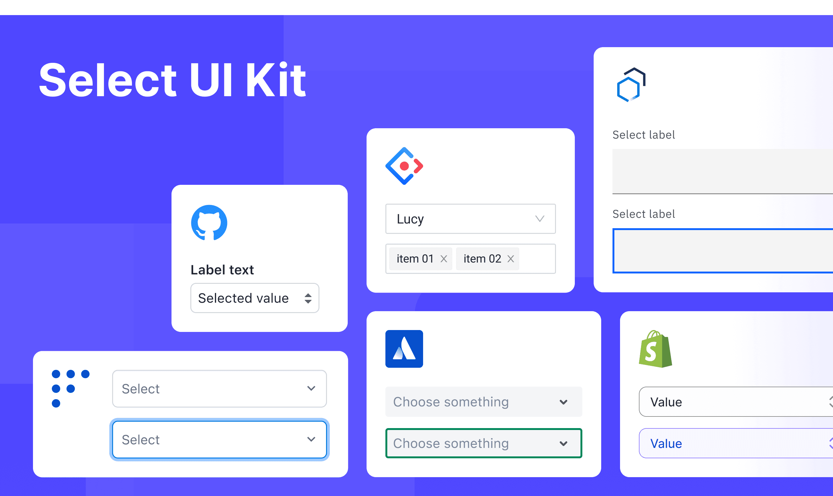
Share This Post

复制链接
分享至X
分享至 LinkedIn
分享至 Facebook

Select

Share This Post

复制链接
分享至X
分享至 LinkedIn
分享至 Facebook

Share This Post

复制链接
分享至X
分享至 LinkedIn
分享至 Facebook

Select

Share This Post

复制链接
分享至X
分享至 LinkedIn
分享至 Facebook

Share This Post

复制链接
分享至X
分享至 LinkedIn
分享至 Facebook

Select

Share This Post

复制链接
分享至X
分享至 LinkedIn
分享至 Facebook

What is Select

In a design system, a "Select" is a UI component that enables users to pick one option from a dropdown list. It is primarily used in forms to collect input by presenting a predefined set of choices, ensuring a clear and consistent user experience.
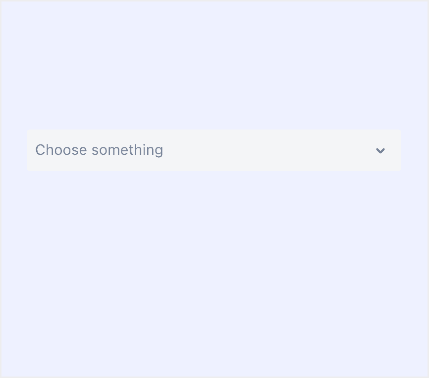
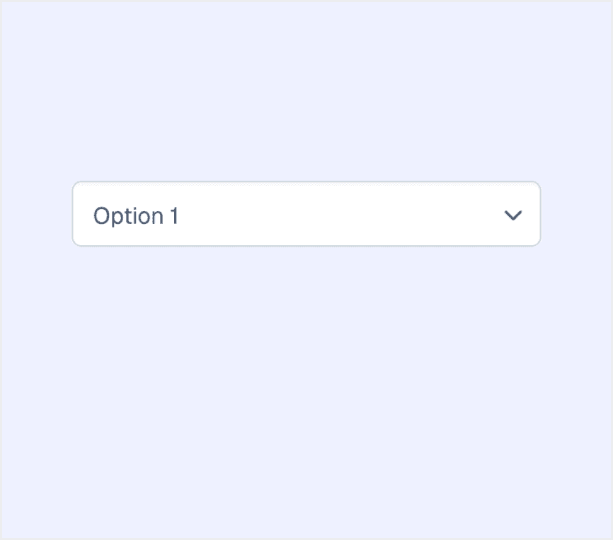
Anatomy Select

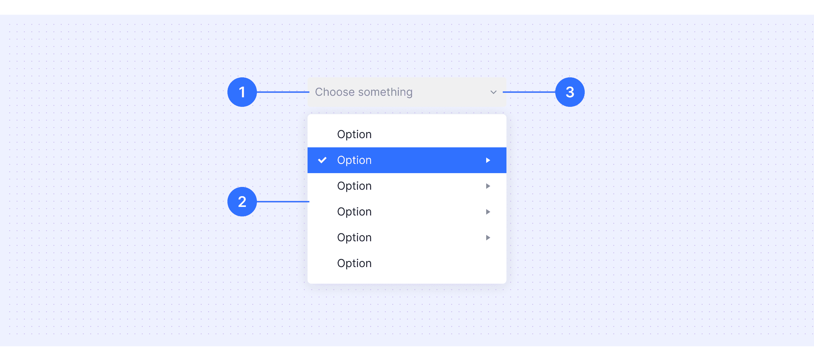
  • Text Input Field: The interactive area where users can click or type to access the dropdown menu.

  • Menu: The dropdown area that contains the list of all available options for choice.

  • Dropdown Arrow: A visual indicator, often in the form of an arrow, signaling that the dropdown can be expanded.

Core features

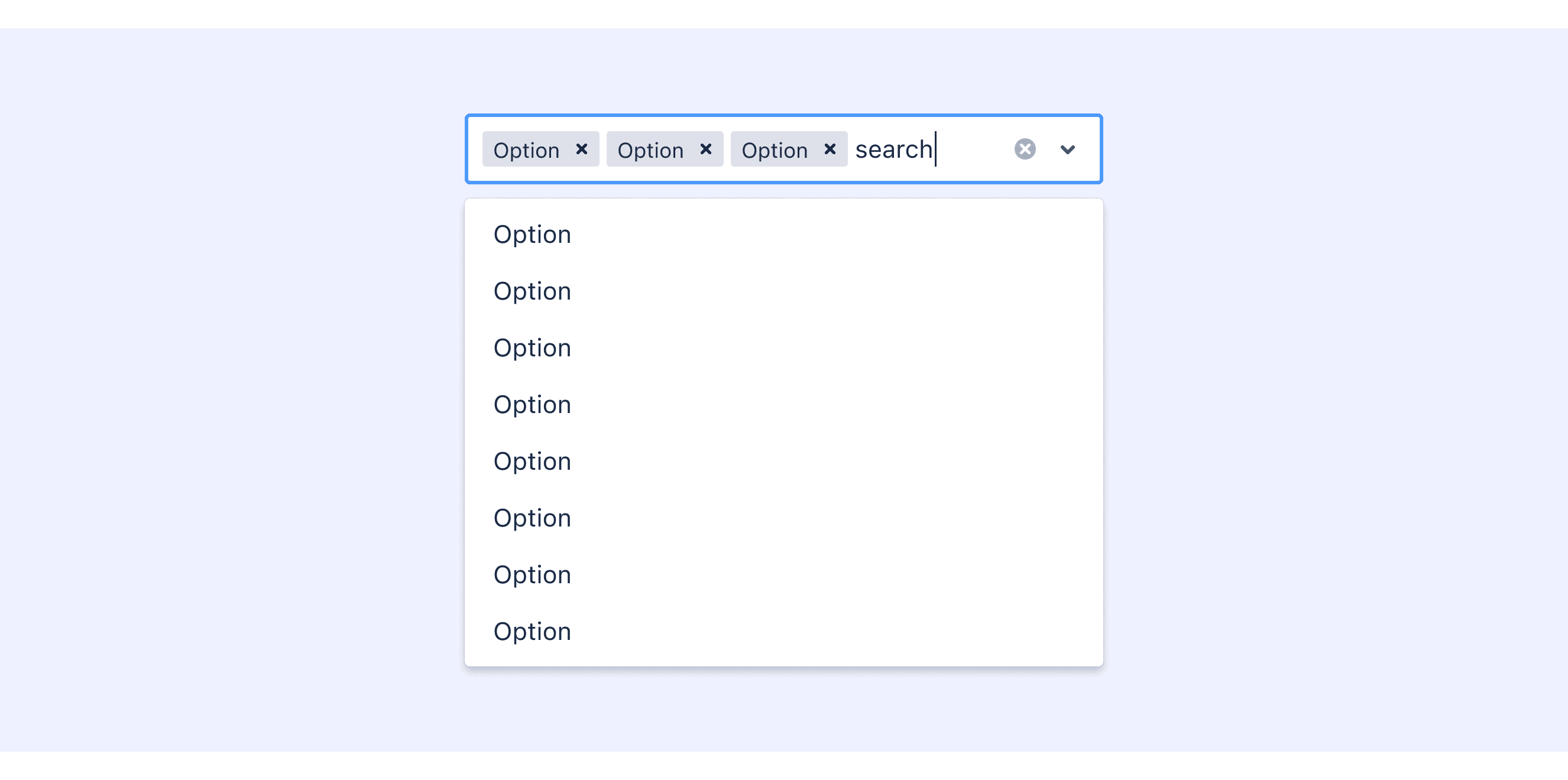
  • Single or Multi-Selection: Allows users to choose one or multiple options from a predefined list.

  • Searchable Dropdown: Provides a search box within the dropdown, enabling users to filter options by entering keywords.

  • Customizable Options: Supports custom option content, such as adding icons, avatars, or additional information to the options.

  • Grouped Options: Supports grouping options under categories or labels for better organization and classification.

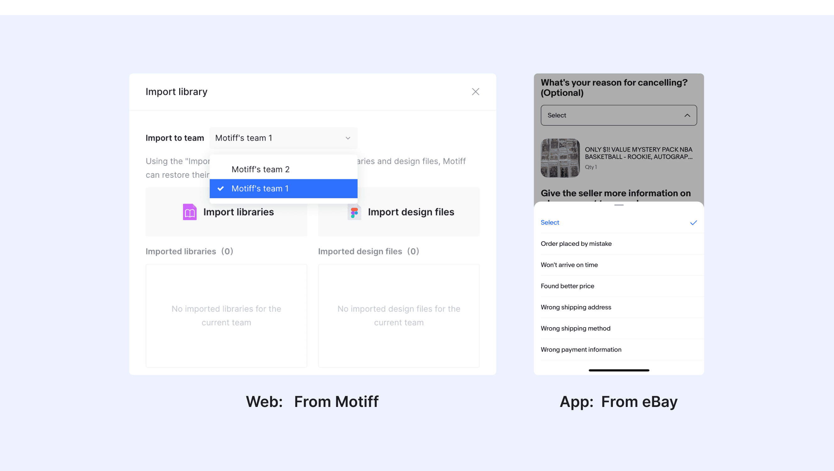
Comparison of Usage in Popular Design Systems

Now, let's look at how some well-known design systems define and implement selects:

Discover how the components are implemented across different design systems like Atlassian, Ant, Carbon Design, etc. Look at their features and rules, like size, and state to choose the best fit for your project.

Default Styles

Enumerates the default appearances of selects across various design systems, highlighting their visual characteristics and usability.

Atlassian design select

Atlassian design select

Atlassian design select

Atlassian design select

Ant design select

Ant design select

Ant design select

Ant design select

Carbon design select

Carbon design select

Carbon design select

Carbon design select

Shopify design select

Shopify design select

Shopify design select

Shopify design select

Forma 36 design select

Forma 36 design select

Forma 36 design select

Forma 36 design select

Primer design select

Primer design select

Primer design select

Primer design select

Features comparison in Design Systems

Comparing components in  Atlassian, Ant, Carbon, Polaris, Forma 36, and Pimer shows differences in size and closing state. 

Design System(link)

Defines

Size

State

Select allows users to make a single selection or multiple selections from a list of options.

  • Default

  • Compact

  • Focus 

  • Default 

  • Hover 

  • Disabled

A dropdown menu for displaying choices.

  • Large

  • Default

  • Small

  • Filled

  • Empty

  • MultiSelect

  • SingleSelect

  • Custom Tag

  • Disabled

  • Enabled

  • Open

  • Closed

  • Hovering

Select allows users to choose one option from a list of values.

  • Small (sm)

  • Medium (md)

  • Large (lg)

  • Enabled  

  • Hover 

  • Selected  

  • Focus  

  • Open  

  • Error  

  • Warning  

  • Disabled  

  • Skeleton  

  • Read-only

Select lets merchants choose one option from an options menu. Consider select when you have 4 or more options, to avoid cluttering the interface.

  • Default

  • Rest  

  • Hover  

  • Active  

  • Focus  

  • Disabled  

  • Error

Select allows users to make a single selection from an options menu.

  • Medium

  • Small

  • Default

  • Active

  • Disabled

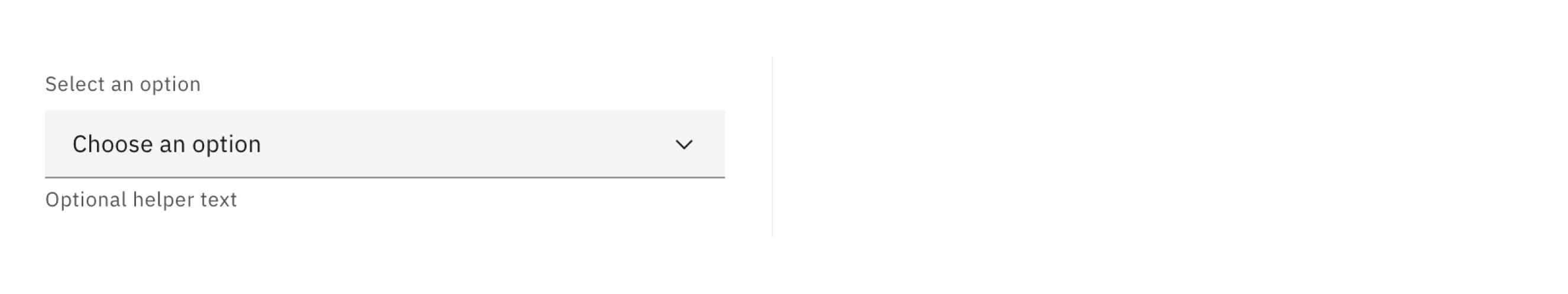
Select is an input for selecting a single option from a menu.

  • Small

  • Medium

  • Large

  • Focused

  • Disabled

  • Invalid

  • Valid

Special Types

Atlassian Design System supports Select with tabs​​.

Allow user to choose tags from list or input custom tag.

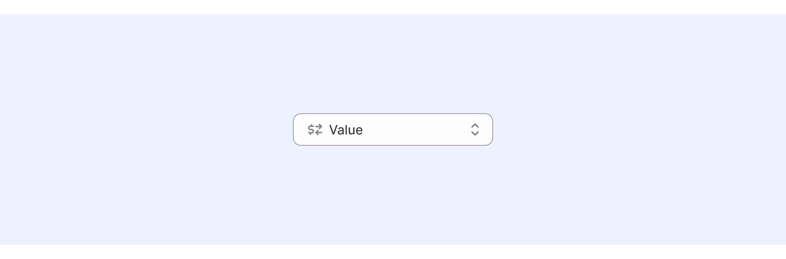
Polaris Design supports Select with prefix​​.

Toggle the Prefix property to display an icon or text to the left of the input value.

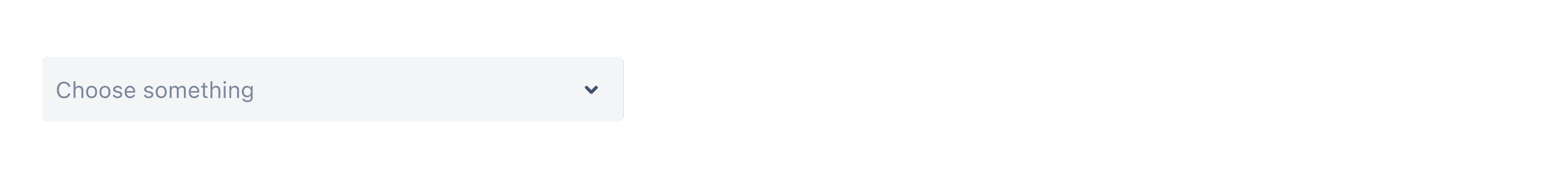
Ant Design supports Select with custom dropdown.

Customize the dropdown menu via dropdownRender. If you want to close the dropdown after clicking the custom content, you need to control open prop, here is an codesandbox.

Select Template for Motiff

This UIkit file combines select designs from Atlassian, Ant, Carbon, Polaris, Forma 36, and design system. It showcases their styles, usage, and customization in one place for easy exploration and selection.

Open and edit in Motiff →

Select vs. Dropdown: Difference and When to Use

In user interface (UI) design, the terms "select" and "dropdown" are often used interchangeably, but they have distinct meanings, which are adapted from a Stack overflow discussion.

  • Definition and Function:

    • Select: Select is a standard HTML form control, typically used in forms to allow users to choose one or more values from a predefined list of options.

    • Dropdown: Dropdown is a more general UI component, often used to display a selectable list of options, but it is not necessarily tied to forms.

  • Visual Appearance:

    • Select: The appearance is more aligned with traditional form styles. It usually has a clear border and expands into a simple dropdown list when clicked.

    • Dropdown: The visual design is richer and more flexible. It can include icons, grouping, search boxes, or even custom components.

  • Use Cases:

    • Select: Use a Select when you need to choose one or more options from a predefined list and submit it as part of a form.

    • Dropdown: Use a Dropdown when displaying a set of links or actions in a navigation bar.

Accessibility in Different Design Systems

Common Practices

  • Keyboard Navigation: Use Tab to navigate to the dropdown, Up/Down arrows to move between options, Enter or Space to confirm a choice, and Esc to close it.

  • Label: Every dropdown should have a label so screen readers can identify it.

  • Focus: When opened, the cursor should move to the first or currently highlighted option, and return to the dropdown when closed.

Differences Practices

  • Atlassian Design: Simple and efficient, supports search and grouping, ideal for complex option scenarios.

  • Ant Design: Highly customizable, supports tag mode and async loading, suitable for flexible requirements.

  • Apple Human Interface Guidelines: Emphasizes intuitive and native experience, focuses on simplicity and keyboard navigation.

  • Carbon Design System: Comprehensive functionality, supports inline and dropdown modes, prioritizes helper text and error states.

  • Shopify Polaris: Focuses on accessibility and practicality, supports prefixes/suffixes, ideal for e-commerce scenarios.

  • Forma 36: Consistency-first, supports custom rendering, emphasizes error feedback and helper text.

  • Primer: The component in Primer does not rely on JavaScript and is fully implemented using HTML and CSS.

Code Examples

Explore default component implementations in Atlassian, Ant, Carbon, Polaris, and Forma 36 design system. These examples showcase standard usage, default settings, and core features across design systems.

Atlassian Design

import React from 'react';

import { Label } from '@atlaskit/form';
import Select, { type OptionsType } from '@atlaskit/select';

import { cities } from '../common/data';

const filterCities = (inputValue: string) =>
	cities.filter((i) => i.label.toLowerCase().includes(inputValue.toLowerCase()));

const promiseOptions = (inputValue: string) =>
	new Promise<OptionsType>((resolve) => {
		setTimeout(() => {
			resolve(filterCities(inputValue));
		}, 1000);
	});

const WithPromises = () => {
	return (
		<>
			<Label htmlFor="async-select-example">What city do you live in?</Label>
			<Select
				inputId="async-select-example"
				cacheOptions
				defaultOptions
				loadOptions={promiseOptions}
			/>
		</>
	);
};

export default () => <WithPromises />;

Show More

Ant Design

import React from 'react';
import { Select, Space } from 'antd';

const handleChange = (value: string) => {
  console.log(`selected ${value}`);
};

const App: React.FC = () => (
  <Space wrap>
    <Select
      defaultValue="lucy"
      style={{ width: 120 }}
      onChange={handleChange}
      options={[
        { value: 'jack', label: 'Jack' },
        { value: 'lucy', label: 'Lucy' },
        { value: 'Yiminghe', label: 'yiminghe' },
        { value: 'disabled', label: 'Disabled', disabled: true },
      ]}
    />
    <Select
      defaultValue="lucy"
      style={{ width: 120 }}
      disabled
      options={[{ value: 'lucy', label: 'Lucy' }]}
    />
    <Select
      defaultValue="lucy"
      style={{ width: 120 }}
      loading
      options={[{ value: 'lucy', label: 'Lucy' }]}
    />
    <Select
      defaultValue="lucy"
      style={{ width: 120 }}
      allowClear
      options={[{ value: 'lucy', label: 'Lucy' }]}
      placeholder="select it"
    />
  </Space>
);

export default App;

Show More

Carbon Design System

{
  render: () => {
    return html`
      <cds-form-item>
        <cds-select
          helper-text="Optional helper text"
          label-text="Select an option"
          placeholder="Choose an option">
          <cds-select-item-group label="Category 1">
            <cds-select-item value="all">Option 1</cds-select-item>
            <cds-select-item value="cloudFoundry">Option 2</cds-select-item>
          </cds-select-item-group>
          <cds-select-item-group label="Category 2">
            <cds-select-item value="staging">Option 3</cds-select-item>
            <cds-select-item value="dea">Option 4</cds-select-item>
            <cds-select-item value="router">Option 5</cds-select-item>
          </cds-select-item-group>
        </cds-select>
      </cds-form-item>
    `;
  }
}

Show More

Shopify Polaris

import {Select} from '@shopify/polaris';
import {useState, useCallback} from 'react';

function SelectExample() {
  const [selected, setSelected] = useState('today');

  const handleSelectChange = useCallback(
    (value: string) => setSelected(value),
    [],
  );

  const options = [
    {label: 'Today', value: 'today'},
    {label: 'Yesterday', value: 'yesterday'},
    {label: 'Last 7 days', value: 'lastWeek'},
  ];

  return (
    <Select
      label="Date range"
      options={options}
      onChange={handleSelectChange}
      value={selected}
    />
  );
}

Show More

Forma 36

Forma 36

Forma 36

Forma 36

import React, { useState } from 'react';
import { Select } from '@contentful/f36-components';

export default function SelectControlledExample() {
  const [selectValue, setSelectValue] = useState('optionOne');
  const handleOnChange = (event) => setSelectValue(event.target.value);

  return (
    <Select
      id="optionSelect-controlled"
      name="optionSelect-controlled"
      value={selectValue}
      onChange={handleOnChange}
    >
      <Select.Option value="optionOne">Option 1</Select.Option>
      <Select.Option value="optionTwo">Long Option 2</Select.Option>
    </Select>
  );
}

Show More

Try AI Design Systems

Create, maintain, and check your design systems with AI in one click.

Try AI Design Systems

Create, maintain, and check your design systems with AI in one click.

Try AI Design Systems

Create, maintain, and check your design systems with AI in one click.

Try AI Design Systems

Create, maintain, and check your design systems with AI in one click.

Try AI Design Systems

Create, maintain, and check your design systems with AI in one click.