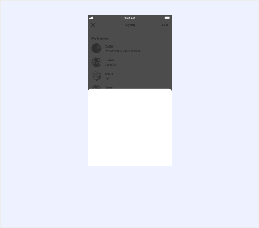
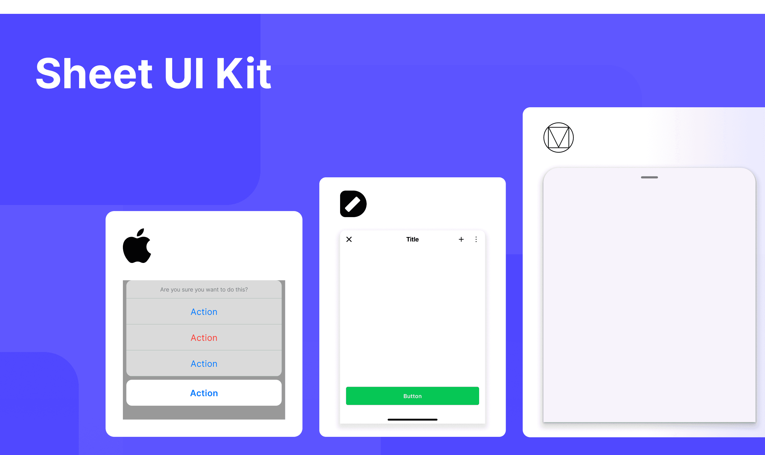
Share This Post

复制链接
分享至X
分享至 LinkedIn
分享至 Facebook

Sheet

Share This Post

复制链接
分享至X
分享至 LinkedIn
分享至 Facebook

Share This Post

复制链接
分享至X
分享至 LinkedIn
分享至 Facebook

Sheet

Share This Post

复制链接
分享至X
分享至 LinkedIn
分享至 Facebook

Share This Post

复制链接
分享至X
分享至 LinkedIn
分享至 Facebook

Sheet

Share This Post

复制链接
分享至X
分享至 LinkedIn
分享至 Facebook

What is Sheet

In a design system, a "sheet" is a UI element that displays additional content as a partially overlaying panel, allowing users to view or interact with related information without fully leaving the current context. It’s often used for presenting detailed options, settings, or actions while maintaining partial interaction with the underlying content.

Anatomy Sheet

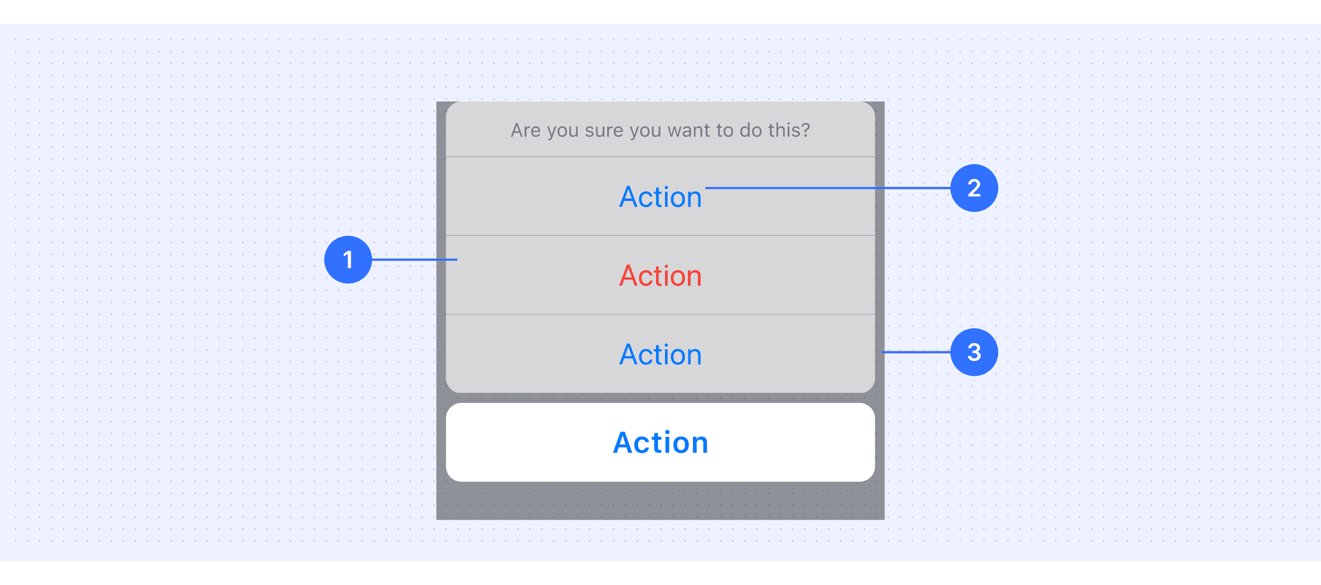
  1. Container: The main body of the sheet, containing all content and actions.

  2. Action Items: Such as a close button, confirm button, or other interactive elements.

  3. Scrim: A semi-transparent layer behind the sheet, used to focus the user's attention on the sheet's content while de-emphasizing the background.

Core features

  • Context Preservation: Allows users to access additional information or perform actions without fully leaving the current screen.

  • Partial Overlay: Appears as a panel that partially overlays the main content, maintaining visibility of the underlying screen.

  • Draggable Interaction: Often includes a drag handle, enabling users to adjust its height or dismiss it with a swipe gesture.

  • Focused Attention: Uses a scrim (semi-transparent background) to emphasize the sheet content while de-emphasizing the background.

Comparison of Usage in Popular Design Systems

Now, let's look at how some well-known design systems define and implement sheets:

Learn how different design systems, such as Material Design, HIG Design, and Ant Design, use sheets. Explore their features and guidelines, like interaction methods and content support, to find the best match for your project.

Default Styles

Enumerates the default appearances of sheets across various design systems, highlighting their visual characteristics and usability.

Material design sheet

Material design sheet

Material design sheet

Material design sheet

Ant design sheet

Ant design sheet

Ant design sheet

Ant design sheet

HIG design sheet

HIG design sheet

HIG design sheet

HIG design sheet

Mand design sheet

Mand design sheet

Mand design sheet

Mand design sheet

Base design sheet

Base design sheet

Base design sheet

Base design sheet

LINE design sheet

LINE design sheet

LINE design sheet

LINE design sheet

Features comparison in Design Systems

Comparing modals in Material, Ant, HIG, Line, and Mand mobile design system shows differences in size and content support. 

Design System

Defines

Interaction Methods

Content Support

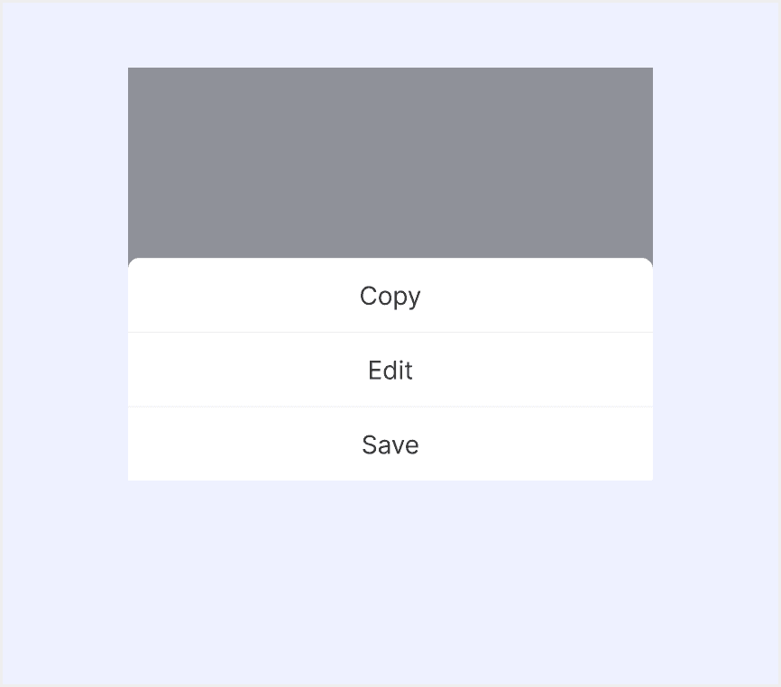
Bottom sheets show secondary content anchored to the bottom of the screen.

  • Swipe to close

  • Tap outside to close

  • Button to close

  • List items

  • Media

  • Dividers

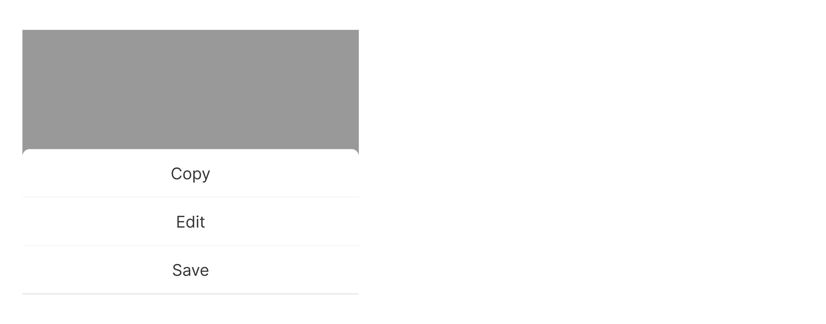
An action menu panel that slides up from the bottom.

  • Tap outside to close

  • Button to close

  • Basic option buttons

  • Hint text

  • Icons

  • Dividers

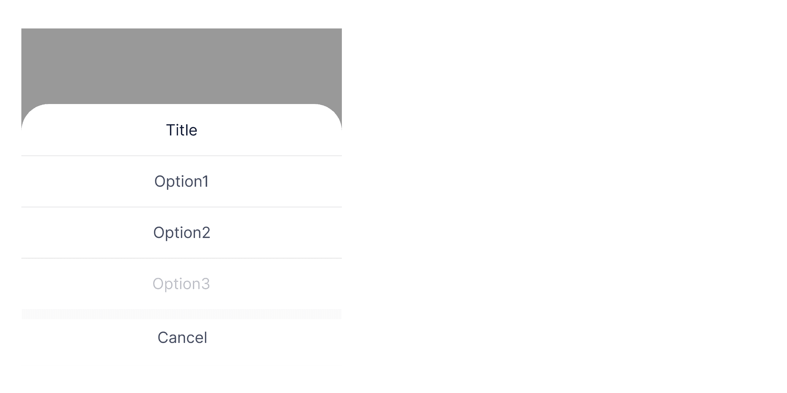
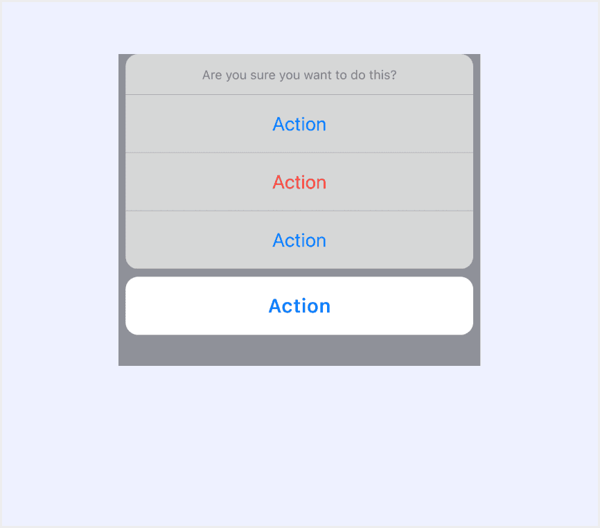
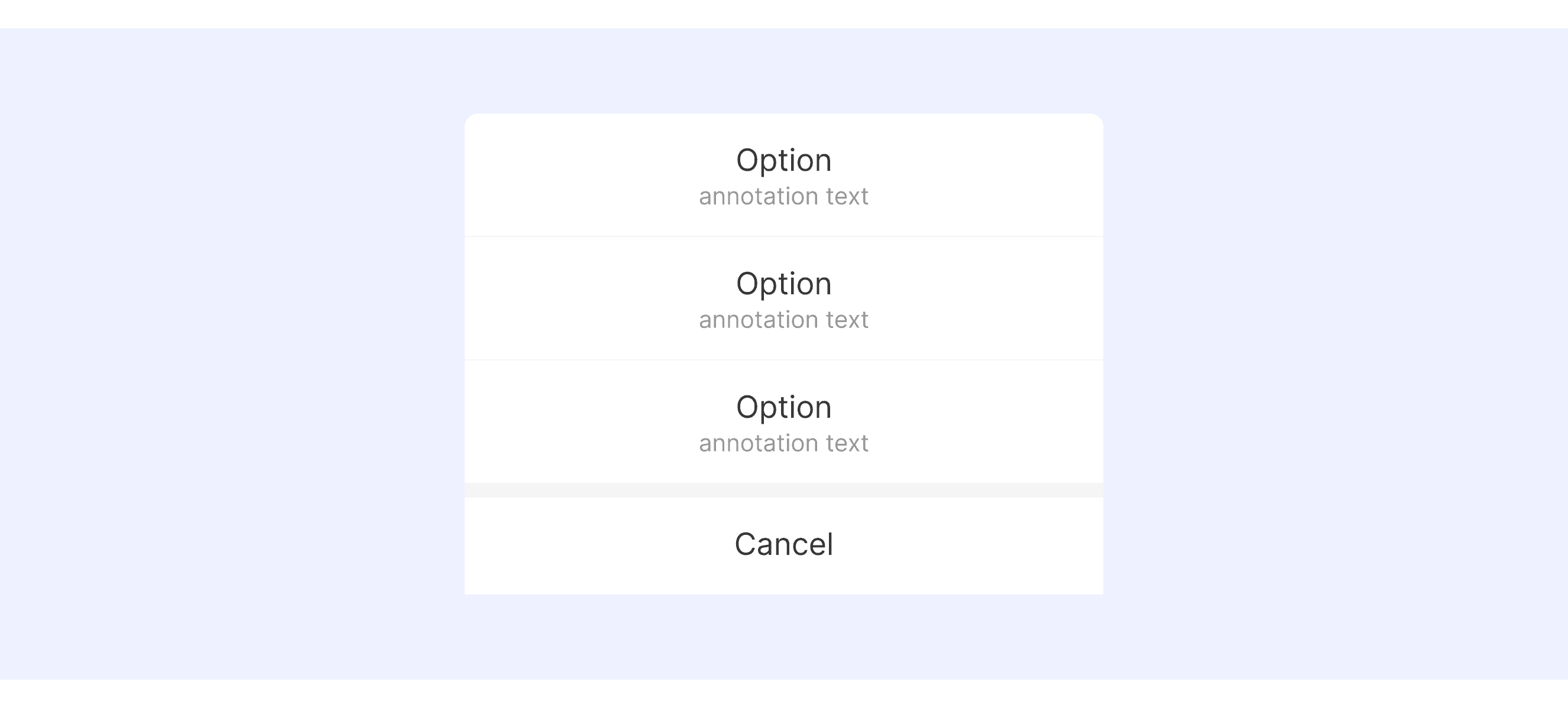
An action sheet is a modal view that presents choices related to an action people initiate.

  • Tap outside to close

  • Button to close

  • Action Grouping

  • Bottom Action

  • Text

Support scenario-relevent operations.

  • Tap outside to close

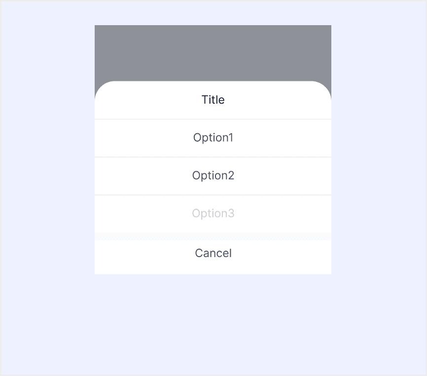
  • Title of Operation Instructions

  • Basic option buttons

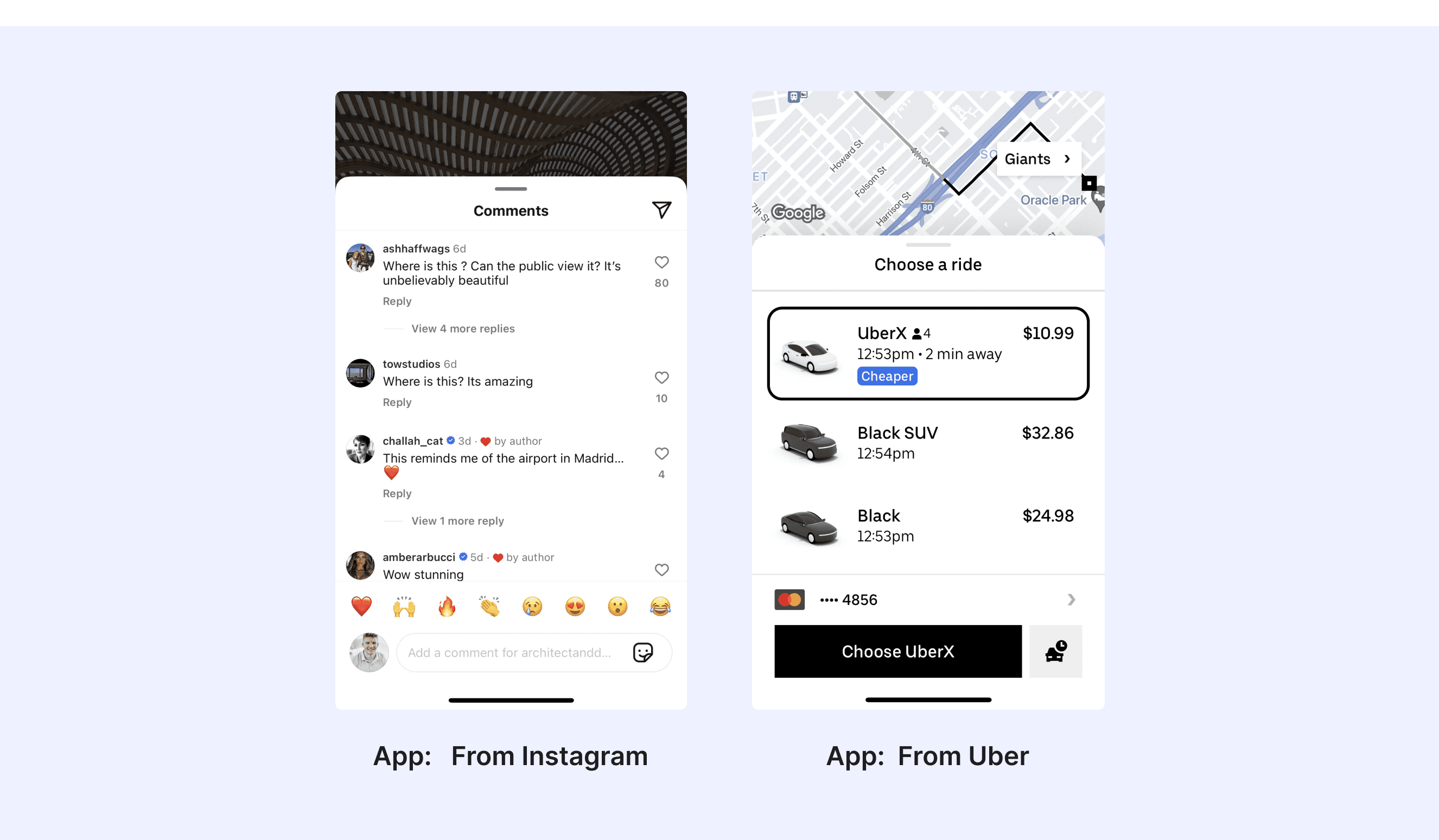
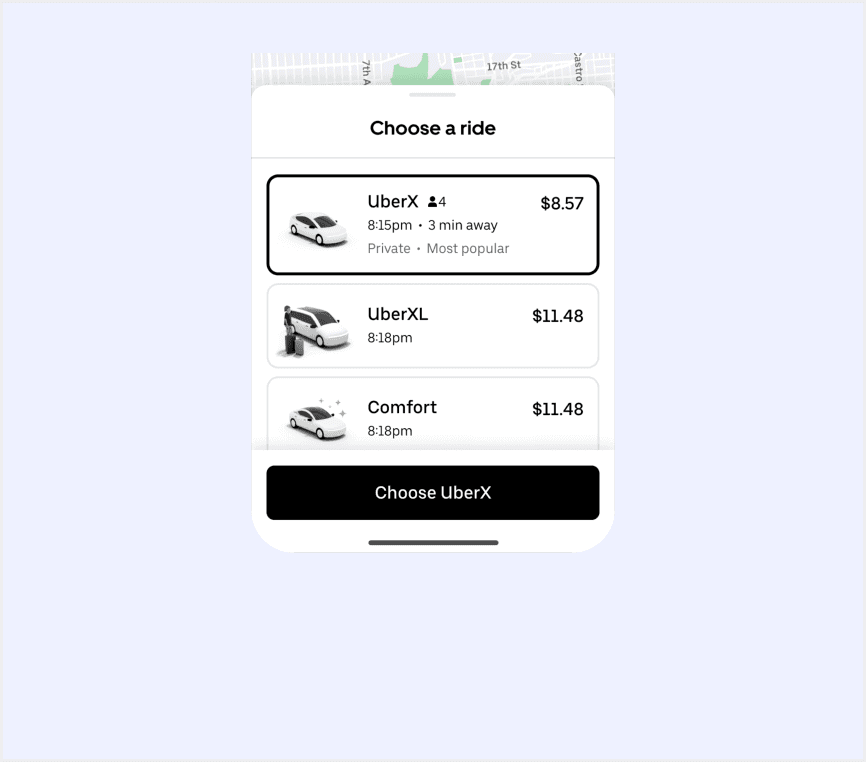
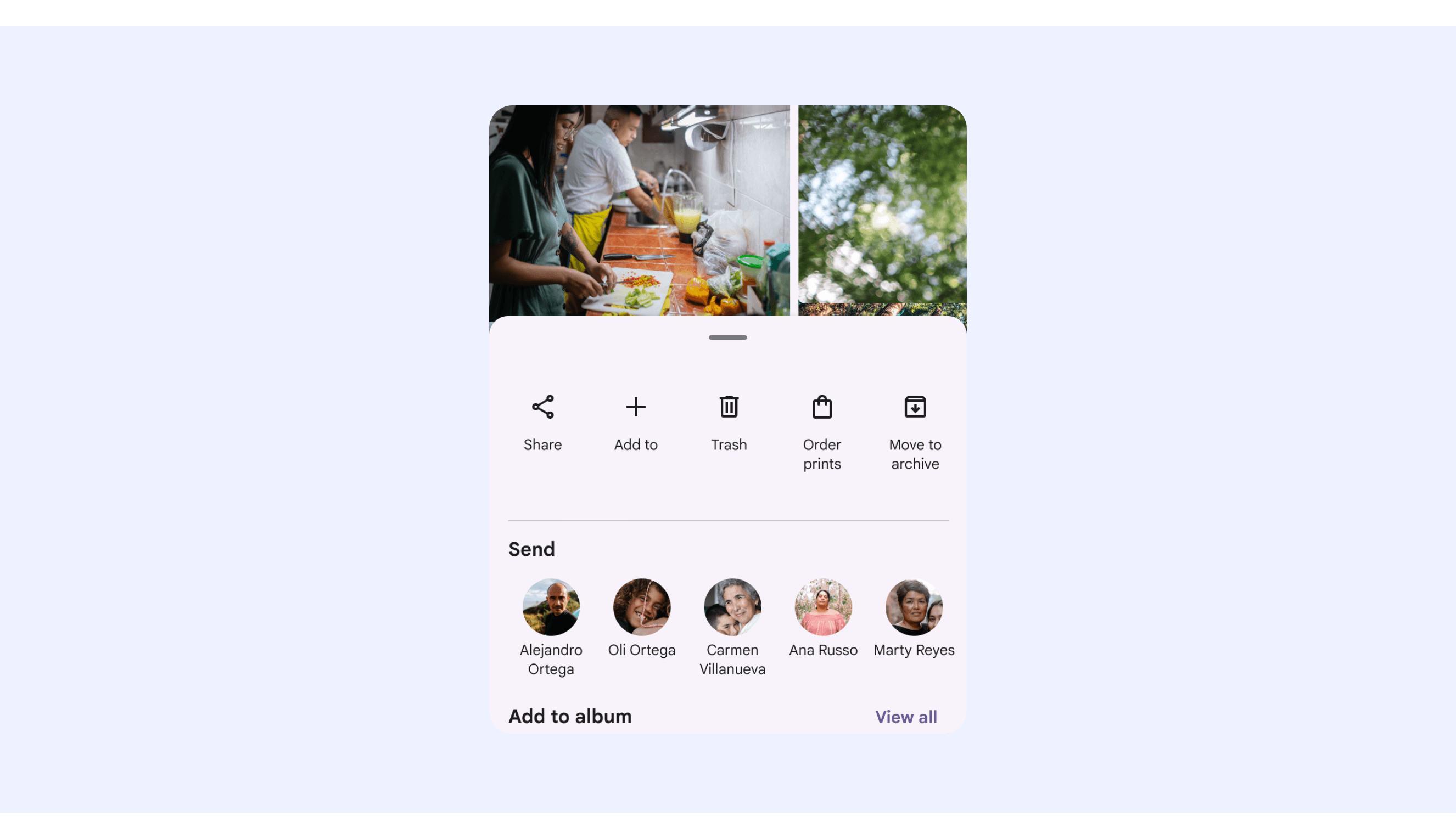
Sheets allow users to interact with two surfaces simultaneously. In Uber apps, sheets are often used to display related information, like location results, on top of a map.

  • "X" icon button on the right

  • Primary button to submit their changes, e.g., “Save” or “Done”  in a button dock

  • “Cancel” button in a button dockESC on the keyboard (supplemental)

  • Overlay behind the sheet (supplemental) 

  • Text Content

  • Lists

  • Charts or Images

  • Buttons and Action Items

  • Nested Components

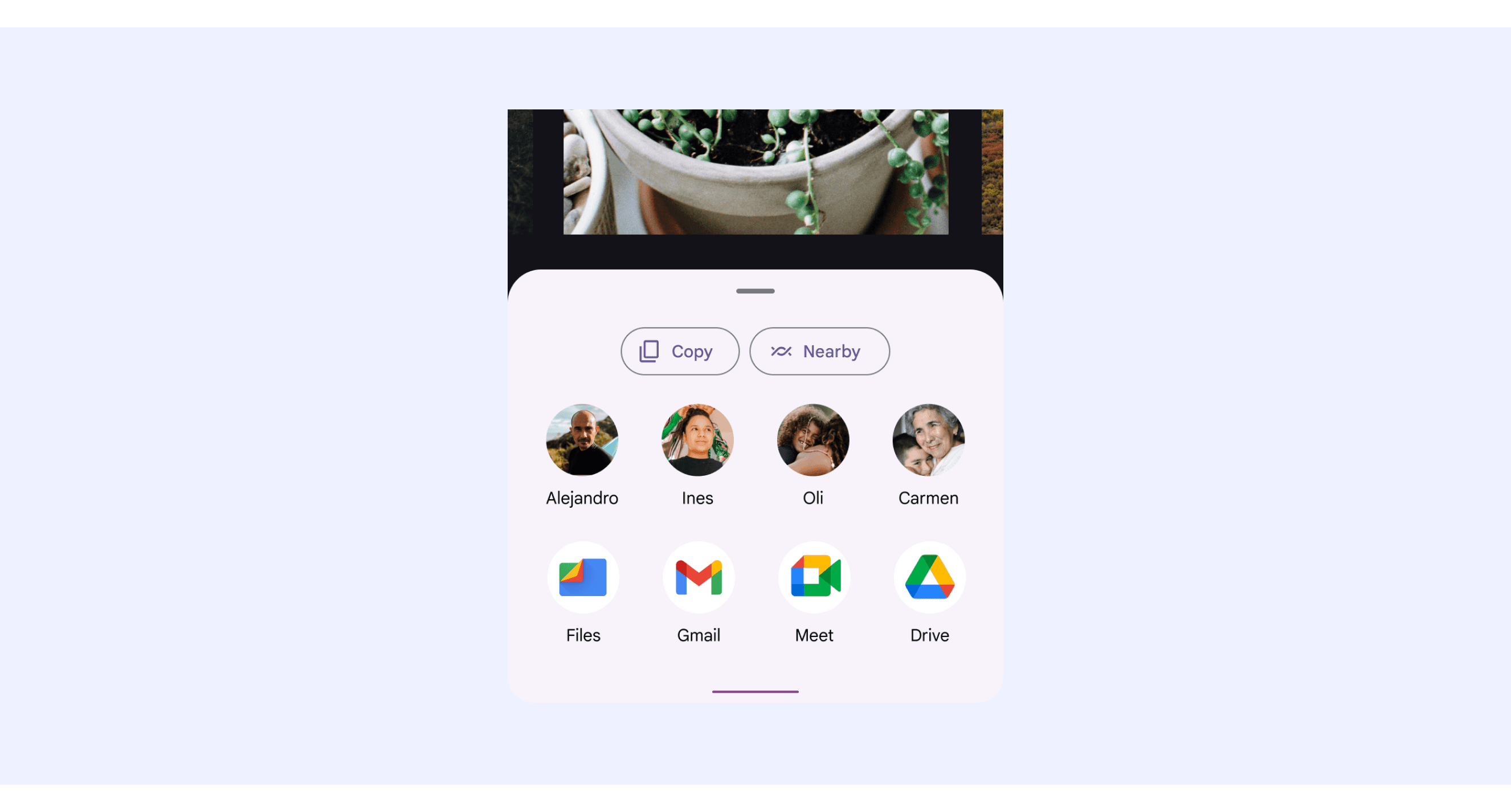
Bottom sheet is a surface fixed at the bottom of the screen which includes content related to the previous screen. 

  • Tapping an item that triggers action

  • Tapping the Scrim

  • Swiping the sheet down

  • Via Close Button

Content Area

  • Flexible Configuration

  • Date Picker

Header Area

  • Navigation Bar

  • Search BarTabs

Button Area

  • Buttons

  • Checkboxes

  • Switch

Material Design system supports Bottom Sheets that can include rich media content, contacts and applications.

  • Bottom sheets can include rich media content such as thumbnails, images, illustrations, and videos.

  • Sheets can display content such as a contact list, including names or avatars, and applications.

Ant Design Mobile supports “sheets with Hint text”.

Sheets need to provide enough information to help people understand their choices.

Sheet Template for Motiff

This UIkit file combines sheet designs from Material, Ant, HIG, Mand mobile, Line, and Base web design system. It showcases their styles, usage, and customization in one place for easy exploration and selection.

Open and edit in Motiff →

Sheet vs. Drawer: Difference and When to Use

In user interface (UI) design, the terms "sheet" and "drawer" are often used interchangeably, but they have distinct meanings, which are adapted from a Medium Community discussion.

Drawer: The Drawer component is perfect for scenarios where users need quick access to navigation or additional options without leaving the current view:

  • Side navigation menus in dashboards.

  • Filters or settings that slide in from the side.

  • Forms that need to remain visible without blocking the main view.

Sheet: The Sheet component offers more flexibility than a drawer, making it ideal for:

  • Full-screen overlays on mobile devices.

  • Detailed modals with adjustable sizes and positioning.

  • Content that requires user focus, such as forms, account details, or settings panels.

Accessibility in Different Design Systems

Common Practices

  • Clear Content Hierarchy: All design systems emphasize the hierarchical structure of Sheet content, with titles used for overviews and subtitles or grouped content providing context.

  • Clear Actions: Content typically includes clear action options (such as buttons or clickable list items) to guide users in completing tasks.

  • Responsive Design: Ensure the Sheet adapts to different screen sizes and orientations while maintaining good usability.

Differences Practices

  • Material Design: Icons or thumbnails can be included to enhance visual cues (e.g., user avatars or file types).

  • HIG: Sheet design focuses on simplicity and contextual relevance, avoiding excessive distractions.

  • Ant Design Mobile: Provides corresponding toast notifications after performing actions.

  • Mand Mobile: Cancel selection interaction is relatively simpler compared to other design systems, only supporting 'Tap outside to close.

  • Base Web: The supported content types are quite rich and can cover various scenarios. For example, the sheet header includes styles such as Progress Bar variants.

  • Line Design System: The definition of header area usage is more flexible, supporting various content types such as tabs, not just a single title.

Code Examples

Explore default modal implementations in Ant Mobile and Mand Mobile. These examples showcase standard usage, default settings, and core features across design systems.

Ant Mobile Design

import React, { useState, useRef } from 'react'
import { ActionSheet, Button, Dialog, Space, Toast } from 'antd-mobile'
import { DemoBlock } from 'demos'
import type {
  Action,
  ActionSheetShowHandler,
} from 'antd-mobile/es/components/action-sheet'

const actions: Action[] = [
  { text: '复制', key: 'copy' },
  { text: '修改', key: 'edit' },
  { text: '保存', key: 'save' },
]

// 基础用法
function Basic() {
  const [visible, setVisible] = useState(false)
  return (
    <>
      <Button onClick={() => setVisible(true)}>最简单的用法</Button>
      <ActionSheet
        visible={visible}
        actions={actions}
        onClose={() => setVisible(false)}
      />
    </>
  )
}

function WithCancelButtonAndDescription() {
  const [visible, setVisible] = useState(false)
  return (
    <>
      <Button onClick={() => setVisible(true)}>取消按钮和额外描述</Button>
      <ActionSheet
        extra='请选择你要进行的操作'
        cancelText='取消'
        visible={visible}
        actions={actions}
        onClose={() => setVisible(false)}
      />
    </>
  )
}

// 选项状态
function ConfigActions() {
  const actions: Action[] = [
    { text: '复制', key: 'copy' },
    { text: '修改', key: 'edit', disabled: true },
    {
      text: '删除',
      key: 'delete',
      description: '删除后数据不可恢复',
      danger: true,
      bold: true,
    },
  ]

  const [visible, setVisible] = useState(false)
  return (
    <>
      <Button onClick={() => setVisible(true)}>禁用和危险的选项</Button>
      <ActionSheet
        visible={visible}
        actions={actions}
        onClose={() => setVisible(false)}
      />
    </>
  )
}

// 事件处理
function Events() {
  const actions: Action[] = [
    { text: '复制', key: 'copy' },
    { text: '修改', key: 'edit' },
    {
      text: '保存',
      key: 'save',
      onClick: async () => {
        const result = await Dialog.confirm({ content: '确定要保存吗?' })
        if (result) {
          Toast.show('执行了保存操作')
        }
      },
    },
  ]

  const [visible, setVisible] = useState(false)
  return (
    <>
      <Button onClick={() => setVisible(true)}>事件处理</Button>
      <ActionSheet
        visible={visible}
        actions={actions}
        onClose={() => setVisible(false)}
        onAction={action => {
          if (action.key === 'edit' || action.key === 'copy') {
            Toast.show(`点击了${action.text}`)
          }
        }}
        afterClose={() => {
          Toast.show('动作面板已关闭')
        }}
      />
    </>
  )
}

// 指令式
function Imperative() {
  const handler = useRef<ActionSheetShowHandler>()
  const actions: Action[] = [
    {
      text: '复制',
      key: 'copy',
    },
    {
      text: '修改',
      key: 'edit',
      onClick: () => {
        handler.current?.close()
      },
    },
  ]

  return (
    <Button
      onClick={() => {
        handler.current = ActionSheet.show({
          actions,
          onClose: () => {
            Toast.show('动作面板关闭')
          },
        })
      }}
    >
      显示
    </Button>
  )
}

export default () => {
  return (
    <>
      <DemoBlock title='基础用法'>
        <Space wrap>
          <Basic />
          <WithCancelButtonAndDescription />
        </Space>
      </DemoBlock>

      <DemoBlock title='选项状态'>
        <ConfigActions />
      </DemoBlock>

      <DemoBlock title='事件处理'>
        <Events />
      </DemoBlock>

      <DemoBlock title='指令式'>
        <Imperative />
      </DemoBlock>
    </>
  )
}

Show More

Mand Mobile Design

<script lang="ts">
export default {
  name: 'ActionSheetDemo',
  title: '基本',
}
</script>
<script setup lang="ts">
import { ref } from 'vue'
import MdActionSheet from 'mand-mobile-next/action-sheet'
import MdButton from 'mand-mobile-next/button'

const visible = ref(false)
const options = ref([
  {
    label: '选项1',
    value: 0,
  },
  {
    label: '选项2',
    value: 1,
  },
  {
    label: '选项3',
    value: 2,
  },
])
const val = ref('')
</script>

<template>
  <div
    class="md-example-child md-example-child-action-sheet"
  >
    <md-button @click="visible = !visible"
      >唤起动作面板</md-button
    >
    <md-action-sheet
      v-model="val"
      v-model:visible="visible"
      title="操作说明的标题"
      :invalid-index="2"
      cancel-text="cancel"
      :options="options"
    ></md-action-sheet>
  </div>
</template>

Show More

Try AI Design Systems

Create, maintain, and check your design systems with AI in one click.

Try AI Design Systems

Create, maintain, and check your design systems with AI in one click.

Try AI Design Systems

Create, maintain, and check your design systems with AI in one click.

Try AI Design Systems

Create, maintain, and check your design systems with AI in one click.

Try AI Design Systems

Create, maintain, and check your design systems with AI in one click.