What is Time Picker
In a design system, a time picker is a user interface (UI) component designed to help users select or input a specific time, such as hours and minutes. It is commonly used in applications for tasks like scheduling meetings, setting reminders, or creating events. They aim to simplify time selection, reduce input errors, and ensure consistency across the application.
Anatomy Date Picker
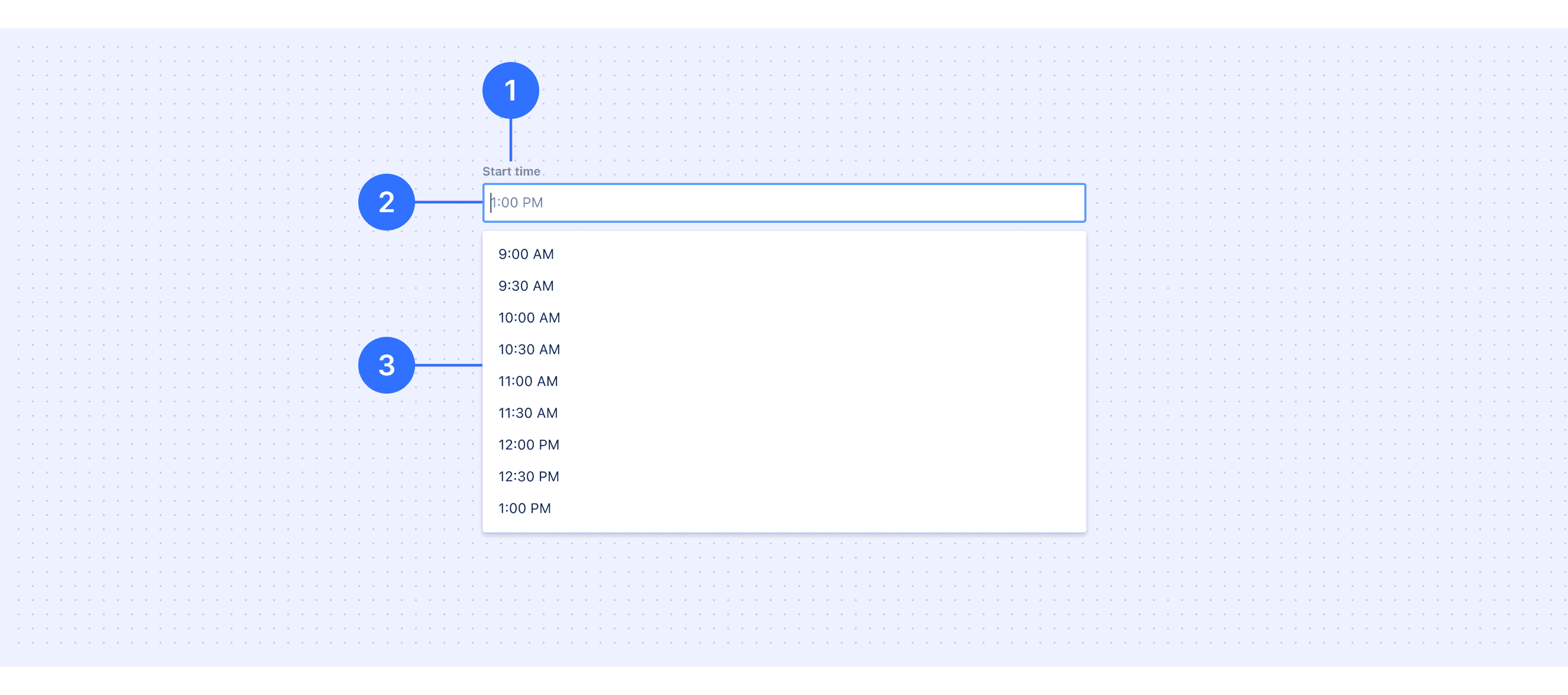
Label: Labels should indicate what information the field requires.
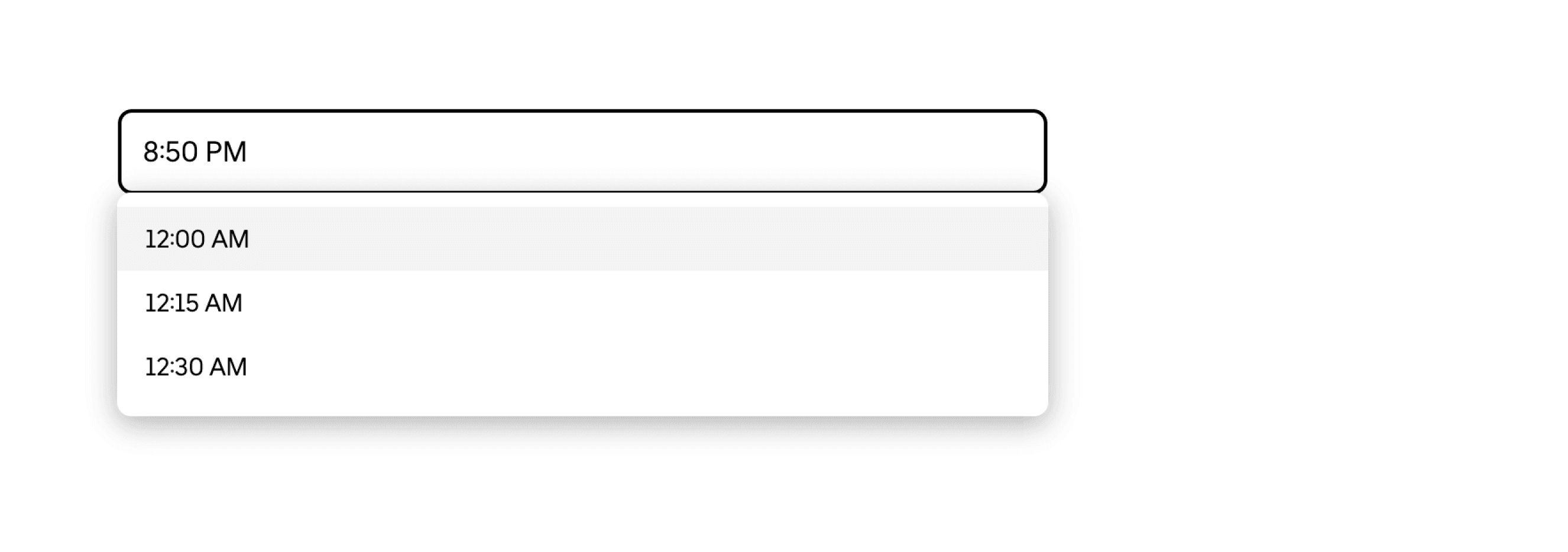
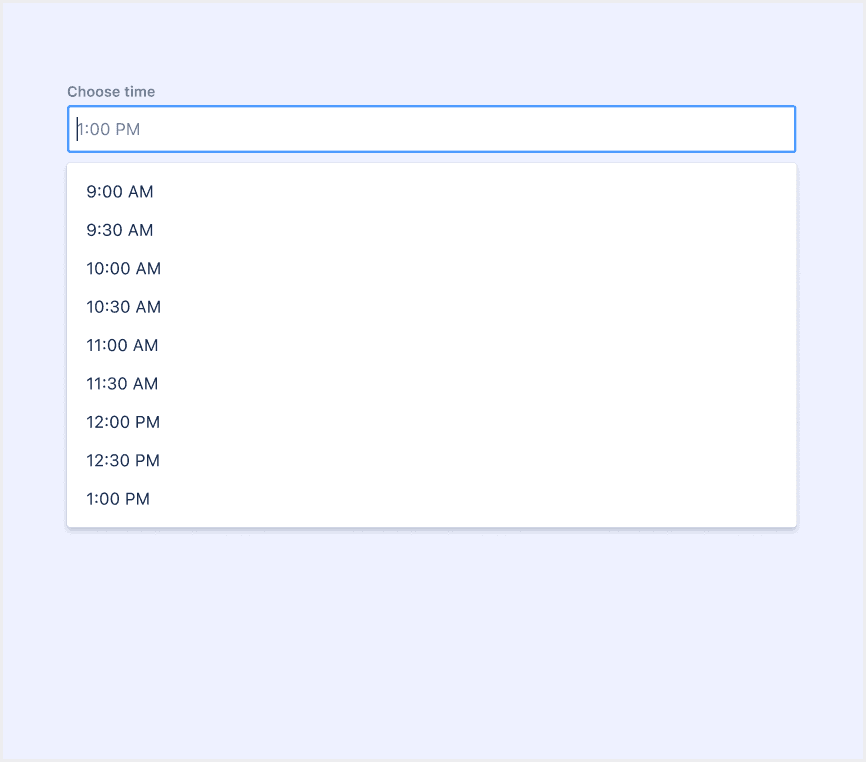
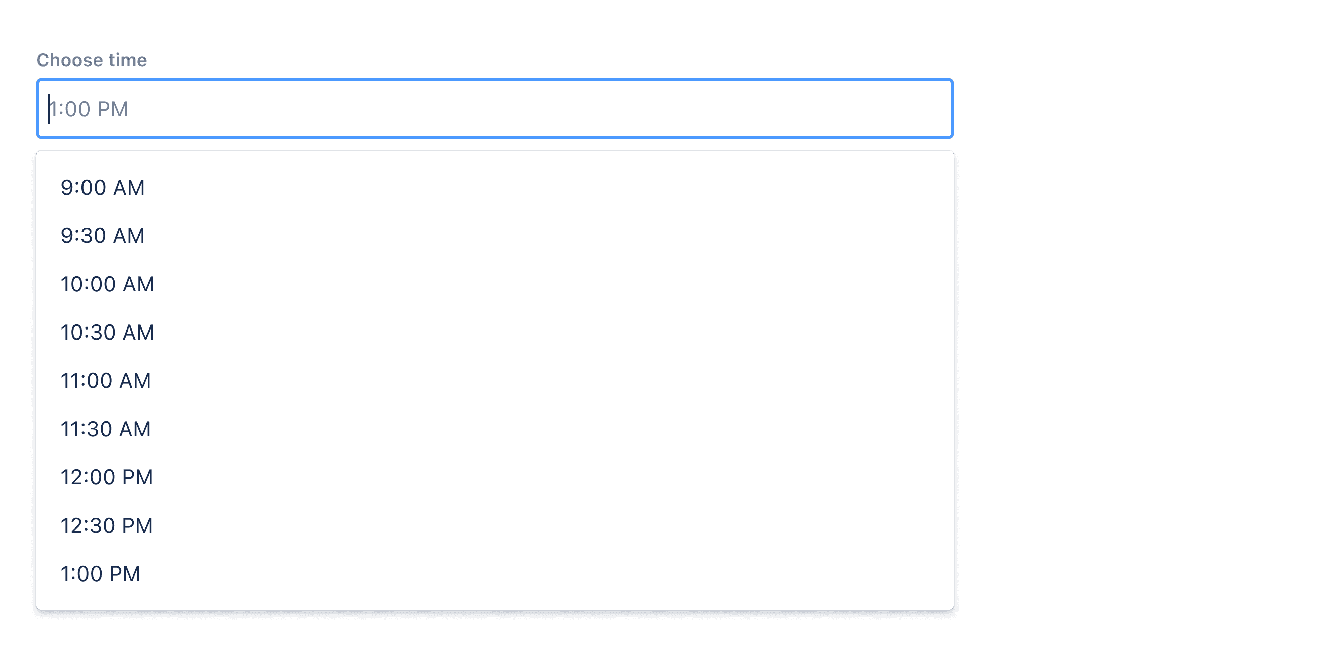
Time input field: Selecting this field opens the select menu showing available times on the selected date. Once a time is selected, the option will be shown in the text input.
Time dropdown: Contains the list of all selectable times.
Core features
Time Selection: Allows users to select specific hours, minutes, and optionally seconds or AM/PM.
Input Flexibility: Supports both manual text input and selection via dropdowns, sliders, or spinners.
Validation: Ensures the entered time is valid (e.g., within a specific range or format).
Localization: Adapts to different time formats (12-hour or 24-hour) and regional preferences.
Comparison of Usage in Popular Design Systems
Now, let's look at how some well-known design systems define and implement time pickers:
Learn how time pickers work in different design systems like Atlassian Design, HIG Design, and Ant Design. Check their features and rules, such as types and time format, to find the best fit for your project.
Default Styles
Enumerates the default appearances of time pickers across various design systems, highlighting their visual characteristics and usability.
Features comparison in Design Systems
Comparing date pickers in Material, Atlassian, Ant, HIG, Lightning, and Base Web design shows differences in types and content structure.
Design System
Defines
Types
Time Format
Time pickers help users select and set a specific time.
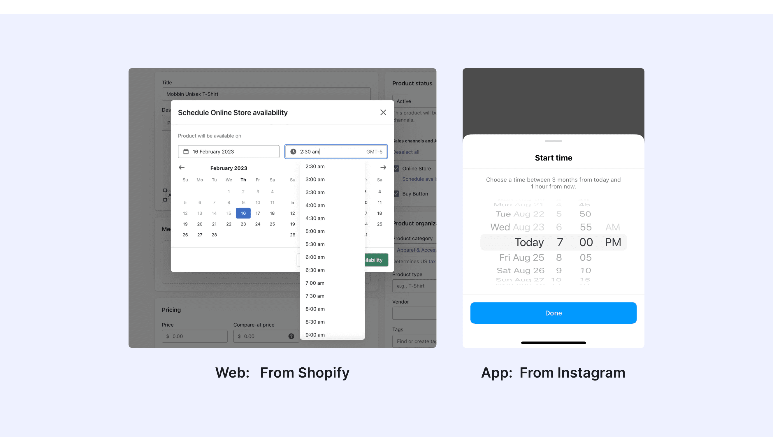
Popover (triggered by input field click)
Supports 12/24-hour formats, customizable (e.g., HH:mm:ss)
A time picker allows the user to select a specific time.
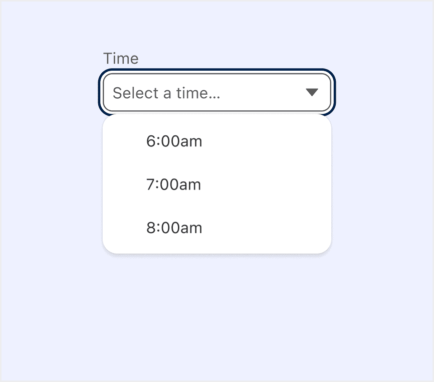
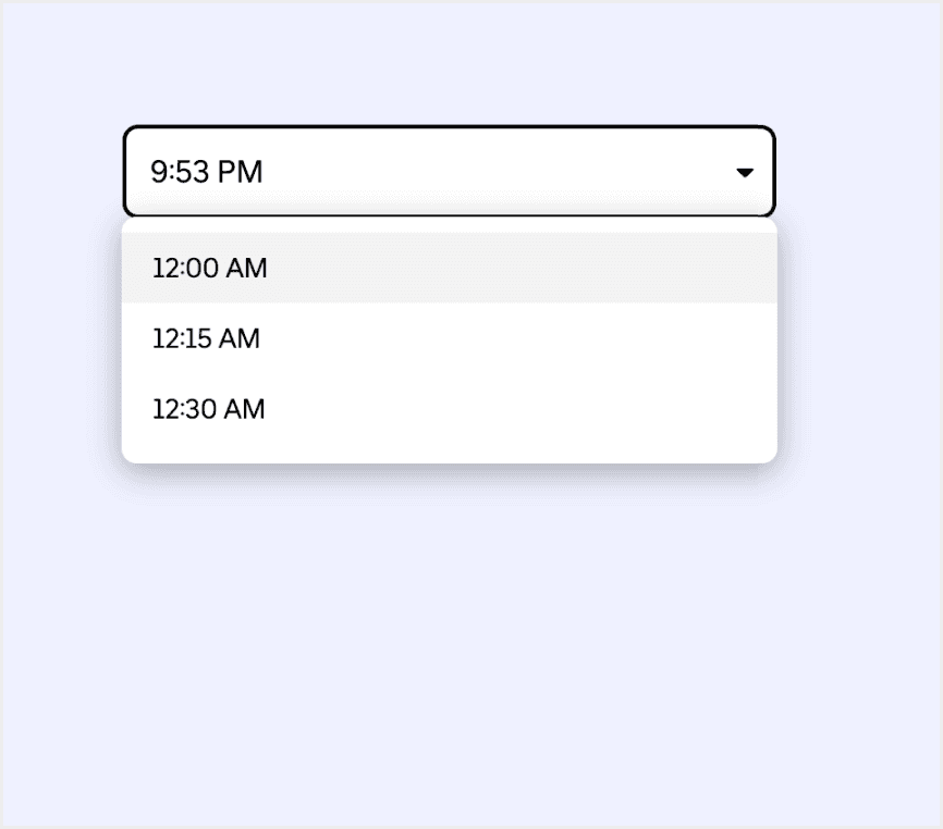
Dropdown menu (triggered by input field click)
Default 12-hour format, customizable
To select/input a time.
Dropdown menu(supports direct input in field)
Supports 12-hour, customizable (e.g., h:mm a)
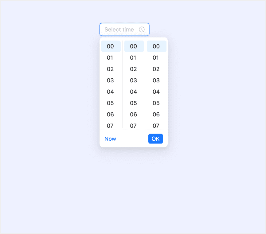
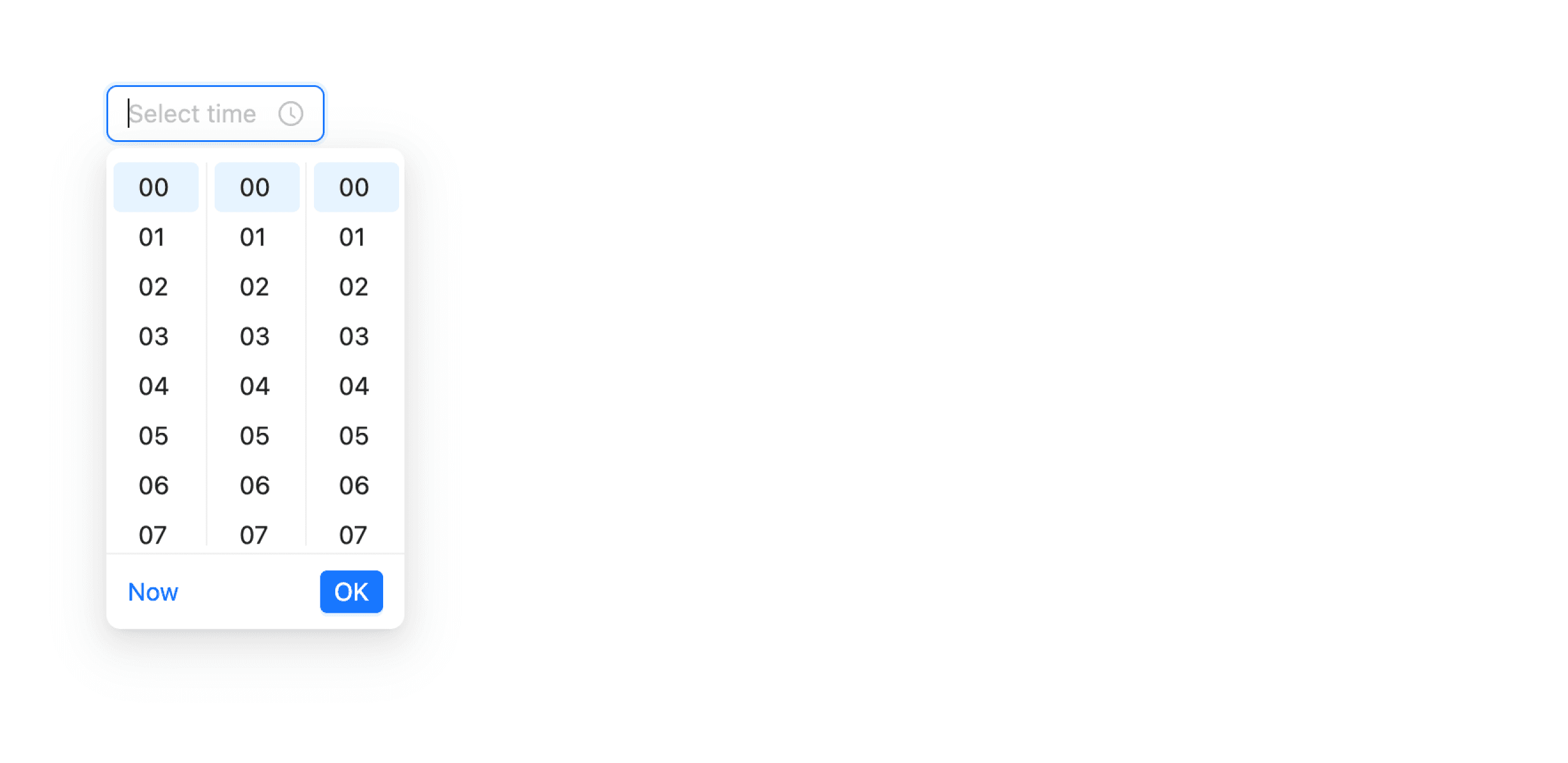
A picker displays one or more scrollable lists of distinct values that people can choose from.
Day selection
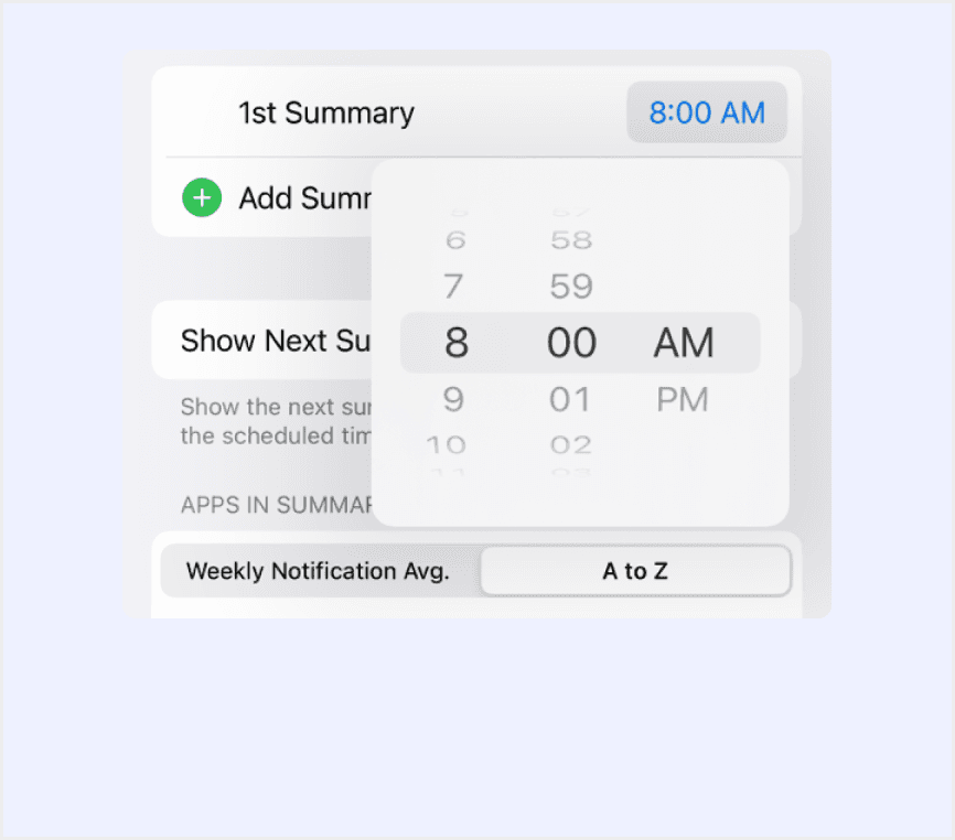
Time selection
Scroll selection (iOS)
Support keyboard navigation
An autocomplete text input to select a time.
Input field + Dropdown menu (keyboard navigable)
12/24-hour format with optional seconds selection
Allows users to select or input time values.
Dropdown menu (triggered by input focus)
12/24-hour toggle, format configurable
Special Types
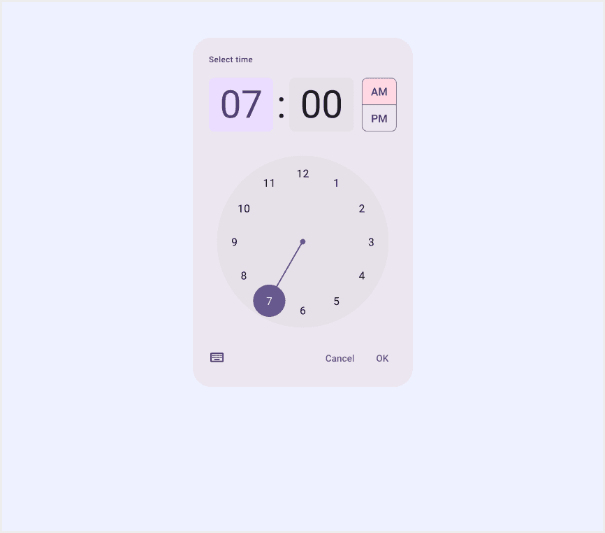
Material Design supports a dial selector time picker for a 12-hour clock and Input selector.
The dial view can be changed to reflect time selection across 24 hours. This option is set outside of the time picker component, typically through system settings.
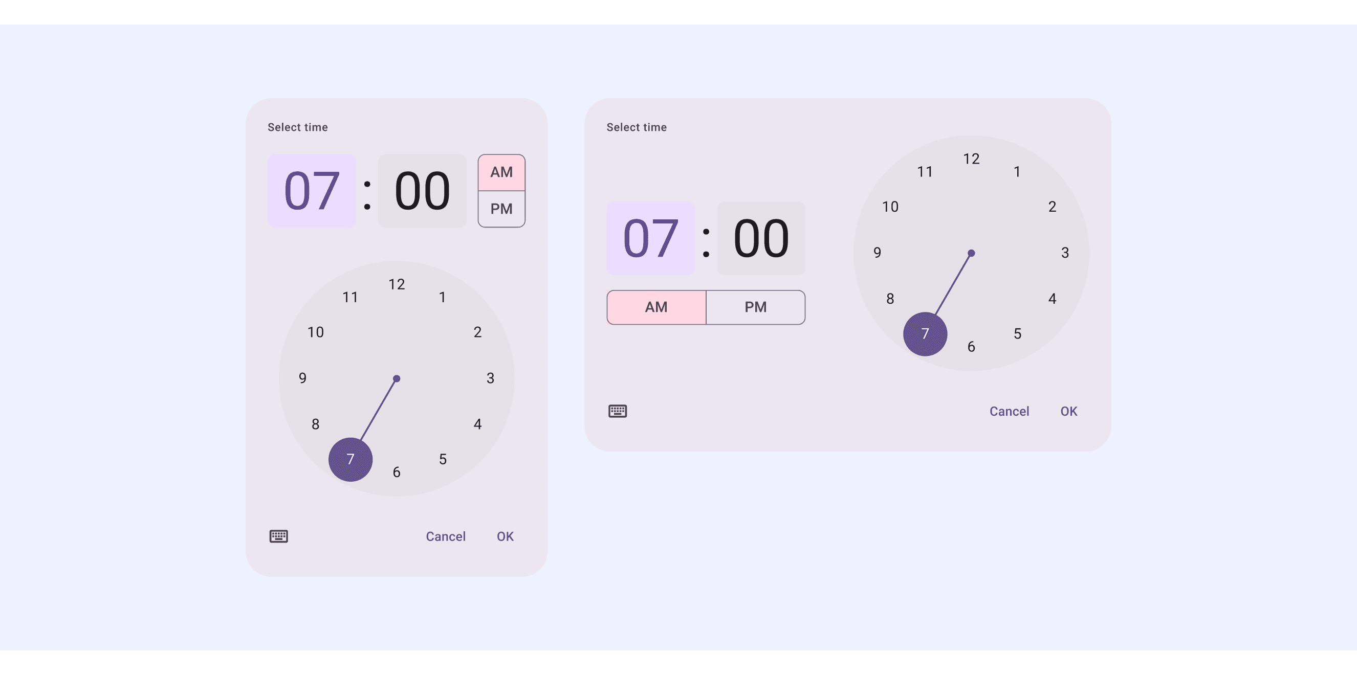
An input picker is a unique type of text field. Unlike typical text field inputs, it adds highlighting to draw attention to the selected field.

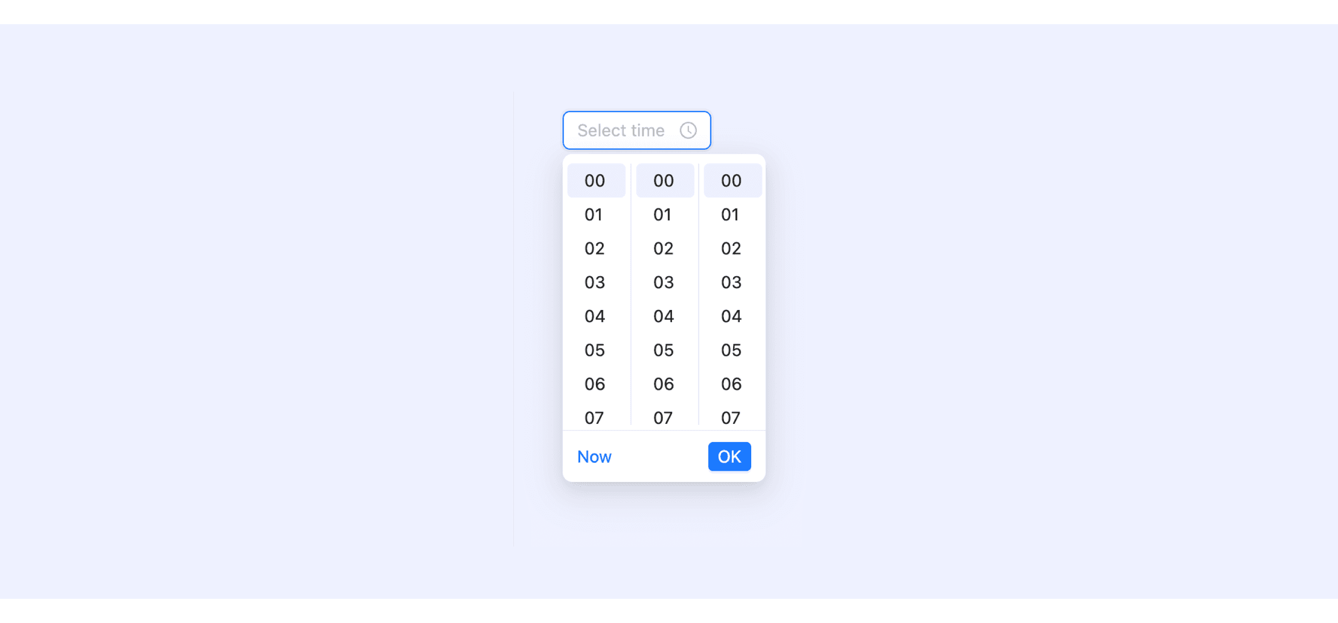
Ant Design’s time picker supports showing stepped options using hourStep, minuteStep, and secondStep.
Click TimePicker, and then we could select or input a time in panel.
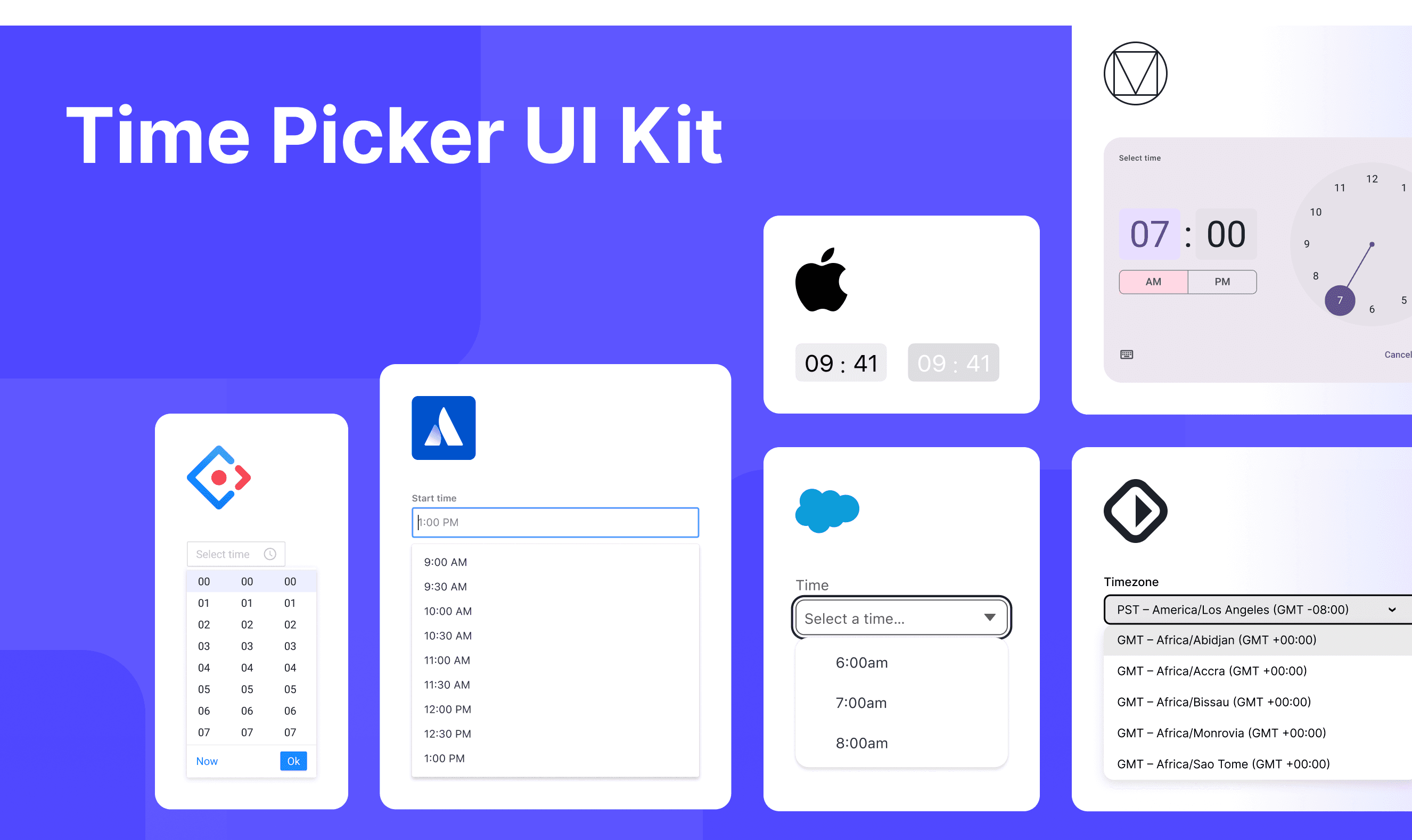
Time Picker Template for Motiff
This UIkit file combines time picker designs from Material, Atlassian, Ant, HIG, Lightning, and Base Web design. It showcases their styles, usage, and customization in one place for easy exploration and selection.
6 DateTimePicker components for your web apps
Entering dates and times on websites is something we do a lot—like picking a birthday, booking a trip, or setting up a meeting. A good DateTimePicker makes this super easy and helps avoid mistakes, which are adapted from a vaadin discussion.
Flatpickr: A lightweight, modular, and highly customizable date picker that is compatible with Angular, Ember, React, and Vue. Ideal for simple web forms and dashboards.
React DateTimePicker: Designed specifically for React applications, it offers comprehensive date and time selection functionality. It supports custom styling and provides desktop, mobile, and responsive variants.
jQuery Date and Time Picker: A classic date and time picker widely used in jQuery projects. It features a rich set of themes and configuration options.
Ant Design DatePicker: Supports both date and time selection. It is tailored for projects using the Ant Design ecosystem, especially large-scale enterprise applications.
Bulma Calendar: Based on the Bulma CSS framework, it is suitable for smaller applications or projects prioritizing a visually cohesive and clean interface.
Vaadin DateTimePicker: Comes with built-in support for various formats and locales. It offers both Java and JavaScript versions, allowing users to input dates via keyboard or overlay.
Accessibility in Different Design Systems
Common Practices
Flexibility in Time Format Support: Most time pickers support switching between 12-hour and 24-hour formats (e.g., use12Hours prop).
Keyboard Navigation Support: Allows navigation using arrow keys to switch between time values and the Enter key to confirm selection, reducing reliance on mouse operations.
Error Handling and Validation: Provides clear error messages when in a disabled state or invalid input is detected (e.g., "Please enter a valid time").
Visual Design Consistency: The design of time pickers typically aligns with the overall style of the design system, ensuring consistency with other components.
Differences Practices
Material Design 3: Supports both clicking the input field to open a time picker panel and directly entering the time via the keyboard.
Atlassian Design System: Specifically designed for forms, with labels left-aligned and positioned above the input field.
Ant Design: Highly customizable, including size adjustments and the ability to add additional content at the bottom of the picker.
HIG: Uses a wheel picker, making it well-suited for mobile devices.
Lightning Design System: Similar to Material Design but incorporates Salesforce branding and supports dynamic form validation.
Code Examples
Explore default time picker implementations in Atlassian, Ant, and Base Web design. These examples showcase standard usage, default settings, and core features across design systems.
Atlassian Design
Ant Design
Base Web Design