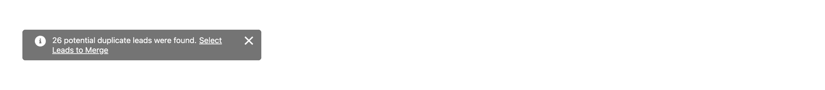
What is Toast
In a design system, a toast refers to a small, non-intrusive notification message that appears temporarily on the screen to provide feedback or updates to users. Toasts are typically used to inform users about the status of an action they just performed or to deliver brief system messages.
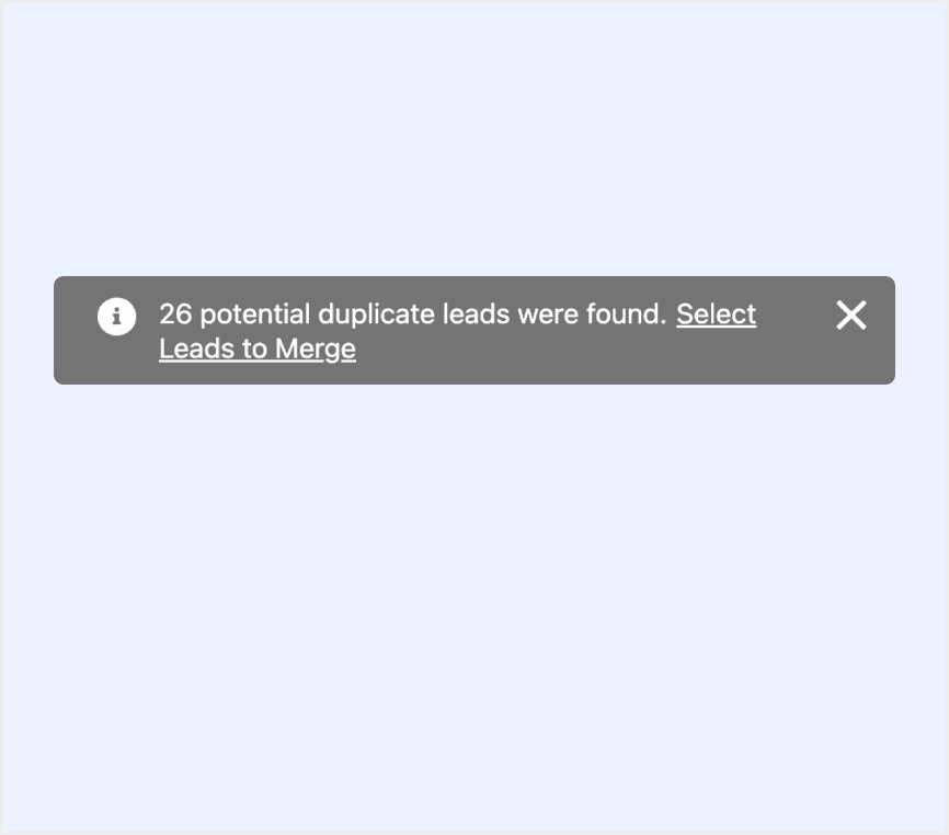
Anatomy Toast
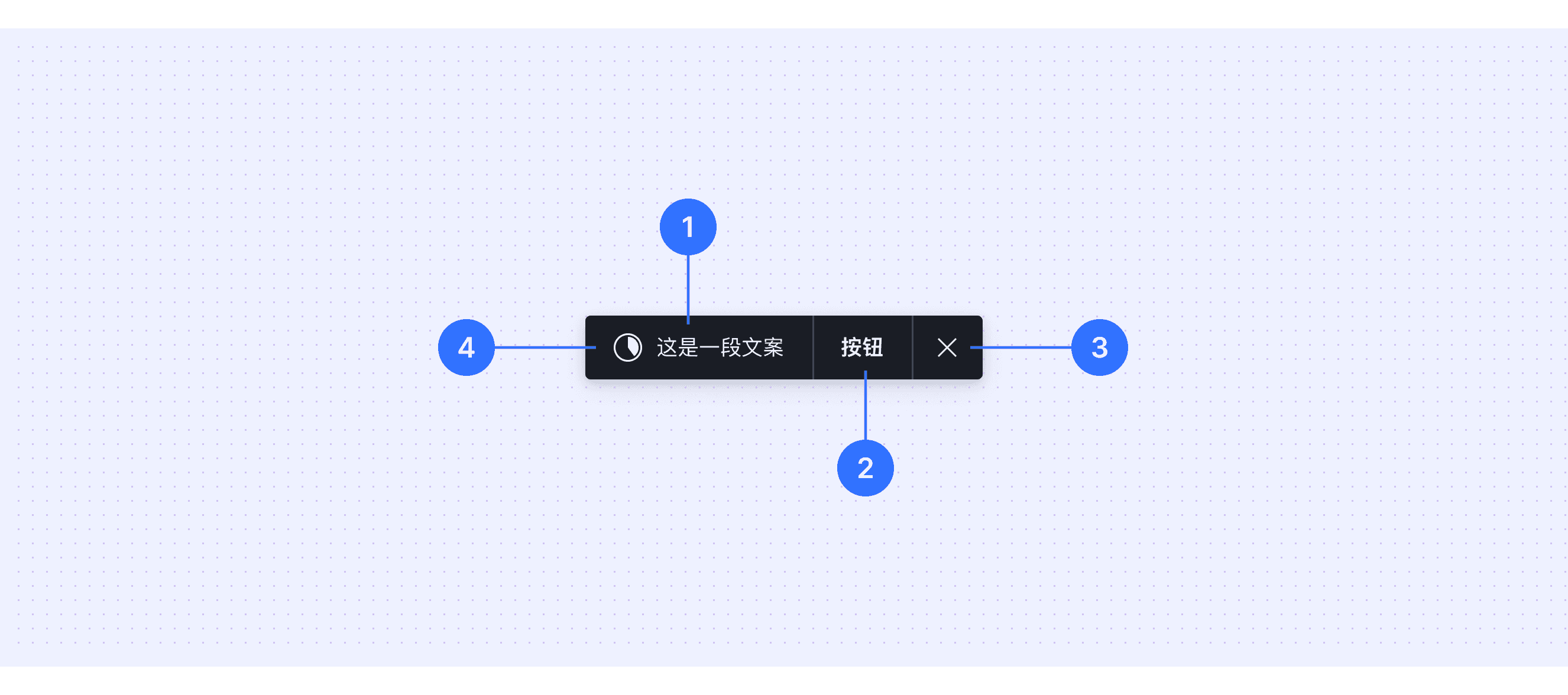
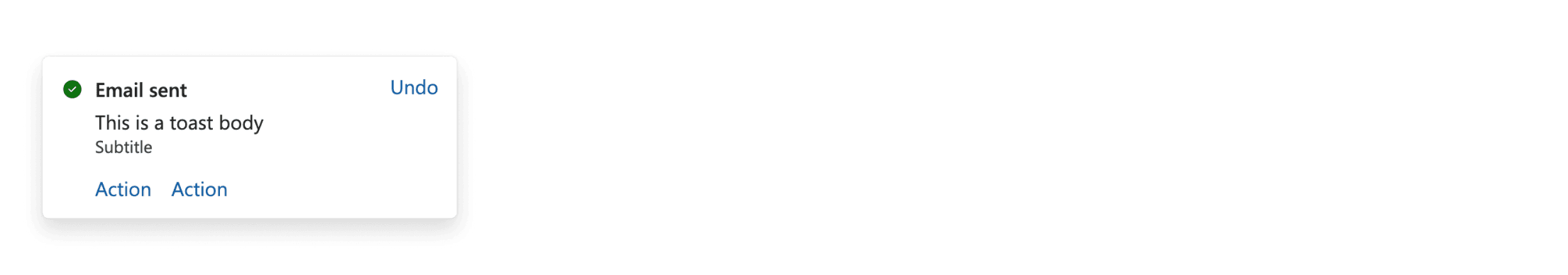
Supporting text: Displays the main message content to convey information to the user.
Action: Provides a clickable action button for users, such as "Undo" or "Retry."
Close button: Displays a close button or other functional icons, allowing users to manually dismiss the toast.
Icon: Displays the progress of an operation or emphasizes the action being performed.
Core features
Non-Intrusive: Toasts appear without interrupting the user's workflow or requiring immediate attention.
Temporary: They are displayed for a short duration and automatically disappear after a few seconds.
Informative: Used to communicate brief feedback, updates, or status messages to the user.
Dismissible: Often includes a close icon or allows for manual dismissal by the user.
Comparison of Usage in Popular Design Systems
Now, let's look at how some well-known design systems define and implement toasts:
Discover how toasts are implemented across different design systems like Material Design, Fluent Design, Ant Design, etc. Look at their features and rules like duration and Interactivity to choose the best fit for your project.
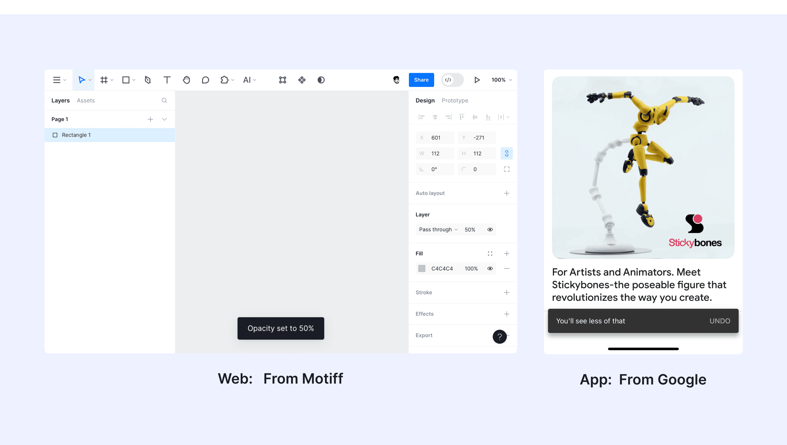
Default Styles
Enumerates the default appearances of toasts across various design systems, highlighting their visual characteristics and usability.
Features comparison in Design Systems
Comparing toasts in Material, Fluent 2, Ant, Bootstrap, Lightning, and Orbit shows differences in duration and Interactivity.
Design System
Defines
Duration
Interactivity
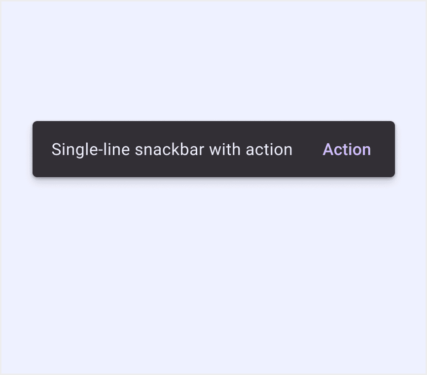
Snackbars show short updates about app processes at the bottom of the screen.
Short (4-10 seconds).
Supports button interaction (e.g., undo).
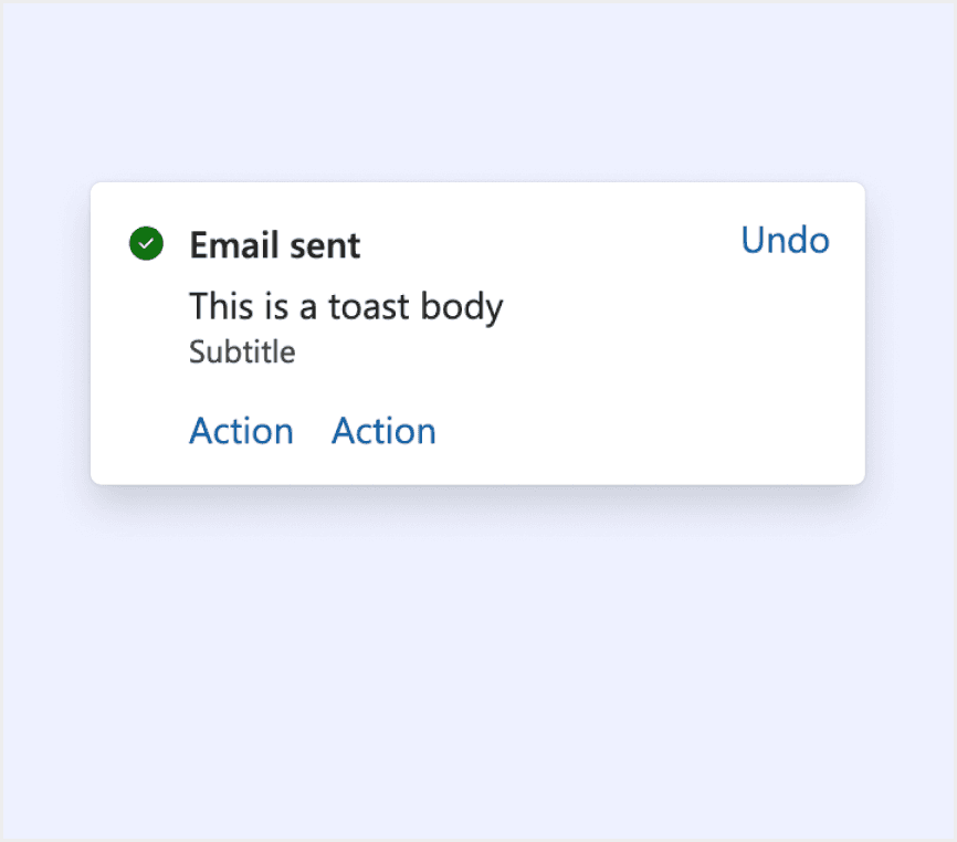
A toast communicates the status of an action someone is trying to take or that something happened elsewhere in the app. Toasts are temporary surfaces. Use them for information that's useful and relevant, but not critical.
Default 5 seconds Customizable.
Supports button interaction (e.g., retry).
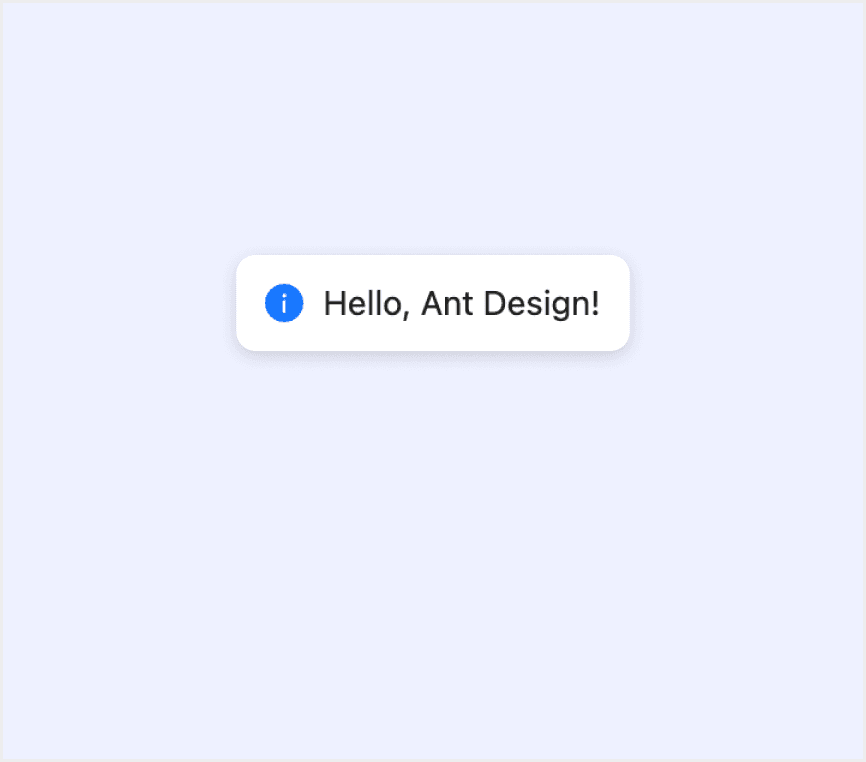
Display global messages as feedback in response to user operations.
Default 3 seconds.
No interactive buttons.
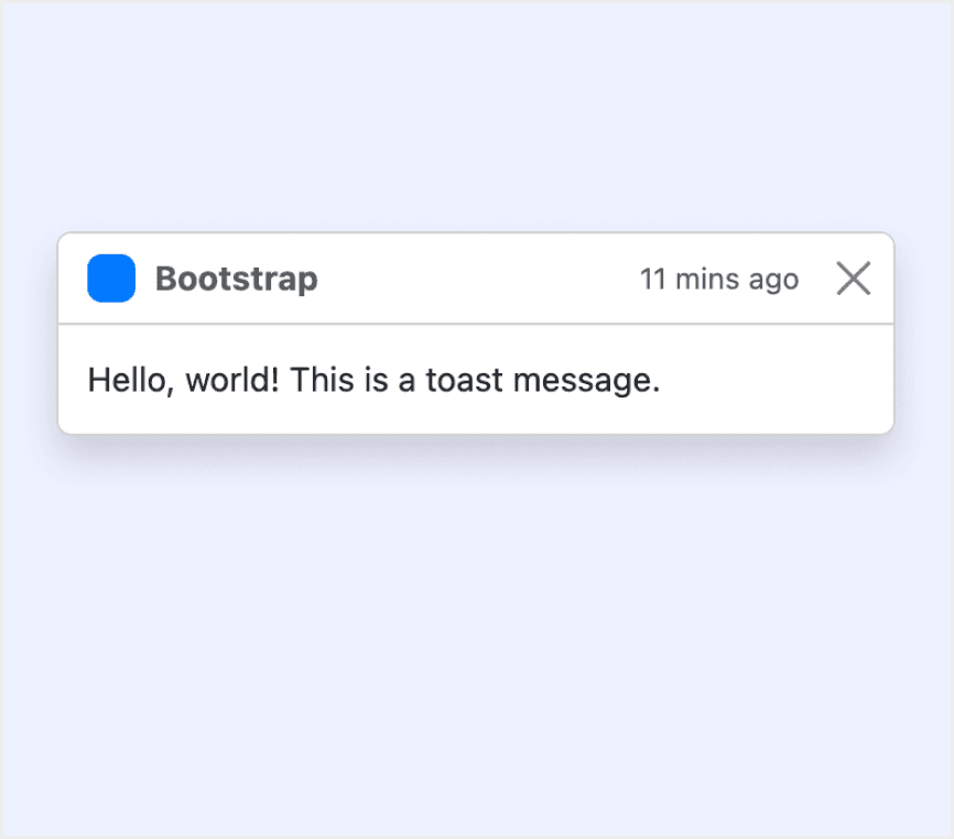
Push notifications to your visitors with a toast, a lightweight and easily customizable alert message.
Default 5 secondsAuto-hide can be disabled.
Supports button interaction.
Toast serves as a feedback & confirmation mechanism after the user takes an action.
Persistent until dismissed.
Forced interaction (must click to dismiss).
Toast shows a brief message that’s clear & understandable.
Default 6 seconds.
Supports button interaction (e.g., confirm).
Special Types
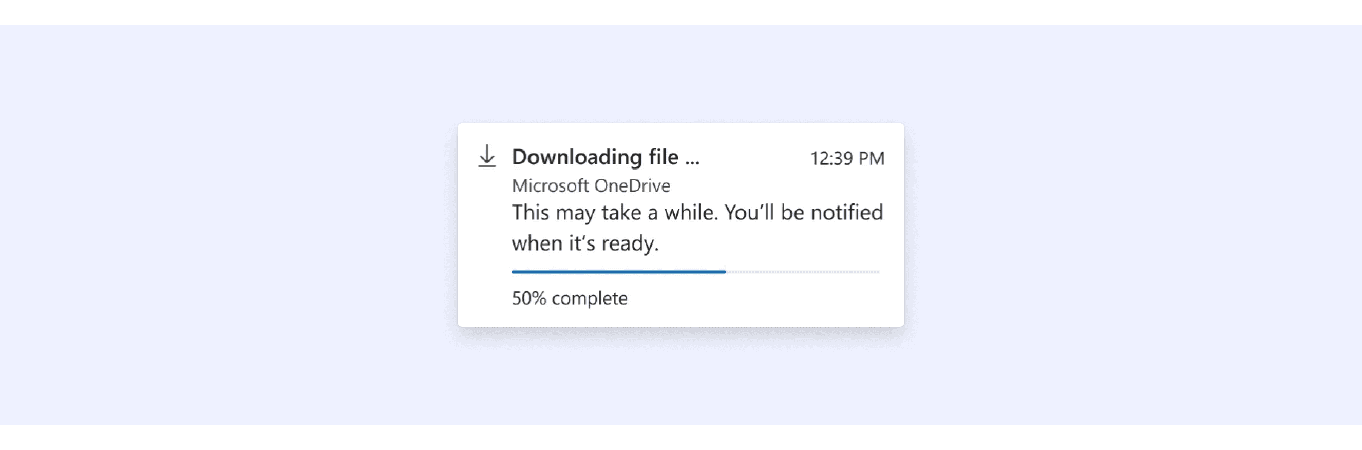
Fluent Design System Allows embedding progress bars within toasts.
Progress toasts inform someone about the status of an operation they initiated.
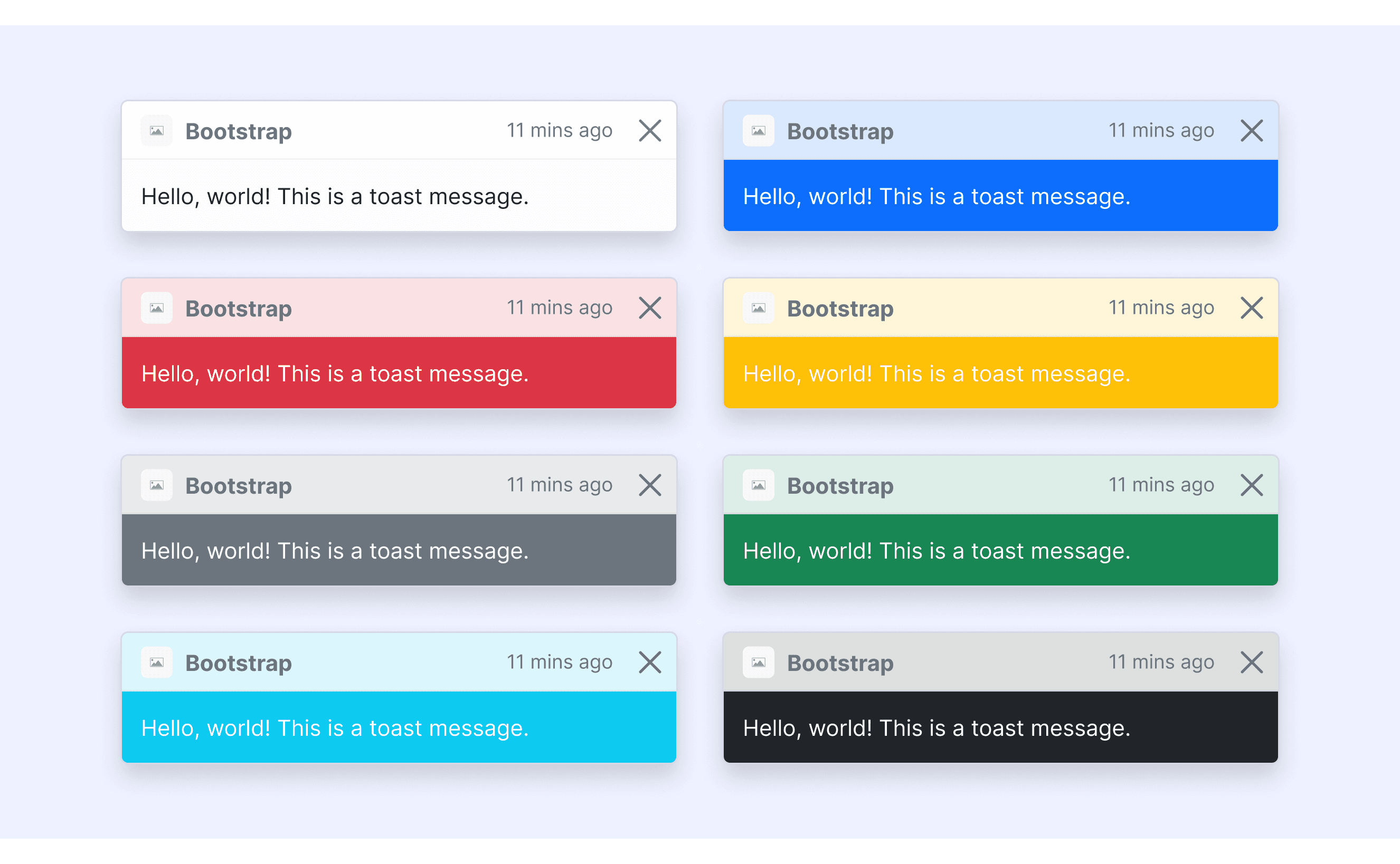
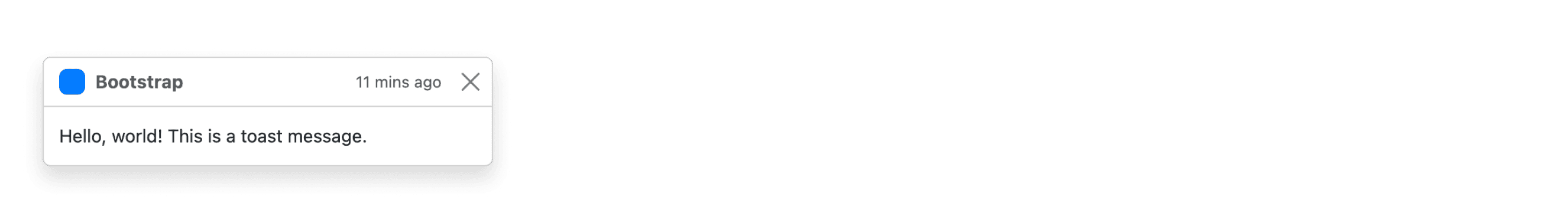
Bootstrap Design supports different colors’ toasts.
The Bootstrap component library offers six color styles for toasts, allowing users to cover a variety of scenarios.
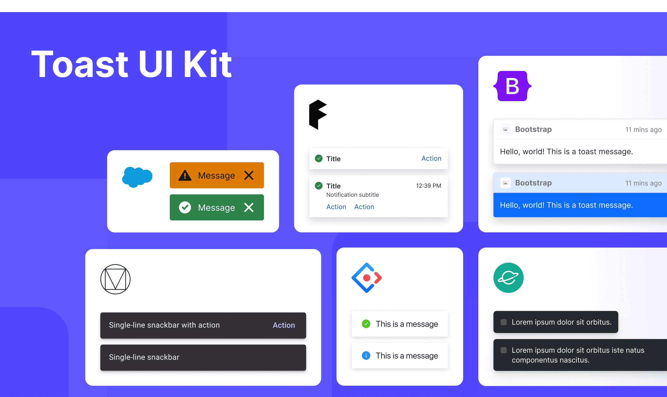
Toast Template for Motiff
This UIkit file combines toast designs from Material, Fluent 2, Ant, Bootstrap, Lightning, and Orbit design. It showcases their styles, usage, and customization in one place for easy exploration and selection.
Toast vs. Alert vs. Notification: Difference and When to Use
In user interface (UI) design, the terms "toast", “alert” and "notification" are often used interchangeably, but they have distinct meanings, which are adapted from a Stack Overflow discussion.
Alert:
Characteristics: An alert is a message that stops you from doing anything else until you click something like "OK" or "Close." It’s used for very important or urgent information.
Use Case: Since it interrupts what you're doing, it's good for situations where you need to act right away, like confirming if you really want to delete something.
Notification:
Characteristics: A notification is a message that shows up, usually at the top of the page. It doesn’t stop you from doing other things, and you can ignore it if you want.
Use Case: Notifications are often used to tell you what happened after you do something, like letting you know a form was submitted successfully. They can also warn you about errors or give you other updates.
Toast:
Characteristics: A toast is a small message that pops up on the screen for a few seconds and then disappears. It doesn’t stop you from doing anything and usually shows up with a little animation.
Use Case: Toasts are great for quick updates that don’t need you to do anything, like telling you a new email arrived or a song has changed.
Accessibility in Different Design Systems
Common Practices
Auto-close Duration: Most systems default to an auto-close duration of 4–10 seconds (e.g., Material/Fluent).
Keyboard Navigation: Supports closing via the "Esc" key (except for Lightning).
Screen Reader Compatibility: ARIA labels are used to mark the toast role (e.g., role="alert").
Color Contrast: Text and background colors meet WCAG 2.1 standards (at least 4.5:1).
Differences Practices
Material: Supports multi-line text display and can interact with floating buttons (e.g., "Undo" actions).
Fluent 2: Allows embedding progress bars within toasts (e.g., file uploads) and adapts to layout adjustments for foldable devices.
Ant: Supports integration with loading states (e.g., "Saving...") and allows message stacking to avoid overlap.
Bootstrap: Enables arbitrary positioning via CSS and supports embedding complex content such as images and tables.
Lightning: Requires manual user dismissal, with styles strictly adhering to Salesforce brand guidelines and not modifiable.
Orbit: Automatically moves toasts to the bottom on mobile devices and supports extending notification types via themes.
Code Examples
Explore default toast implementations in Material, Fluent 2, Ant, Bootstrap, Lightning, and Orbit design. These examples showcase standard usage, default settings, and core features across design systems.
Fluent 2 Design System
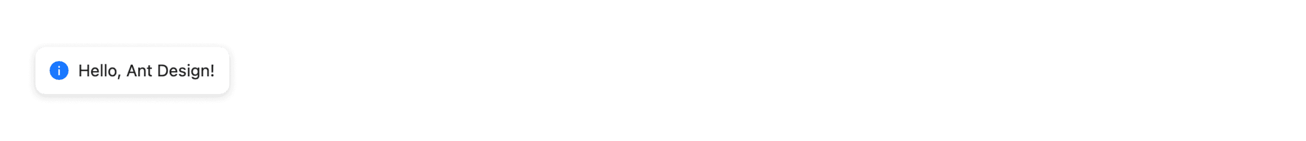
Ant Design
Bootstrap Design System
Lightning Design System